Research Update - Week 1
This starts a series of posts I plan to make weekly to keep track of progress I have made in the various research projects I am involved in.
YSOLab
YSOLab has yet to meet this semester, with our first meeting being planned for next Friday (9/8/23). However, I have made some progress over the last week that I believe is worth documenting here.
A More Detailed .FITS Output
One consistent function of the combined-light-curve script we have been working on has been the ability to collect the reduced data from each of the relevant sources and save it as a single .FITS file. The benefit of this is that we are able to then use this data elsewhere without needing to retread the previous data reduction steps we do during the combined-light-curve script.
The data exportation step has been together and working for some time, however I was never quite satisfied with the overall completeness of the data we saved; the initial version gathered the relevant unTimely and filtered NEOWISE data in each time bin, and associated each with a single mean mjd, with this data all stored within a table in the fits file. Other information, like the object’s ra, dec, and the measurements from SESNA, were stored in the header of the fits file.
While this did accomplish our most basic parameters, as time went on I felt that it was necessary to create a second version of this exportation process that included much more data than previously.
To store this volume of information, I utilized the ability of the .FITS file format to hold multiple separate tables inside a single file. Using this, I assigned each data source its own, separate table within the file, allowing for each source to have its own set of columns. This does have the tradeoff that it becomes more tedious to interface with the file, however I feel that the additional included data is worth it.
I was able to implement this new method, and I have run it over the usual sets of objects without error.
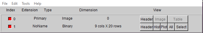 Image of the old .FITS file layout
 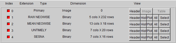 Image of the new detailed .FITS file layout
Future Work
There a few things I think would be useful to work on in the coming weeks.
Firstly, I think I will put together a small python script that automates the process of interfacing with the new detailed file format. Using this, it would become much easier and less tedious to use this data in other scripts, and speed up the overall process of exploring this set of data.
Another idea was to further investigate ways of identifying possibly variable protostars. Up until now we have only been performing very basic checks, mostly involving by-eye observations of the produced light curves and examinations of the standard deviations of the magnitudes. While doing some research, I came across this paper (link) that involves examining the variability of protostars using a variety of more sophisticated methods than we have been using. My goal was to dig into this paper, then see if I could reimplement some of these methods on our most promising variability candidates over the next few weeks.
Cosmology Group
Building Slice Contours
My main goal this last week in my work with Dr. Visbal has been to try and get a better grasp on the relationship between the several different sets of data we have extracted from the renaissance simulation. Our hope is that by doing this, we can find some additional process we can implement that will help improve the agreement between our semi-analytic model and the fully analytic results from the renaissance simulation.
Our main points of comparison are the ionization cube, which represents the fraction of hydrogen ionized at each point within the simulation box of renaissance, the overdensity of dark matter from renaissance, the photon grid we produce from the given halo information, and the positions and virial radii of each halo present in the reniassance simulation data at our redshift of interest.
To compare these, the main plot we have been working with has been different projections, where we choose a halo within our set and slice out a small cube (usually 80 pixels across) around that halo from each of the relevant data cubes. We then sum these cubes along each axis, plotting these as contours. We are also plotting the halos in these slices as circles, with the radius corresponding to the virial radius of the halo and the color corresponding to whether the halo is capable of star formation.
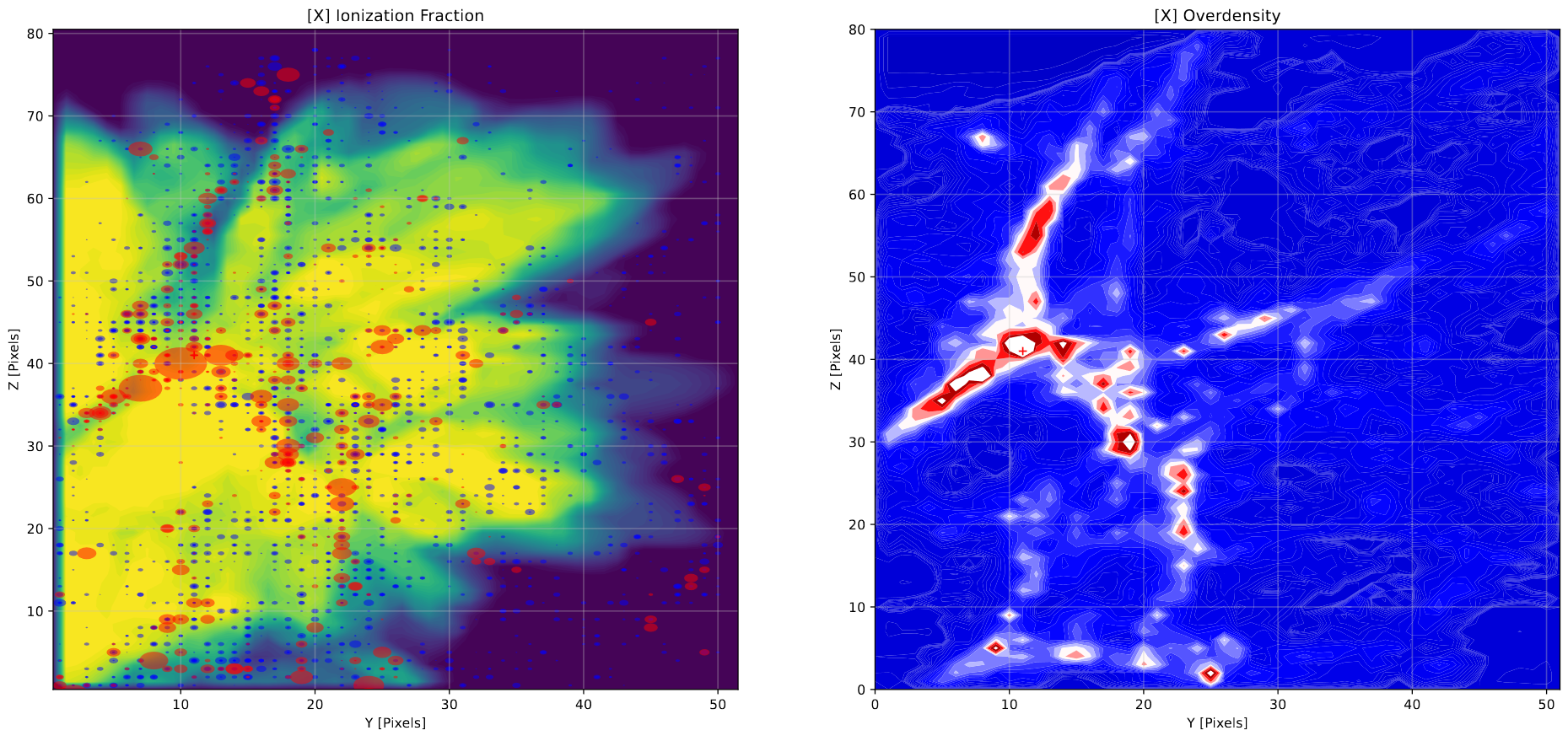 Example of a contour plot along the x-axis surrounding a specific halo
Future Work
Our next step is to analyze these plots and try to identify some method of reintroducing the complexity that is present in the renaissance simulation that cannot be replicated by the bubble placement methods utilized in the semi-analytic model. We are currently leaning towards some kind of ‘subtraction’ method, where we subtract away the ionization from regions based on some factor; perhaps around high density regions, or around isolated halos that can’t form stars.