Research Update - Week 10
YSOLab
Creating Color Plots
One of the main things I worked on this week was creating a set of plots that show the relationship between the color of each of the measurements with both the mjd and the magnitude of one of the bands. The main purpose was to try and provide more evidence of variability, or to explain situations where there is a disconnect between the colors in different bands or datasets.
An example of one such plot is shown below.
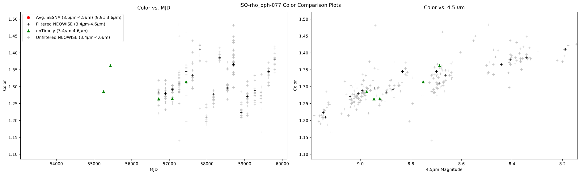 Color Plot of one object
One interesting thing to note here is that, despite the light curve for this object being otherwise inconclusive, this plot shows some evidence of an outburst, as the color of the source becomes blue as it becomes brighter.
Creating ‘Variability Timescale’ Plots
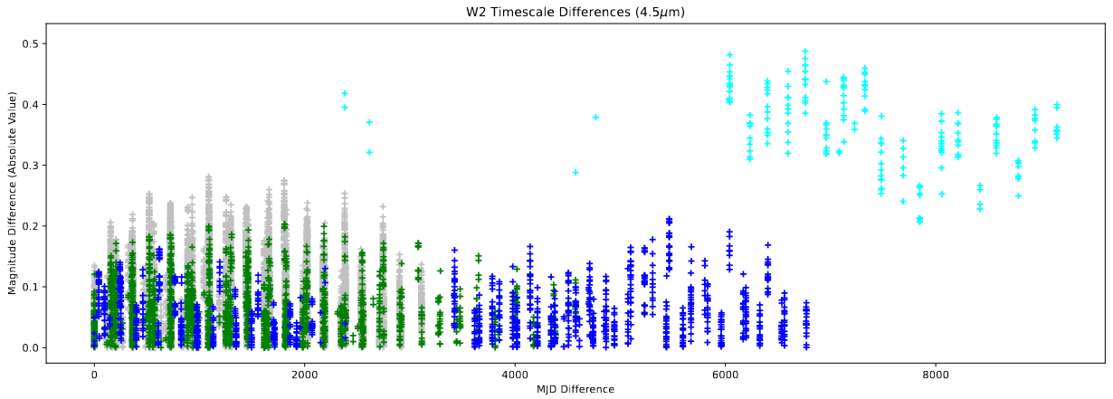
The other main thing I worked on was creating a plot that Dr. Megeath had described during our previous meeting, where we get the difference between the magnitude of each measurement and the timestep difference between each measurements. What this measurement intends to show is the ‘power’ of the variation at different scales; A higher value at lower timestep differences is evidence of a lot of variability on smaller timescales, while higher values at larger timestep differences is evidence of a lot of variability on longer timescales.
The only really pertinent detail on implementation was my mesh-based approach; rather than iterating through each value to get it’s difference with every other point on at a time, I created a mesh of values using numpy’s meshgrid, which allowed me to get the differences for both the magnitudes and the timesteps in a single operation, which drastically reduced the computation requirements, especially for sets with many points.
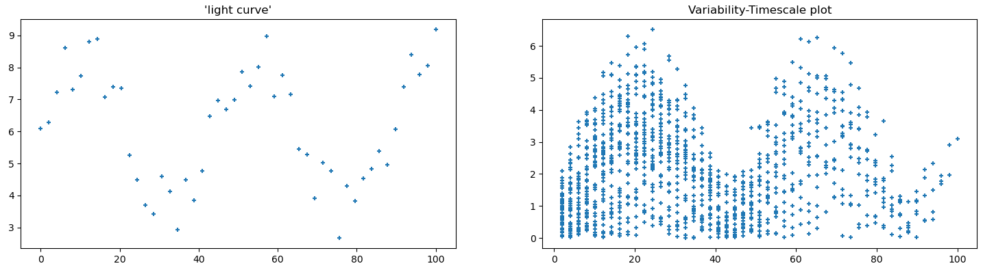
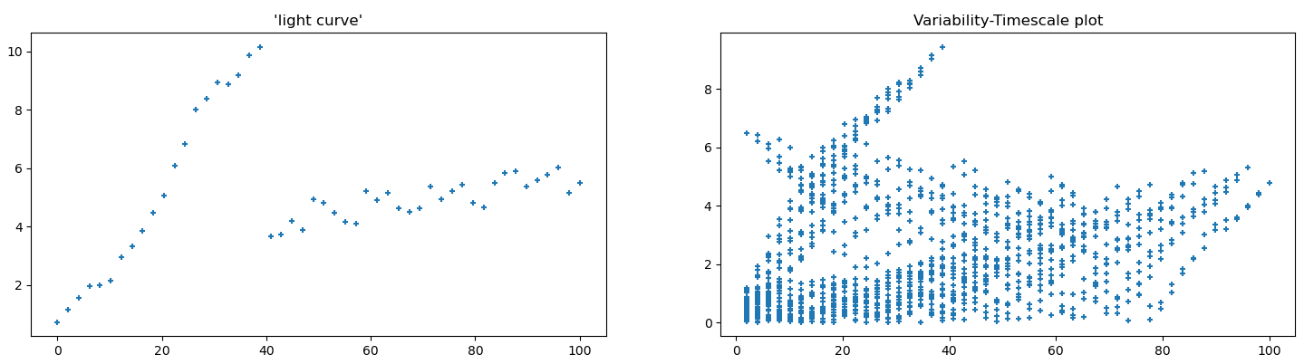
Before applying these plots to the actual light curve data, I instead created a few ‘toy’ examples of simple curves, with the intent being to see how different features were represented on these plots.
 example of a fake light curve with a sinusoidal shape, with some added noise
 example of a fake light curve with a sort of ‘burst’ shape, with some added noise
Following this, I implemented these plots as part of the light curve creation code, so we can automatically generate them for every source in our set.
 example of a variability timescale plot
Future Work
For next week, our focus will be to focus specifically on the candidates of our set with more than 1 magnitude of overall variability, and try to leverage these new plots to make determinations of whether they represent variable sources or not.
Cosmology Group
Fixing Recombination Mistakes
Following from last week, I spent some time working to resolve the issues with my recombination implementations, specifically the mistakes I had made with calculating the timestep lengths and converting from comoving to proper coordinates.
These were both relatively simple mistakes to fix, luckily; the timestep length was a case of assumed units, where I had assumed the timestep calculation to be returning the time in hubble time, when in reality it was in years. By swapping out my conversion factor, I was able to get the proper value, which will likely have a major impact on the final result.
The issue with the conversion of co-moving to proper coordinates was similarly fairly simple, where I only had to flip my conversion, so instead of multiplying by (1+z) I am dividing by (1+z), which fixed the mistake.
Comparing Results
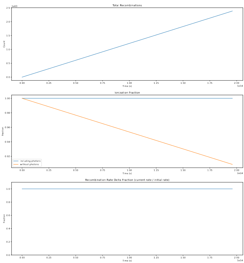
Following these fixes to the recombination implementations, I ran the model with these effects integrated, and examined the results. The main initial check was of the total count of photons and recombinations;
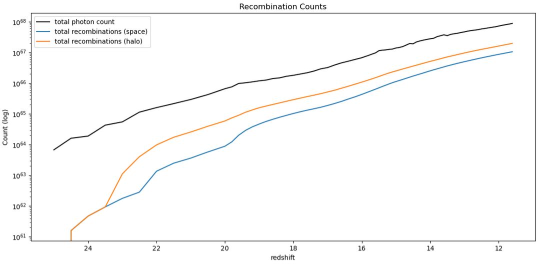 A plot showing the cumulative total of recombinations and photons over time
The takeaway here is that the recombination-aware models are no longer finding more recombinations than photons, as they were before, and appear much more as we expect them to.
The next check was of the ionization fraction over time, compared between the halo-based, space-based, and unaltered models;
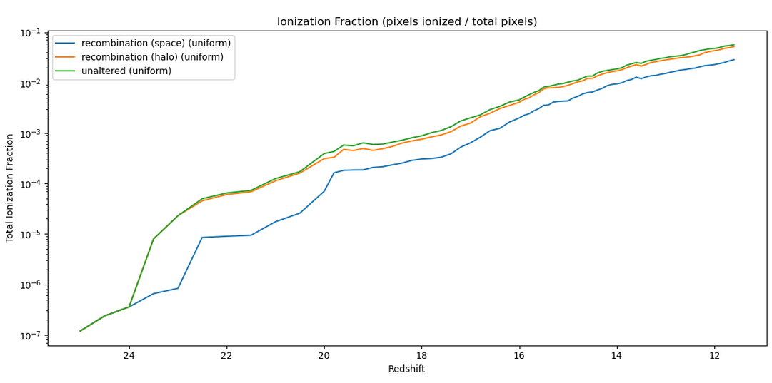 This plot shows the ionization fraction over time for the space, halo, and unaltered models.
The interesting thing here is the disconnect between the halo-based and space based versions, best shown in a separate plot, which represents them as a fraction of the unaltered ionization fraction;
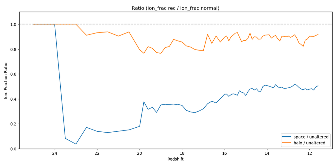 This plot shows the ratio of the recombination ionization fractions to the unaltered model.
Specifically, we see a fairly unphysical ratio in the space-based version, which sees an almost 50% reduction in the ionization fraction, which doesn’t really connect well with our physical understanding of the role of recombinations. In contrast, the halo-based version sees only a ~10% reduction, which matches our physical expectations much more closely.
As a result, for the time being, we will be moving forwards with the halo-based method for recombination.
Solving Recombination Rate ODE
One other thing I worked on this week was trying to understand how the recombination rate of the ionized regions changes as the ionized regions recombine, and become less than 100% ionized.
Constructing the ODE
To construct the ODE, I followed the below logic;
\[\frac{dN_{r}}{dt} = \alpha * n_I^2 * V\]Where;
$n_I$: number density of ionized hydrogen $\alpha$: constant. ($2.6*10^{-13} \frac{cm^3}{s}$) $V$: Volume of ionized region
We can say that;
\[n_I = n_T * X\]Where; $n_T$: number density of all hydrogen $X$: Ionization Fraction
We can then say that;
\[X = \frac{N_I}{N_T}\] \[X = \frac{1}{N_T}(N_{Io} + N_p - N_r)\]where; $N_T$: Total Number of Hydrogen Molecules $N_I$: Number of Ionized Hydrogen Molecules $N_Io$: Number of Initial Ionized Hydrogen Molecules $N_p$: Number of photons that have been emitted $N_r$: Number of recombinations that have occurred.
Since we start with the assumption that the ionized regions are fully ionized,
\[N_{Io} = N_T\] \[X = \frac{1}{N_T}(N_T + N_p - N_r)\] \[X = \frac{1}{n_T}(n_T + n_p - n_r)\]where;
$n_r$: number density of recombinations.
Returning to our original equation,
\[\frac{dN_{r}}{dt} = \alpha n_I^2 V = \alpha V (n_TX)^2 = \alpha V n_T^2 X^2\] \[\frac{dN_{r}}{dt} = \alpha V n_T^2 * (\frac{1}{n_T}(n_T + n_p - n_r))^2\] \[\frac{dN_{r}}{dt} = \alpha V n_T^2 * \frac{1}{n_T^2}(n_T + n_p - n_r)^2\] \[\frac{dN_{r}}{dt} = \alpha V (n_T + n_p - n_r)^2\] \[\frac{dN_{r}}{dt} = \alpha V (\frac{N_T}{V} + \frac{N_p}{V} - \frac{N_r}{V})^2\] \[\frac{dN_{r}}{dt} = \alpha V \frac{1}{V^2} (N_T + N_p - N_r)^2\] \[\frac{dN_{r}}{dt} = \frac{\alpha}{V}(N_T + N_p - N_r)^2\] \[\frac{dN_{r}}{dt} = \frac{\alpha}{V}(Vn_T + N_p - N_r)^2\]The ODE I landed on was;
\[\frac{dN_{r}}{dt}(t) = \frac{\alpha}{V}(V*n_T + N_p - N_r)^2\]where; $V$: Volume of the ionized region $n_T$: total density of hydrogen $N_p = N_p(t)$: number of photons emitted from t=0 to now. $N_r = N_r(t)$: number of recombinations that have occurred from t=0 to now.
Some caveats;
- This assumes that the photons and recombinations are evenly smeared across the entire range, rather than concentrated at the halo positions and at locations far from the halos, respectively
- Technically, this is a set of simultanious differential equations, as N_p(t) in addition to N_r(t).
- It is a very simple one, as the $\frac{dN_p}{dt}$ is constant
- I sidestep the problem by just manually incrementing V_p at each step by the amount expected.
- This makes the assumption that the number of photons never exceeds the number of recombinations
- In reality, this is bounded such that $N_p - N_r < 0$
- This isn’t reflected in the equation (I wasn’t sure how to)
- I implemented this manually in the solver below
Unit Check;
\[\frac{dN_{r}}{dt}(t) = \frac{\alpha}{V}(V*n_T + N_p - N_r)^2\] \[\frac{dN_{r}}{dt}(t) = \frac{\alpha}{V}(V*n_T + N_p - N_r)^2\] \[\frac{dN_{r}}{dt}(t) = \frac{[cm^3]}{[s]} * \frac{1}{[cm3]} * ([cm^3]*\frac{[quantity]}{[cm^3]} + [quantity] + [quantity])^2\] \[\frac{dN_{r}}{dt}(t) = \frac{1}{[s]}([quantity] + [quantity] + [quantity])^2\] \[\frac{dN_{r}}{dt}(t) = \frac{1}{[s]}([quantity])^2\] \[\frac{dN_{r}}{dt}(t) = \frac{[quantity]^2}{[s]}\]This seems almost correct, and matches with the units of the original version;
\[\frac{dN_{r}}{dt} = \alpha * n_I^2 * V\] \[\frac{dN_{r}}{dt}= \frac{[cm^3]}{[s]} * \frac{[quantity]}{[cm^3]}^2 * [cm^3]\] \[\frac{dN_{r}}{dt}= \frac{[cm^3]^2}{[s]} * \frac{[quantity]^2}{[cm^3]^2}\] \[\frac{dN_{r}}{dt}= \frac{1}{[s]} * \frac{[quantity]^2}{1}\] \[\frac{dN_{r}}{dt}= \frac{[quantity]^2}{[s]}\]Solving with RK4
I then solved this by implementing an RK4 solving method, where I also manually updated the photon counts at each step, to match the expected bubble size.
Using this solving method, I was able to calculate the recombination rate for a bubble with a 4 pixel radius with various values of photons.
For a bubble of that size, if we assume it creates no additional photons, the recombination rate over the timestep is described by;
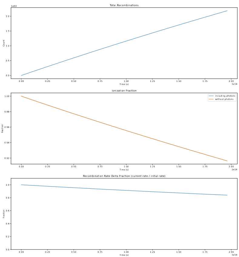 This plot shows some properties of the solved ODE.
For that same bubble, if we add in enough photons to fully create a bubble of that size in a single timestep (which is likely more photons than usual), we get the following;
 This plot shows some properties of the solved ODE with added photons.
The overall takeaway is that, even in the extreme case where there are no additional photons, the recombination rate only sinks to about ~90% of its original value, and as such the effect of this on the number of recombinations created is likely fairly small. Couple this with the effect of photons, as well as some of the assumptions made in creating this, such as the assumption that the recombinations and photons are smeared equally across the whole volume, rather than the photons forming a gradient starting from the halo at the center, and the recombinations occuring primarily around the edge, and we decided that we will not try to integrate the variable recombination rate into our model for the time being.
Future Work
For next week, my main goal is to take a look at implementing an alternative method for placing ionized bubbles, called A-sloth, with an eye towards comparing the effectiveness of this other method against ours.
I will also be working on gathering together all of the different improvement methods we have developed, and try to synthesize a combination of methods that will achieve the best results.
Gun Violence Archive Research
Regressions on Datasets
Goals & Logic
This week, my main goal was to work with the merged dataset that contains the GVA, FBI, and CDC gun violence deaths at the county-year level to try and find correlation between the two sets. To do this, I found the python package stats_models, which allows me to perform R-style correlation and linear regression tests, which is handy, as most of my experience in this area is in R, rather than python.
Checking Conditions
My first step was to check some of the conditions that are necessary to perform some of the upcoming tests. Specifically, I wanted to test to see if these variables are approximately normal. using a set of qq-plots, we can see that;
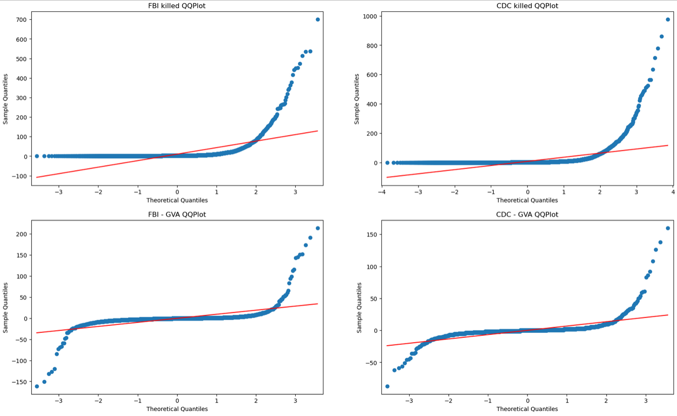 This shows a set of QQplots for the different variables of interest.
From these plots, it is clear to see that, while the actual counts of deaths are not normal, the differences between the fbi and gva set and the cdc and gva set are actually fairly normal, and as such could be easily used for the z-tests of means.
Z-test of means
Performing a set of z-tests, we get the following result;
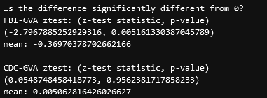 This image shows the z-test output for both sets.
the takeaway here is that, for the FBI-GVA set, the mean of the difference is significantly different from zero, meaning there is significant evidence that the FBI set is different in some capacity from the GVA set.
Linear Regression
To perform the linear regression, we decided to construct a new variable that would help reduce some of the correlation that is inherent in our data. Specifically, due to the nature of population sizes, the number of gun violence deaths will almost always be correlated with the population of a place, as more people will result in more possible gun violence interactions.
To try and reduce this in-built correlation, we constructed the following regression variable;
\[[diff] = \frac{([FBI\;deaths] - [GVA \;Deaths])^2}{[mean\;population]}\]One detail here is the use of the mean population of each county. This was done to try to reduce another set of correlation, specifically between the year and population variables, which will almost always be correlated, as populations tend to grow with time in nearly every case. To solve this, I calculated the mean population over the timespan in each county, and assigned it to a new variable.
Using these variable, we constructed a set of initial regressions;
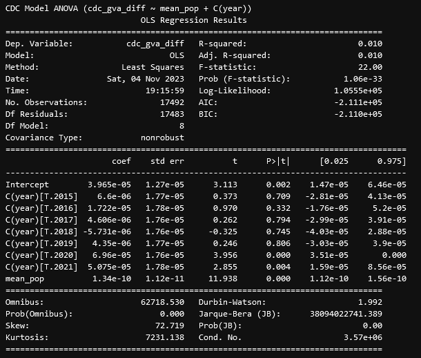
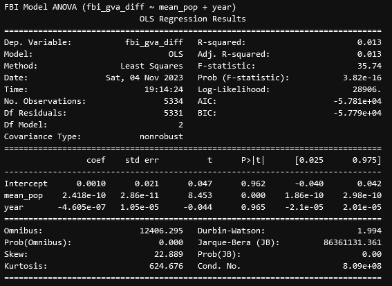 This image shows the linear regression output for the described model.
From these results, we see that, for the difference between the FBI and GVA data, there exists a VERY significant correlation with the mean population of a county and the difference, with the relationship being positive, such that the more people there are in the county, the larger the difference will be, even with our attempts to account for that effect in our regression variable. This is interesting, but we ended up focusing more on the CDC data, as that had a much more interesting set of results.
 This image shows the linear regression output for the described model.
From these results, we see that, similarly to before, the difference between the CDC and GVA data is correlated strongly with the mean population, but unlike before, the year is also very significantly correlated with the mean population, which was concerning. This prompted our second test, which was to consider the year as a categorical variable;
 This image shows the linear regression output for the described model.
This result was very intriguing, as it turns out the majority of years are not correlated with the difference, with only 2020 and 2021 being correlated. The final nail in the coffin was an additional set, where I encoded a new variable that was False for the years 2014-2019, and True for 2020 and 2021. This resulted in the fairly conclusive result;
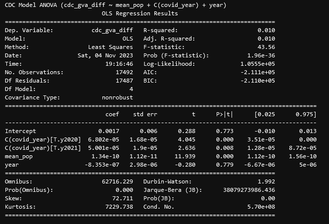 This image shows the linear regression output for the described model.
Here, we can see the source of that relationship; The years 2020 and 2021 represent a point of significant correlation, which essentially means that the data from those years is consistently different from the data taken during the different years, such that being during those years is a good predictor of that difference. Including this variable also reduces the correlation of the year variable to a very insignificant p-value of 0.779, indicating that, without those two problem years, the year variable is not a good predictor of the difference.
Initial Impressions & Concerns
Our initial impressions here are mostly focused on the CDC data, as it had the more interesting results. Specifically, we have significant evidence that the GVA data and the CDC data are significantly different, with the years of 2020 and 2021 being significantly more different.
This suggests some interesting things; those years represent the main peak of COVID, and Dr. Lilley had heard rumors that many hospitals were not being entirely accurate in their recording of deaths, with hospital policy being to categorize someone who was COVID-positive as having died of COVID, regardless of the true cause of death. Since these hospital sources are where the CDC gathered its cause of death information from, it isn’t impossible that this resulting over-categorization of deaths could have resulted in gun violence deaths being incorrectly designated as COVID-related, which would possibly explain the significant difference between the GVA set and the CDC set during specifically those years.
Future Work
To further investigate this difference, my next step will be to obtain the count of COVID deaths from the CDC website, in order to see if that has any correlation with the differnce between the two sets.
Cluster Research Pod
Background Subtraction
The main thing we worked on this week was integrating background subtraction into our process. Our first step was to convert the JWST data into the photon counts, which we accomplished using some fields from the header to convert from mili-Janskies per sterradian to photons per pixel.
Next, we used the Background2D method from the photutils package to generate an image that contained the background brightness of the image, which we then removed from the original image using the formula;
\[I_{bkg-sub} = \frac{I_{original}}{\sqrt{I_{bkg}}}\]Using this, we then ran the DAO source detection algorithm, which seemed to return more accurate results.
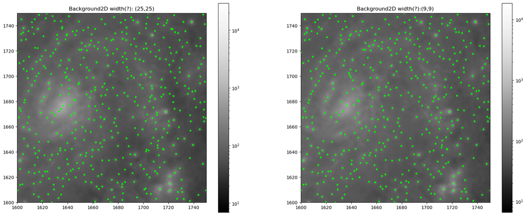 This plot shows a small portion of the image with different sizes for the background subtraction, with detected sources shown.
Future Work
Our goal for next week is two-fold; first, we want to try and better select the parameters for the background image creation, as we were just very quickly setting basic parameters, and there might be some improvements to be found through tuning them more carefully. Second, we want to use some centering algorithms to properly center our candidate objects on top of their sources, and then remove any duplicate detections in preparation for the photometry portion.