Research Update - Week 11
YSOLab
Integrating Additional Spitzer Data
One of the primary things I worked on this week for YSOLab was integrating some new Spitzer data that Dr. Megeath provided at the end of last week. This data included some from the YSOVAR program, which provided many additional clustered points, as well as more general Spitzer points for the ophiuchus region.
This data came in the form of an IDL .sav file. This .sav file was structured in the same way as the previous data I had recieved, so I was able to re-use the functions I had constructed to painlessly extract the data into a more python-friendly .csv file.
At this point it was fairly trivial to load in and add these new points to the existing additional Spitzer data, and the light curves now include these additional points.
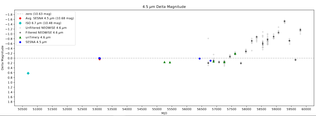 Delta Magnitude plot including the Additional SESNA Data
Future Work
For next week, our plan is to work on finally finishing our initial visual inspection of the set of ophiuchus sources with greater than 1 magnitude of variability. We have been slowly picking away at it for several weeks now, but we should be finished by next week.
Cosmology Group
Implementing A-SLOTH Algorithm
Basic Overview
In order to evaluate the effectiveness of the output of our semi-analytic model, we are planning to compare it against a different method of producing the ionized bubble output, specifically the one enumerated in the paper A-SLOTH, a different semi-analytic model of the epoch of reionization.
The A-SLOTH method differs from ours in how it places the bubbles. In their method, it assigns each halo a bubble based on the number of photons it has created. If the center of any of these bubbles intersects with another bubble, the two bubbles are removed, and a combined bubble is placed that has a volume equal to the sum of the two component bubbles, and is centered at the center of mass of the two bubbles.
Calculating Distances Between Points
The first step in implementing this algorithm is to write a function that can take in a set of positions, and returns the minimum distance between each point and every other point in the set.
This operation is a little sticky, as it isn’t particularly difficult to write a very simple iterative version, however because there are a decent number of points, and knowing Python’s characteristic slowness, doing it this way would be less than ideal.
I have used other packages (Open3D) to perform this operation before, most recently in my work on Galactic Clusters, where I wanted to see how clustered our detection candidates were. However, I thought it would be best to write my own function in this case, in order to reduce dependencies, and because I wasn’t sure if Open3D was available in Python 2.7, which is what we are running our simulations in.
I also had the benefit that I already had one angle I could pull on, as I had recently solved a similar problem in YSOLab, where I was able to use a numpy meshgrid to get the difference in time between every point in a set, and associate it with the difference in magnitude in order to identify the timescales with the greatest variability.
To get the distances between every point, I created a set of 2-dimensional meshs of the positions in x, y, and z. These sets consisted of two grids for each axis. Using this, I was able to use the pythagorean formula to create a 2-dimensional mesh that represented the distance between every point in the mesh.
One foible of this method is that, as a result of the geometry, the values along the diagonal represent the distance between every point and itself, and as such will be zero in essentially every case. However, because I am only concerned with the minimum distance between each point, and I know the maximum possible distance that two points can be from each other in pixels ($\sqrt{3*(256)^2}$), I can arbitrarily set the distances along the diagonal to 1000, and as such they will never be picked as the closest point, except in the possible edge case where there is only a single point in the box (although that situation is very unlikely.)
Following this, I can then find, for each row (which corresponds to a specific point), the index of the point that is closest to that point using the numpy argmin() function.
I can then return this, in addition to the distances each corresponds to.
Combining Intersecting Bubbles
Now that I can find the distances and indices of the nearest bubble center for each bubble, I can move forward with combining the intersecting bubbles.
To do this, I had to make a few assumptions that are related to the order in which things happen. Specifically, depending on the order in which bubbles are combined, one can end up with different results.
I decided to process the bubbles from highest stellar mass to lowest stellar mass, as well as to use the stellar masses when combining on center-of-mass.
To combine the bubbles, I essentially iterate through the nearest distances and find the first one that is smaller than that bubble’s radius, which indicates the other bubble’s center is within the current bubble. Then, I delete the smaller bubble from the array, and I add the volume of that bubble to the current bubble, and change its position to the center of mass of the two. This process is then repeated, until the iteration does not find any nearest distances that are smaller than the bubble’s radii.
Comparing A-SLOTH Results
The overall output is visually similar to our model output in general distribution, but differs in a few subtle ways. Firstly, the A-SLOTH method makes generally the correct size of bubbles, however the bubbles tend to ‘drift’ away from the most representative position, when comparing against the Renaissance output, whereas our model tends to follow the output much more closely. This is likely due to the bubble combining, and how a number of small bubbles will ‘pull’ a large bubble from its original location to their center of mass.
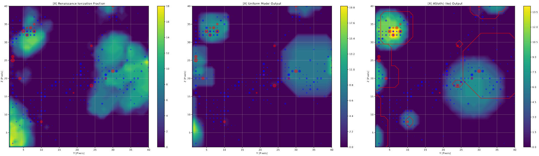 A slice plot showing an instance of a bubble drifting from its proper position
On the other hand, the A-Sloth bubbles tend to more accurately represent the sizes of the largest bubbles, whereas our model tends to overshoot the sizes of very large bubbles by a significant amount.
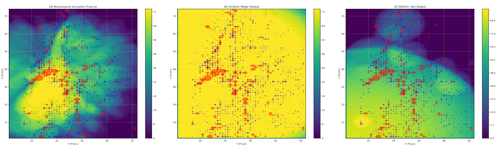 A slice plot showing our model overshooting the bubble size on a large bubble
Future Work
For next week, I plan on going back and consolidating some of the plotting code I had previously created, specifically the code for creating the distribution of ionized starless halos, as well as the bubble volume distributions code. This is in addition to some planning on my part, where I am trying to figure out how we can best try a variety of these new parameters and pin down the best model we can.
Gun Violence Archive Analysis
Finding COVID Deaths Correlation
One of the first things I worked on this week was testing the correlation between the differences between the GVA and CDC set and the number of COVID deaths in each county, with our initial expectation being to find some level of correlation.
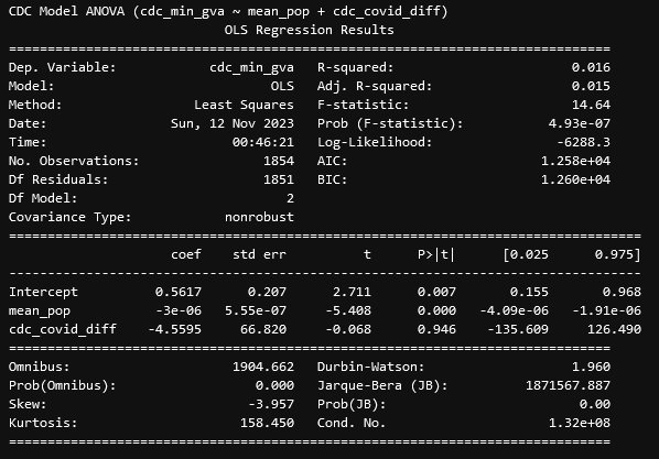 Linear Regression Output for the CDC minus GVA vs. population and covid deaths divided by population.
After performing the regression, we see almost the exact opposite, where there is essentially no correlation between the number of COVID deaths (divided by the population of the county) and the difference in gun violence deaths between the GVA and CDC sets.
Testing Equivalence of Datasets
The next thing we wanted to verify again was whether the sets were significantly different. Using a t-test, we found the following;
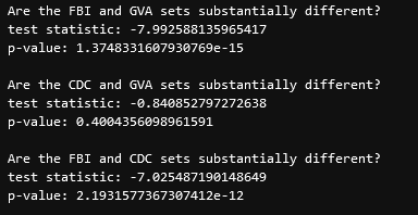 T-tests comparing the different datasets for non-equivalence
This indicates to us that the CDC and GVA data are not significantly different from each other, and are very similar, whereas the FBI and GVA set are significantly different from each other.
This, logically, makes some sense, as the CDC and GVA sets are both measuring all deaths by gun, both accidental and malicious, whereas the FBI set is laser-focused on only homicides, and as such will not include many of the incidents that the CDC and GVA sets might.
Graphing National Counts
One additional thing that I did was put together a plot showing the national death counts from the three sets both by year, and by month.
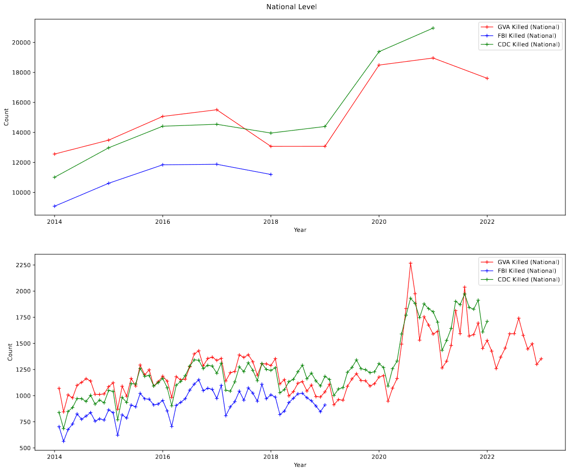 Trends showing the yearly and monthly national counts of gun deaths in all three sets.
It was while making this plot that I discovered a serious, significant problem, which brought our work to a screeching halt.
Identifying a Critical Mistake
Where I Identified my Mistake
My mistake became clear when we are comparing the CDC and GVA data. For the first several years (2014-2017), the GVA data and the CDC data follow each other very closely, before the GVA data suddenly stops following the CDC data in 2018, and continues in that way for the rest of the set. This is reflected in the monthly trendlines as well, with the who sets matching until march of 2018, before diverging.
The specific time of divergence (March of 2018) is no coincidence, and was a key piece of evidence that the problem was the result of my own mistake, and not a quirk of the data. This was further proven when I created a version of the plot that includes the officially reported yearly deaths from the Gun Violence Archive Website, which match this point of divergence.
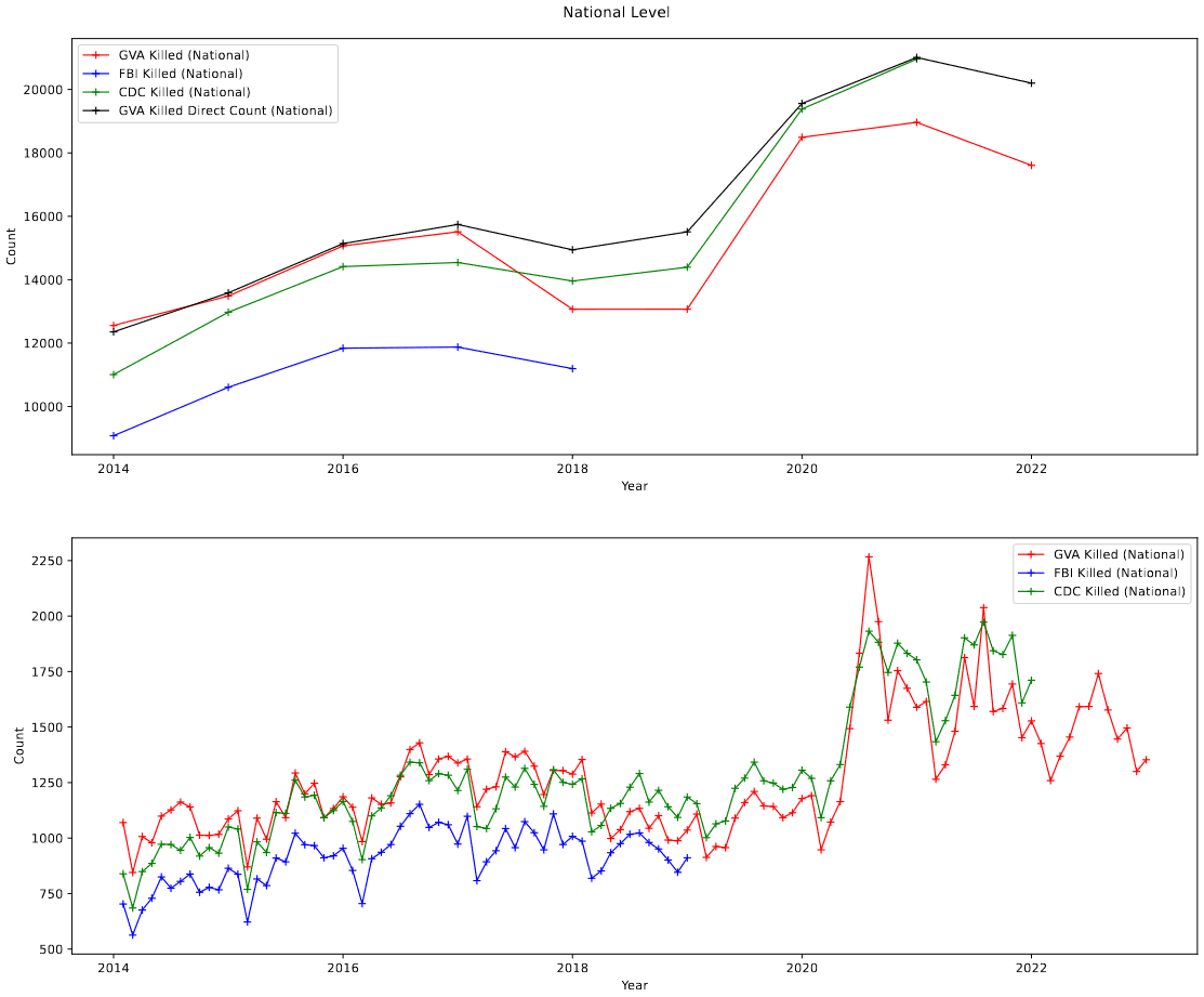 Trends showing the yearly and monthly national counts of gun deaths in all three sets, in addition to the actual reported counts from the GVA website.
What Could Cause This?
General Origins of the Dataset
The current dataset we are working with is actually a combination of two sets of data; an original GVA scrape from 2018, and a newly scraped set from earlier this year.
In the early days of this project, we had come across someone else who had managed to scrape the GVA set as we had planned to, however they had done it back in 2018, and had no plans of updating their set. While I initially tried to use their scraping code, I quickly abandoned that plan and switched to writing my own webscraper in Python. I worked on and eventually deployed this scraper over the summer, and was able to gather (what I believed to be) all of the detailed incident information on the GVA website from 2018 through May of this year.
The reason a scraper was necessary is that, despite offering a way to query and download incidents from their page, the data available was very limited, and did not include things such as the latitude and longitude, which were available on each incidents individual page. It was in pursuit of this additional information that I wrote this scraper.
I was then able to merge my set, which extended from 2018 to 2023, with the pre-existing set, which extended from 2014 to 2018, and get a set of 9 years of gun violence data, with a particularly high degree of specificity.
The important point to note from this is the differing origins of the data; the older data was scraped 5 years ago, while the newer data I took was scraped earlier this year.
A Peek Back at the Scraping Process
The scraping process I used was, in actuality, split into two different scrapes; an initial scraping of the basic incident data, and a second scrape of each individual incident page.
In order to speed the process along, I downloaded some code I had found online, which was able to do the paradoxically more difficult task of downloading the basic incident data. With this basic incident data, I gained the incident IDs, which were an important component of identifying the page url for each incident, and allowed me to focus on the more important task of scraping the information from each incident page.
Until recently, I had never questioned the accuracy of the results this code gave me, and I had assumed that it would accurately gather every incident.
How Could I Have Avoided This?
The conclusion that became clear to me, following some reflection, was that I had failed on several levels to verify my collected data, and I had repeatedly assumed that my process was working as intended. Had I stopped for a moment and verified the results of the code I downloaded, I would have seen immediately that the counts I was receiving were not matching with the original set, and that there was a problem somewhere.
Instead, I continued without checking, and we did not discover my mistake until nearly 6 months later, and entirely by accident. I will need to be much more cautious about this kind of thing in the future, and make sure that I verify my datasets as I am creating them, rather than 6 months after the fact.
Tracking Down My Mistake
Checking Intermediate Files
To try and find the exact source of the problem, I first took a look at some of the intermediate files that I used while scraping the incident data. Specifically, I looked at the basic incident data that was output by the basic data scraper. This data is what dictated what incidents were later scraped, so it would be the most likely culprit for missing incidents.
After checking the incidents, I was able to verify that this is where the problem was; when I compared the incidents in 2017 that the original 2018 set had, and the incidents that were in the intermediate set, I came up ~3000 incidents and ~2000 deaths short.
From this, I can know that I am at least on the right track, and that the problem lies somewhere in the basic incident information scraping code.
Manually Testing Query Page
I then wanted to compare the results of the basic information scraper with the results obtained using the query page that the GVA provides, to see if the scraper was actually obtaining all of the available information.
After using the query page to select and download a .csv containing all the incidents that occurred on january 1st, 2017, I compared the incidents I recovered with the number available in both the pre-existing 2018 set, and the output of the basic info scraper.
The surprising result was that, counter to what I expected, the manually downloaded set matched the count in the basic info scraper’s set, but was lower than the pre-existing 2018 set.
What this tells me is that the basic info scraper is likely working properly, and collecting every available incident from the site, but there are certain incidents that aren’t available through the query page that are included in the pre-existing set.
The concerning part of this is that, from the graphs above, the pre-existing 2018 set matches with the official counts from the GVA, while our counts do not match, but are based on every available incident that can be obtained from the query page.
My Current Theory
My current theory is that, at some point between 2018 and now, the GVA has, either accidentally or intentionally, made a certain subset of their incidents unavailable through both the query page, and through directly accessing the incident pages. These ‘phantom’ incidents are seen in the pre-existing set, which has the scraped information from the incident pages, but those incident pages no longer exist.
These phantom incidents do correspond to real incidents of gun violence, as evidenced by the source column in the pre-existing set, which links to many news articles or FBI pages about specific incidents. This is also proven by their inclusion in the GVA’s official counts, as it is because of these phantom incidents that the counts of the 2018 set match the GVA’s official counts very closely.
Future Work
I am not really sure where exactly to go from here. My current plan is to bring this information to Dr. Lilley on Tuesday, and get his opinion on what I have found, and see if he has any suggestions on how we could proceed.
Cluster Research Pod
Testing Sets of Median Subtraction
One of the things I worked on this week was testing a number of strengths of background subtraction, in an attempt to see what effect it had on the starfinding code. The three vectors I was examining were the nearest-neighbor distances of the found points, the number of found points, and the images themselves.
The counts of sources showed an interesting relationship, where at the lowest level of median subtraction we see significant change in count from one to the next, but this then evens out to about the same number of sources found for a wide range of different median sizes.
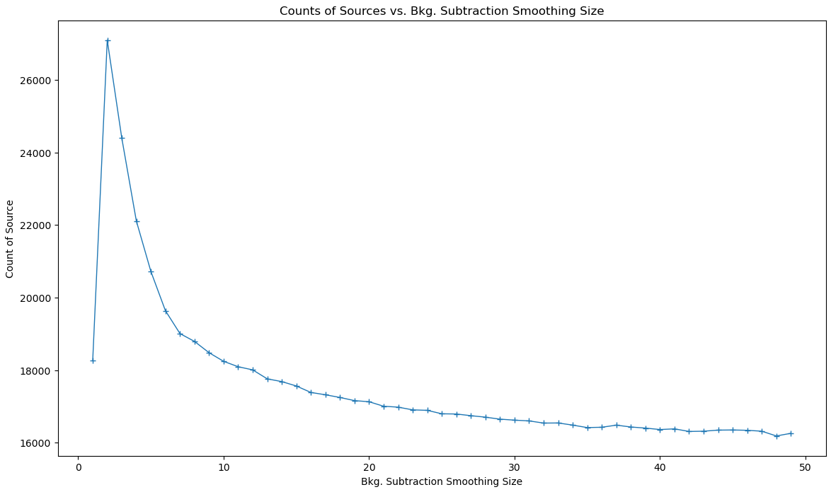 a plot showing the counts of sources found vs the size of the smoothing in the background subtraction.
This is also seen the nearest neighbor distance distribution, where each of the distributions past the smallest size are almost identical, and increasing the size does not change the distribution of distances in any measurable way.
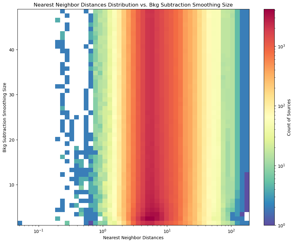 a plot showing the distribution of nearest-neighbor distances vs. the smoothing size in the background subtraction.
One final ‘plot’ was to compare visually the images with this background subtraction. This was done using a small ‘animation’, which made it easier to compare the effects quickly. The overall impression I recieved agreed with these plots; past the first levels of the median subtraction size, we do not see any significant change in the image, with some slight reduction in the overall brightness, with a slight increase in brightness around the AGN next to the main galaxy dist.
Working with Centering Sources
The cluster detection process does not usually return the exact center of the source, and we will probably need to employ some kind of centering algorithm in order to place the cluster positions in the center of their actual source. To do this, we attempted to use the centroid_sources function from the phot_utils package, where the code fits a 2d gaussian to each source and tries to align them with the image data.
We ran into some odd problems with this method, however; for many sources, the centering code seems to pull them away from their source, and sometimes off into a darker, empty region.
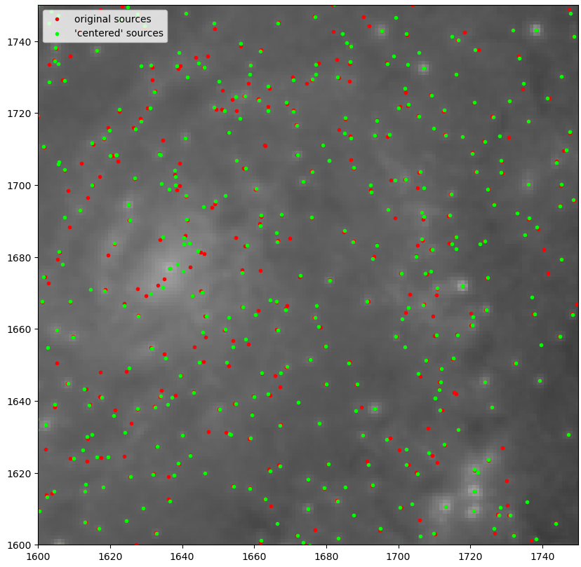 Showing a small portion of the image with the centering results and the original sources.
This, coupled with the inability to decrease the size of the box used below 3, meant that, for the time being, we will be holding off on centering the sources.
Settling on a Final Cluster Set
After some deliberation and by-eye checks with Dr. Chandar, we have decided on a set of parameters to produce a set of cluster candidates.
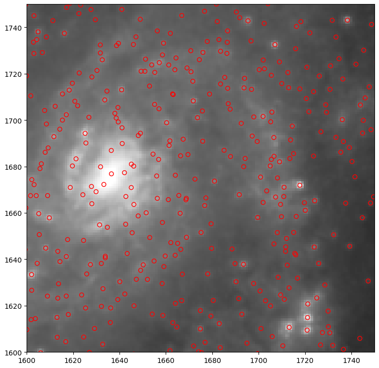 a plot showing the a small portion of the image with the final cluster candidates.
Future Work
For next week, our goal is to compare the existing HST cluster catalog for this galaxy with the candidates we have from the JWST image, and try to draw some conclusions as to how they compare.
To do this, we have obtained a new version of our JWST image that includes the WCS coordinates, which will allow us to convert between pixel positions and celestial coordinates.