Research Update - Week 12
YSOLab
Possible Problems w/ Additional SESNA Data
This week was fairly slow on progress, however on thing that did come up while reviewing the light curves that contain the new additional SESNA data was the presence of a few concerning characteristics, which we eventually narrowed down to two possible problems.
The first of these problems were a consistent jump between adjacent points within a single band. This issue appeared in both cases where saturation was likely, as well as in cases where saturation is unlikely.
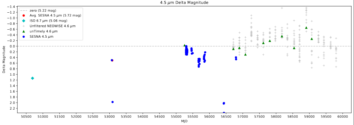 Delta Magnitude plot showing the differences found within a single band
The second of these problems was a consistent disconnect between the agreement of the 4.5 micron bands in the Spitzer and WISE data, and the agreement of the 3.6 micron bands in the Spitzer and WISE data. Specifically, the 4.5 micron measurements from the Spitzer telescope matched well with the 4.6 micron measurements from the WISE telescope (including our calculated offset), whereas the 3.6 micron measurements from the Spitzer telescope are significantly brighter than the 3.4 micron measurements from the WISE telescope, even with our calculated offset.
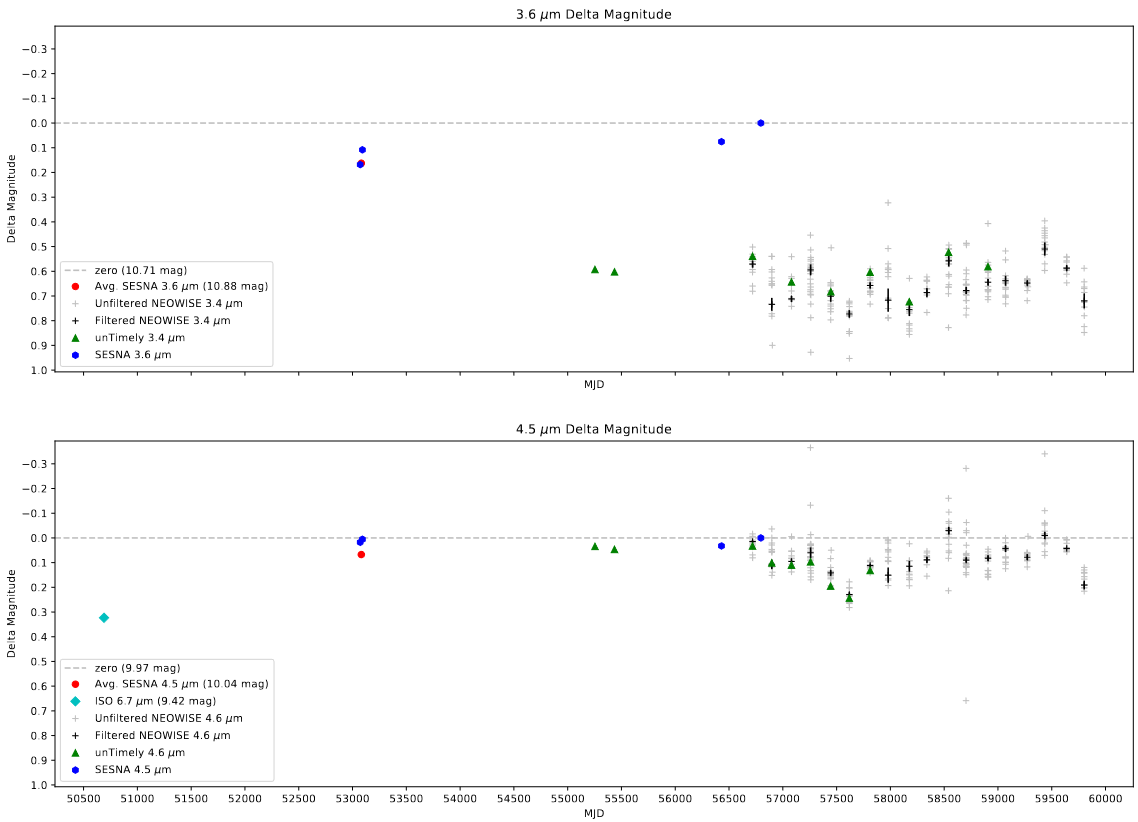 Delta Magnitude plot showing the differences found between bands
This difference isn’t really surprising, as the wavelength response curve for each filter is different, however these differences are both consistent and consistently massive, even with our attempt to rectify this through a calculated offset.
Future Work
For next week, our goal is to investigate this disconnect further, and try to find a solution.
Cluster Research Group
Mapping out Model Optimization
One of my two main goals this week was to try and better map out the different available parameters of the model, in preparation for our search for the best selection. I identified 3 main sets of parameters.
Escape Fractions
The first parameters I noted were the escape fractions for popII and popIII stars. These represent the fraction of photons that escape from the interior of each halo into the IGM, and are therefore able to ionized the outside gas.
These make the blanket assumption that every halo shares the same escape fraction, which isn’t really an accurate assumption, with the reality being that each halo would likely have it’s own unique escape fraction. However, to first order, this assumption is useful for simplifying the problem
In the past these have also served as a way of accounting for other discrepancies in the model, which can help to further motivate our choice to have these as single, stationary values.
From some experimentation in the past, I have found that, for redshift z=11.6 (where the majority of my work has been done), the amount of popIII stellar mass is an insignificant fraction of the total stellar mass, with popII stars making up the vast majority of that stellar mass. As such, for the redshifts in question, the popIII escape fraction has very little noticable effect, with even large swings in value not effecting the total ionization fraction by more than 1-2%.
For an initial tuning stage, the popII and popIII escape fractions are likely where we will start, and will be best represented by the total ionization fraction of the simulation space, and by the distribution of ionized starless halos.
Bubble-Dependent Scale Factors
One other knob we could turn is the bubble-dependent scale factors. The current bubble placement method has a problem, in that, due to some logical hurdles, it consistently overshoots the size of a bubble by 8 times when isolated, and by 4 times when nearby other halos.
To rectify this, the original version of the model had added in a universal 1/4 factor to the number of photons, which worked well for most bubble sizes. However, I had found that this method broke down for the smallest bubble sizes, where resolution effects meant that the bubbles were almost exactly the correct size.
To rectify this, I implemented I bubble-scale dependent factor, which decreased from 1 to 1/4 over the first few scales, which helped to fix this problem.
Our thinking is that, on top of this fix, we could also individually change the weighting used for each individual bubble scale, allow us a large degree of control over the individual bubble sizes.
Our plan was that, initially, we would define a three step function, where bubbles below a certain size are encouraged, bubbles between two sizes are neutrally affected, and bubbles above a certain size are discouraged. This would need to be informed by an understanding of the desired bubble sizes, which we can obtain from several of the graphs discussed below.
Density Considerations
There are also a set of considerations that could be made based on the density distribution within the box. We have been struggling to include this information in the model, due mostly to an interaction between our assumption of spherically symmetric bubbles, and the general shape of the density distribution.
Essentially, nearly every halo will exist inside a higher density region, and will mostly exist along a dense filamentary region. In the real case, the ionized regions that formed around these halos don’t result in perfect spheres, but rather a sort of dumbell shape, with the central region being mostly neutral due to the density of the gas, but the photons then leak out of two sides and form ionized regions adjacent to the filament. In contrast, our simulation that each bubble forms as a filled sphere centered on the halo, which encompasses both the less dense outer regions, as well as a larger portion of the filament that the halo resides within.
As a result of this, when we try and average the density over the bubble region, we find that the resulting density is much, much higher than it should be, and the resulting simulation output is almost completely neutral, with only a few smaller bubbles around the very largest halos.
We have been investigating ways to fix this on and off throughout this project, and are trying currently to really nail down a conceptually defensible method for eliminating this problem.
In the past we have explored using clustering algorithms to identify and clip out these dense filamentary regions, however those attempts were placed on the backburner, and some evidence from one of the newer plots places some serious doubt on the ability of clipping the density to actually resolve these issues.
I have been personally batting a few ideas around, and by next week I hope to have a few ideas to present that could help address this problem.
Creating & Updating Plots
The other main thing I worked on this week was on updating and consolidating a number of useful graphs that I had developed earlier in this process. I made a second pass on some of these plots, improving their readability and usefulness, as well as tossed together a few variations that should help use observe different properties of this data.
Bubble Volume Distribution Plots
New Approach to Identifying Bubbles
One of the major projects I pursued early on in this process was trying to devise a method to separate the different disconnected volumes within the ionization data. This method made extensive use of open3D’s different datatypes and methods to achieve a mostly durable result, however I was less than proud of the final product, and there were a number of problems that I would have needed to address if I wanted to use it.
It was only later on that I stumbled across the idea of clustering algorithms. This discovery renders much of my earlier work obsolete (and a little silly, in retrospect), as something like DBSCAN is perfectly capable of achieving exactly what I wanted in less than a minute.
I implemented the DBSCAN algorithm, using each of the ionized pixels as the input points, with an epsilon of 1, indicating that any ionized pixels that were more than 1 pixel from an existing cluster were given their own cluster.
This dramatically increased both the confidence I had in these results, and the speed at which these results could be obtained.
Changes to the Plot
Following these improvements to the process of obtaining the volumes for each individual bubble (measured as the number of pixels that make up that bubble), I spent some time improving and consolidating the graph into a class, which can be easily transferred between files and used on a variety of data.
This is the second time I have consolidated a graph into a class like this, with the first example being the Halo Slice plots that I developed. This process is time-consuming, however it helps save me time later, and allows me to much more easily and quickly iterate on and modify these plots on the fly.
The final result for a set of testing data is shown below;
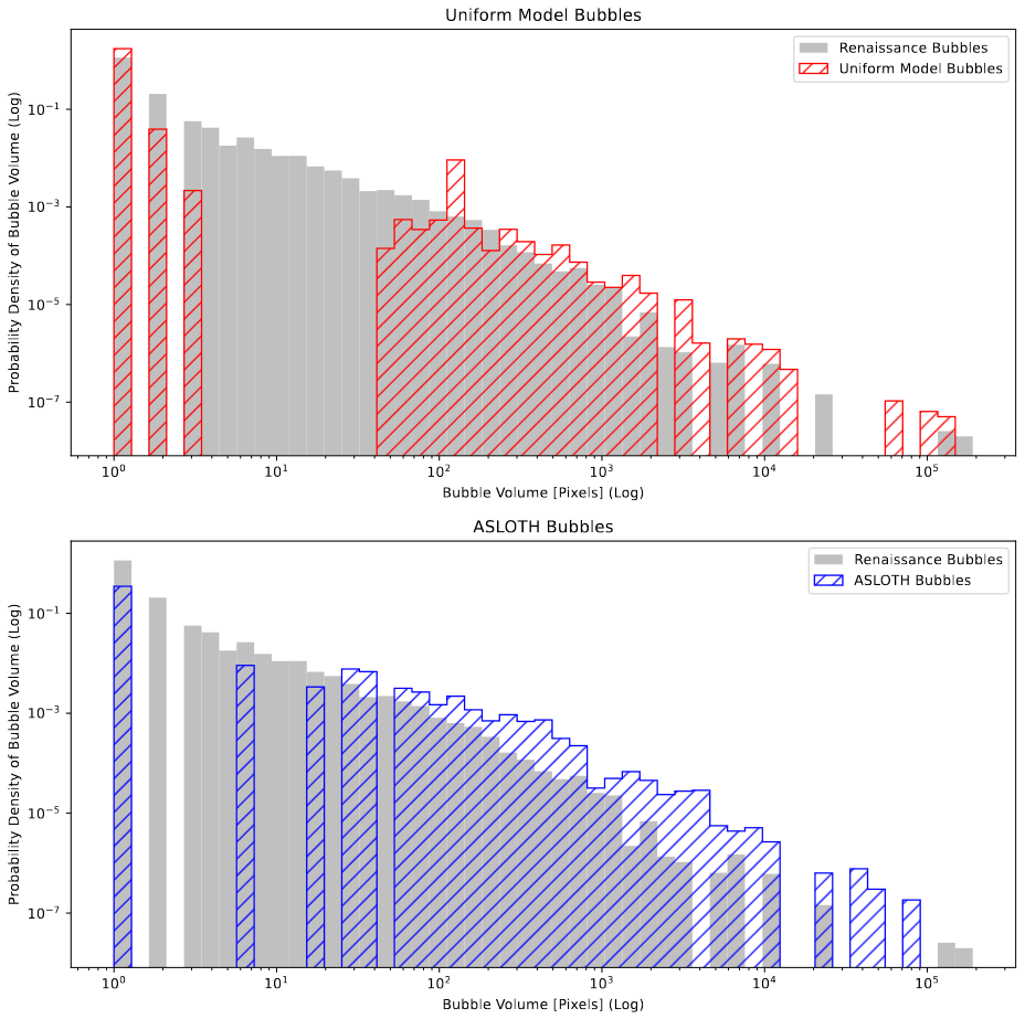 Improved Bubble Volume Plot comparing the Renaissance Bubbles, Uniform model bubbles, and A-SLOTH bubbles
The main change to note here is the swap to the probability density of the bubble sizes, rather than the raw number in each bin. This was done to help better demonstrate the overall distribution, as the physical number of bubbles would be affected by things like the ionization fraction or the bubble’s geometry, while the probability density will better highlight differences in the distribution.
While the models used in the example above are very preliminary, with the uniform model representing a version of our model without recombinations and with a uniform 1/4 bubble scaling factor, the plot seems to help motivate our model over the existing A-SLOTH results. Specifically, our model’s distribution follows the renaissance’s curve very well, with a gap between 5-12ish pixels, likely due to the fact that our model cannot place bubbles between 1 and 9 pixels in volume, with the 2 and 3 pixel bubbles being caused by several single-pixel bubbles forming adjacent to each other. The A-SLOTH model also follows somewhat, but noticably diverges at larger bubble volumes, indicating that it is placing more larger bubbles than renaissance is at certain scales. This is perhaps due to the additive volume effects, and the resulting shifting of a bubble to encompass more and more area on its own.
Feedback from Dr. Visbal, Ryan, and Mihir indicated that it would likely be better to switch to a raw count of bubbles, rather than the probability density, as the count will be both clearer to understand, as well as help show when a model is making too much of a certain size of bubble.
Star-less Halo Ionization Plot
One other plot that I had constructed earlier was star-less halo ionization plot, where I plotted a histogram of the masses of halos which were ionized, but had no stellar mass, indicating that they were being ionized by a nearby halo.
I experimented with these plots pretty extensively, with my main goals being to better highlight the differences between each plot, and to somehow integrate the number of total star-less halos in each bin, to help better contextualize the results.
The results of this are shown below;
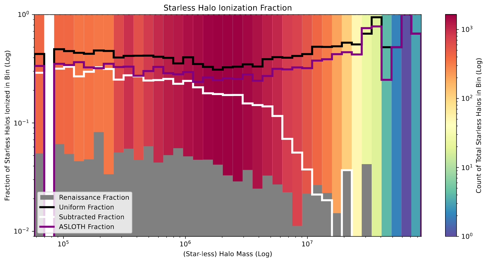 Improved Starless Halo Ionization plot showing the mass of star-less halos vs the fraction of star-less halos ionized within each mass bin. Compares the renaissance, uniform, a-sloth, and simple subtraction models.
To explain, the height of each bin represents the fraction of the star-less halos within that mass bin which are ionized. For example, the bin at 10^6 indicates that, for star-less halos of around 10^6 solar masses, ~5% of the halos are ionized in the renaissance output, whereas ~30% of the halos are ionized in our current model output, and ~20% are ionized in A-SLOTH.
The color in the background indicates the total number of star-less halos that are present in that bin, with most of the halos being between 10^6 to 10^7 solar masses, and a very small number having more than 5*10^7 solar masses.
The increased information is a double edged sword; on the one hand, they are more informative, but they are also more complicated to try and parse.
This graph also reflects and in many ways better accentuates the relationship I had observed on the earlier plots, where the current models do a poor job of replicating the results of the renaissance simulations, having far more ionized star-less halos at all levels than renaissance.
There is also one additional model present on this graph, which is a simple ‘subtracted’ model, where I took the uniform model output, selected regions of high density, and set them to neutral. This was one method we employed in an attempt to help replicate the results of the renaissance simulation, and it seems to work in some capacity on this plot, but an upcoming plot firmly disproves this specific method from accurately achieving the results we want.
Pixel Density Ionization Plot
One new plot that I put together was based heavily on the previous graph, however instead of star-less halos and their masses, it considers the density of each individual pixel. Otherwise, it is exactly the same as the previous plot, where each bin represents the fraction of pixels within that density bin that are ionized.
![]() Newly created Pixel Density Plot showing the density of pixels vs the fraction of pixel ionized within each density bin.
Newly created Pixel Density Plot showing the density of pixels vs the fraction of pixel ionized within each density bin.
This plot was actually interesting, and helped to motivate our general understanding of the current failures of the plot. Specifically, it shows that, for the majority of the pixels of around average density (which here is one, as this density is derived from the overdensity of each pixel plust one) agree well with our models, however this agreement breaks down as we reach higher density pixels, which are likely part of these neutral filamentary regions that our current model cannot capture.
One thing to note is the increased presence of ‘shot noise’ as we approach the right side of the graph. This is because, as we reach that portion of the graph, there are fewer and fewer pixels to work with, so a single pixel difference can massively affect the fraction of pixels within that bin.
This plot also motivates strongly against the simple ‘subtracted’ model that I had described above, as evidenced by it’s precipitous drop at almost exactly where I had established the cutoff. This makes sense, logically, however the sharp contrast between it and the renaissance results indicates that any attempts to rectify that lack of shielding in high density regions will need employ a more complex method.
Bubble Surface Area Plot
These next few plots are more experimental and less immediately useful for a variety of reasons (which is why I put them after the good ones :] ).
This plot builds off of the existing bubble volume plot, and attempts to help capture the irregularity of the bubble shapes between the different models.
To do this, I first used the previously described clustering algorithm DBSCAN to identify the specific bubbles, then used a small edge-finding method I had made a few months ago to isolate the number of pixels that make up the edges of each bubble, which I treated as roughly equivalent to the surface area of that bubble.
I then divided this by the volume of an ideal sphere with that same volume, with the assumption that, since the sphere represents the minimum surface area possible for a set volume, these values should necessarily be higher, and as such I expected the renaissance values to be larger than 1, with our model and A-SLOTH being much closer to 1.
The resulting graph is shown below;
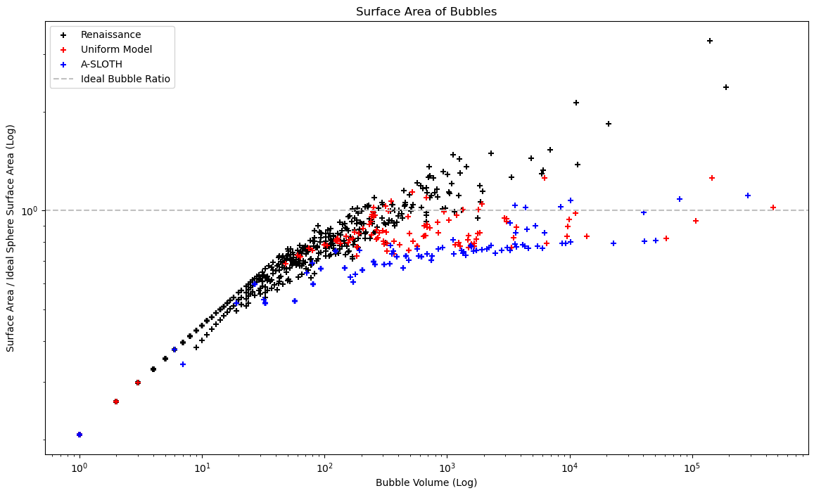 Plot attempting to show the approximate surface area ratio between each bubble and an ideal sphere of the same size vs the bubble volume. The problems with this approach are explained below.
As can be seen, this did not match my expectations. Upon review, these differences resulted from two main sources; a breakdown of my assumption that the surface area is equal to the number of pixels at the edges, and resolution effects when placing a smooth sphere in a voxel environment.
Firstly, my assumption that the number of edge pixels is equivalent to the surface area is a decent enough approximation for the larger bubbles, but breaks down as you reach the smallest bubble sizes, where a single pixel bubble will be given a surface area of 1, when in reality it had a surface area closer to 6. This partially explains why nearly all the bubbles near the low end are overlapping, and are well below the expected ratio of 1, as their surface areas are being significantly underestimated by my assumption.
The other issue is in my assumption of the uniform sphere. I calculated the radius of each ideal sphere without considering the resolution effects. As a result, a perfectly spherical bubble will always have slightly less surface area than it apparently should, due to the effects of pixelation. This can be seen in the A-SLOTH model, which nearly always places perfectly spherical bubbles, but ends up with values that are less than should be possible.
This last issue is maybe fixable if I instead place each of these ideal bubbles and count the resulting pixels, however we decided to focus on other tasks for the time being, and as such this plot will be placed on hold for now.
Bubble Agreement
Another plot that I experimented with was an ‘agreement’ plot. ‘Agreement’ was calculated by selecting a random box from the same location within the model and in renaissance, then counting up the number of cells that were equivalent (either both 1, or both 0). This was then divided by the total number of pixels in that cube, and plotted vs the ionization fraction within that smaller box.
The results are a little difficult to interpret, however;
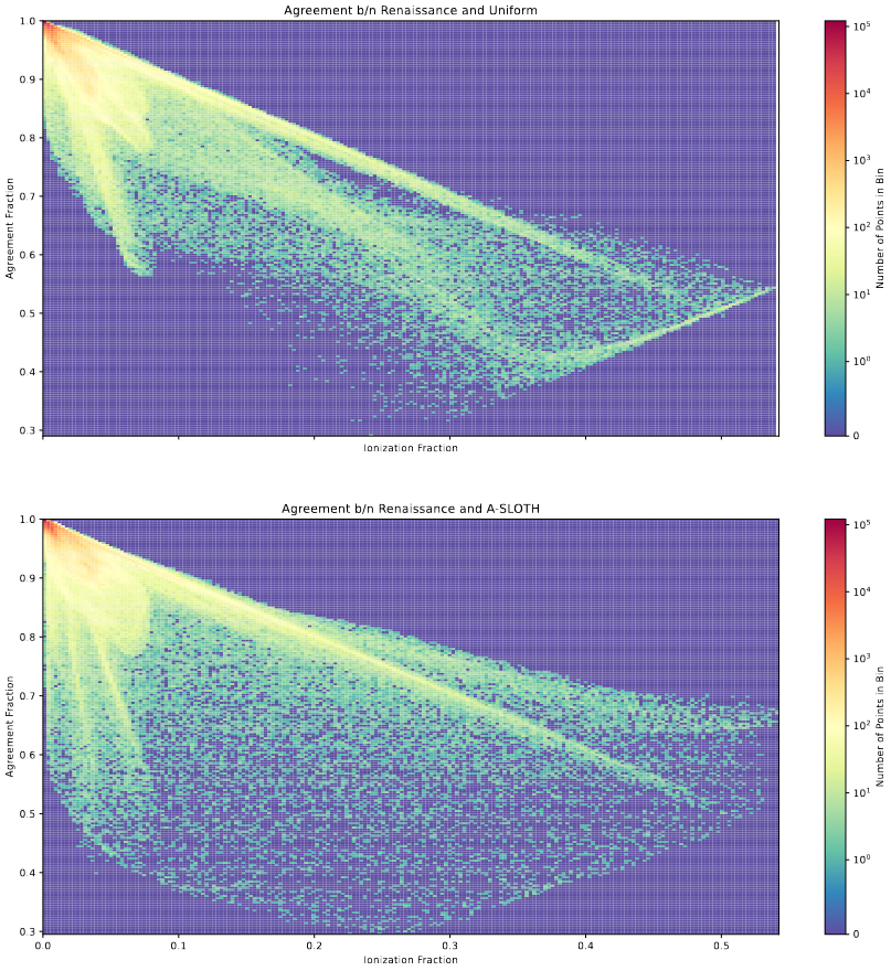 2D Histograms showing a ‘geometry agreement’ vs the ionization fraction of small sample boxes within the larger model outputs.
There are a few details that stick out immediately; firstly, as the ionization fraction of the sample decreases, the agreement increases; this makes some sense, as the regions with the best agreement are going to be ones with no ionization in any box, and the most disagreement is going to occur in regions with a log of ionization.
Overall, unless I can figure out exactly what the patters on this plot are indicating, this one is not as useful and digestable as the other discussed plots, and will be shelved for the time being.
Halo Mass & Pixel Density
The final plot, and likely the less useful for most cases, was a plot that attempted to show the ionized halos vs both their halo mass, and their pixel density.
The plot consists of several layers. The background is a 2d histogram showing the number of starless halos for a specific bin of halo mass and pixel density. The scattered points indicate the ionized halos from each model.
![]() Plot that shows the pixel density vs halo mass for every ionized halo within several different models, with a background showing the distribution of every star-less halo within renaissance.
Plot that shows the pixel density vs halo mass for every ionized halo within several different models, with a background showing the distribution of every star-less halo within renaissance.
Part of the failing of this plot is in the density of points; without some better way to represent the values, it becomes very difficult to distinguish the different sets of points when they are overlaid.
The other main failing is that it doesn’t seem to communicate an interesting feature; for all but the subtraction method, we see a pretty even agreement between distribution of star-less halos in renaissance, and the ionized star-less halos in the models, with the only exception being the simple subtraction model, which clearly shows where I placed the neutral cutoff.
One thing this model could be useful for is motivating our search for a different method of reflecting the shielding effects of dense regions on these star-less halos, as demonstrated by the below plot.
![]() Plot showing the distribution of ionized star-less halos in renaissance vs. the subtraction model
Plot showing the distribution of ionized star-less halos in renaissance vs. the subtraction model
Future Work
Planning Work on Integrating Density Cube
My work for the next week will be primarily focused on trying to think of a method of intergrating the density field that avoids our current problem with our assumed bubble geometry. The hope is that, by doing this, we could begin to better replicate the shielding effect we see that prevents many of these higher density pixels from being ionized.
Gun Violence Archive Research
Investigating Discrepancy in Scraped Sets
My main work this week has been on trying to pin down the reason that certain incidents are no longer able to be scraped, while they were able to be scraped in 2018.
Checking in QGIS
My first check was to check the physical location of these incidents. To do this, I leveraged the available latitude and longitude and the software QGIS, an open-source mapping software.
Doing this, there was no obvious connection between the locations of an incident and whether than incident was scrapable or not.
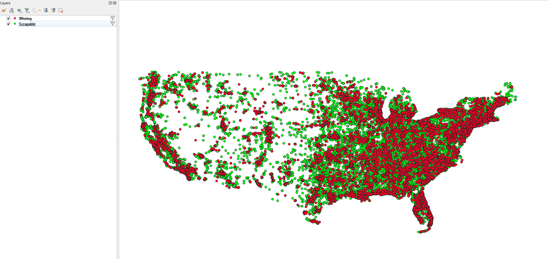 Zoomed out screenshot of the QGIS window with the points placed via their longitude and latitude.
Checking Means
One other check I did was to look at the difference in the number of deaths between the two sets. What I found was that, for the unscrapable sets, the mean killed per incident was significantly lower than the mean killed per incident for the scrapable set.
![]() small snipped showing the output of mean killed between the scrapable and unscrapable sets.
small snipped showing the output of mean killed between the scrapable and unscrapable sets.
Future Work
There are a few more checks I am planning on performing to try and better understand why these incidents are different from the larger set.
Beyond this, we had thought of a few different methods for moving past this problem, mostly revolving around either assuming it was a uniform exclusion and stating as such, or considering the change in incident number year to year for a larger grouped set.
Cluster Research Pod
Assigning RA & Dec to JWST Detections
My first task this week was to assign an RA and Dec to the cluster detection candidates. I first had to obtain the new JWST image, which had WCS that were more correct than the previous file.
Using this, it was trivial to then detect clusters in this new image using the same method, then apply the WCS from the header to convert to ra and dec.
Plotting HST & JWST Sources Together
Next, my goal was to plot the sources I found overtop of the image, and compare with our existing HST cluster set. Our hope was that these would agree in some way, and would help inform our next steps.
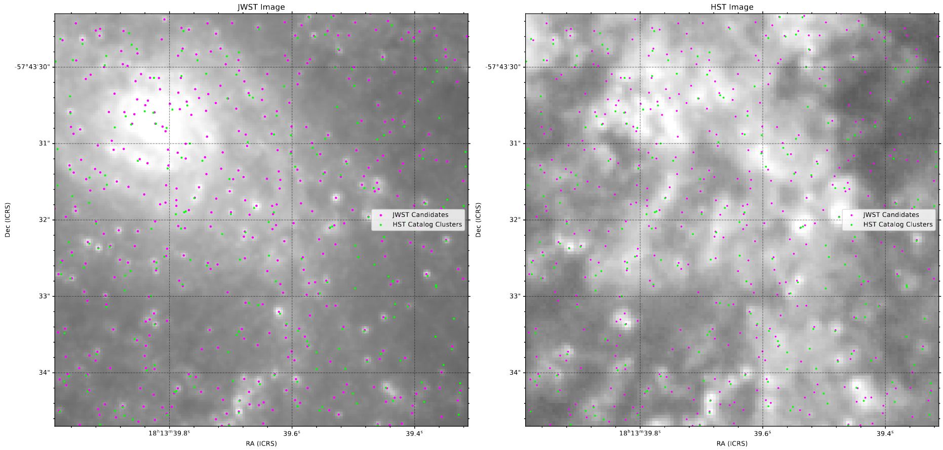 A view of the central region of IC4687, with our HST cluster catalog and JWST candidates plotted on both the JWST image and the HST image.
The overall agreement was fairly good (when we included the offset, found using the process below), and it seems that the JWST set did an excellent job of capturing all of the HST detections, and often found more than one where HST only found a larger, extended source.
There were a few cases where the HST set found a source that the JWST set did not, but all of those cases seemed likely to be just noise within the HST image, as they were always faint detections at the edge of the galaxy, and were often not present at all in the JWST set.
Determining Image Offsets
How to Define Offset
One warning I had recieved along with the new file was that, while the WCS were improved and would be more accurate, it is likely that they could be slightly off from reality, as the JWST pipeline has not yet fully matured, and there are still some unanswered questions on how to achieve the best results from the raw images.
To try and approach this, I decided to try and figure out what offset I would need. This process relied on a few assumptions; First, that the sources detected in the HST image and the sources detected in the JWST image are nominally the same. Since we have yet to find a satisfactory method for centering these cluster detections in the JWST image, I also made the assumption that, while the detections where going to be slightly off-center, they would be off-center in a radially symmetric way (they aren’t more off-center in a specific direction).
From this, I then used the open3D method that, for each point in one set, finds the distance to the nearest point in another set. Using this with the HST and JWST point, I was able to get a distribution of the closest distances.
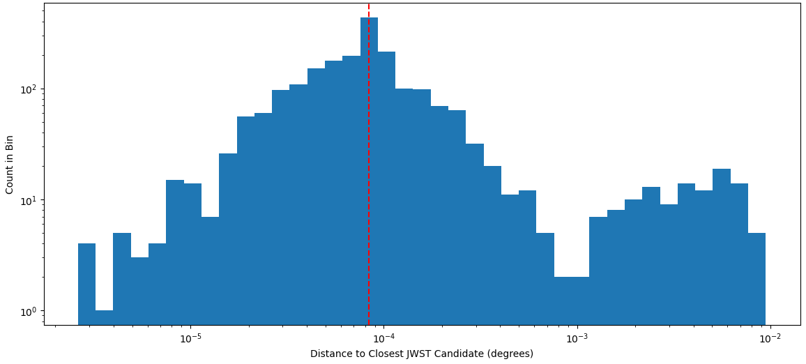 Distribution of closest distances from each HST point to the nearest JWST candidate.
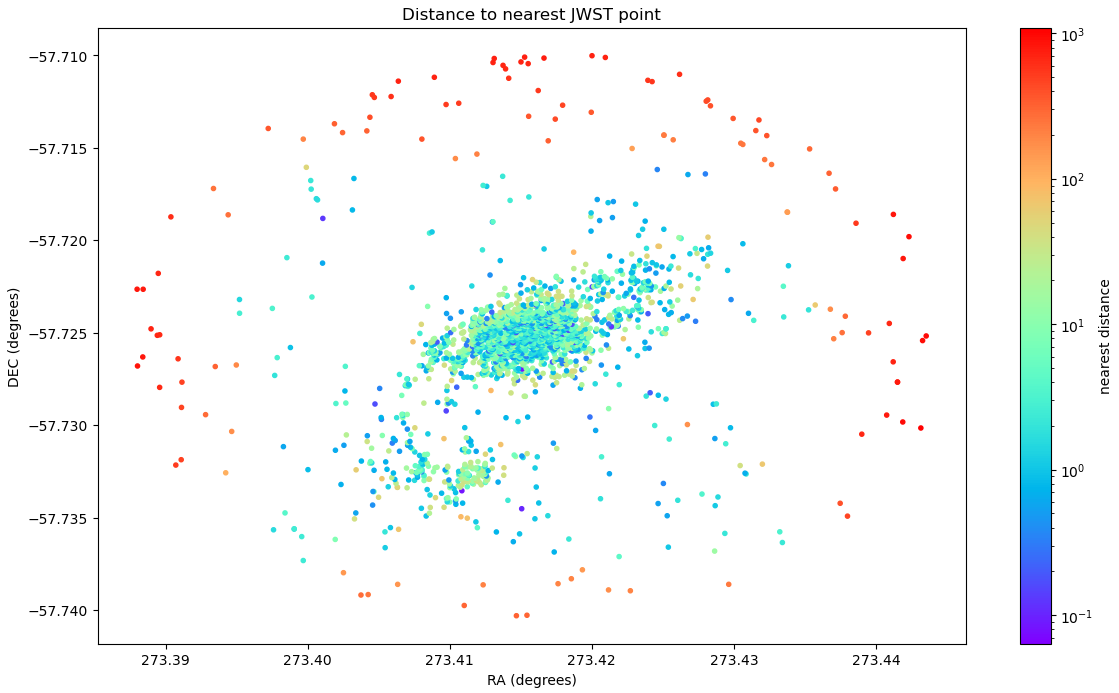 A map showing the closest distances from each HST point to the nearest JWST candidate. Note the outer candidates that exist outside of the JWST region, which represent the bump at the higher end which remains constant throughout the offset process.
Testing on a Parameter Set
I decided to mark the median of the closest distances as the marker of how well the two sets agreed, and then found that median for a large mesh of possible RA and Dec values. The results were actually better than I expected, with a very visible decline to a specific minimum at a point that was not zero.
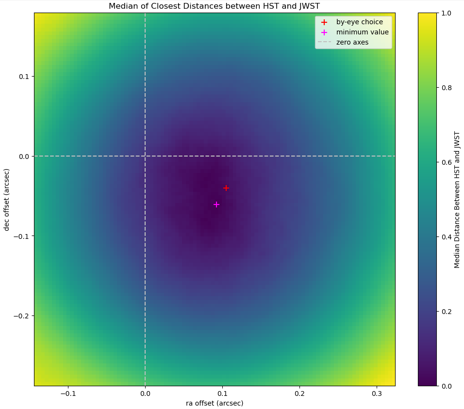 Plot showing the mesh of median distances tested on a mesh of ra and dec offsets
These offset values also matched well with my by-eye offset, where I manually lined up two sources, then recorded the ra and dec shift.
Comparing Final Distributions
Looking at the distribution of the closest distances between these sets, the new offsets clearly helped, with the distribution of closest distances spreading out towards a lower value with the new offsets.
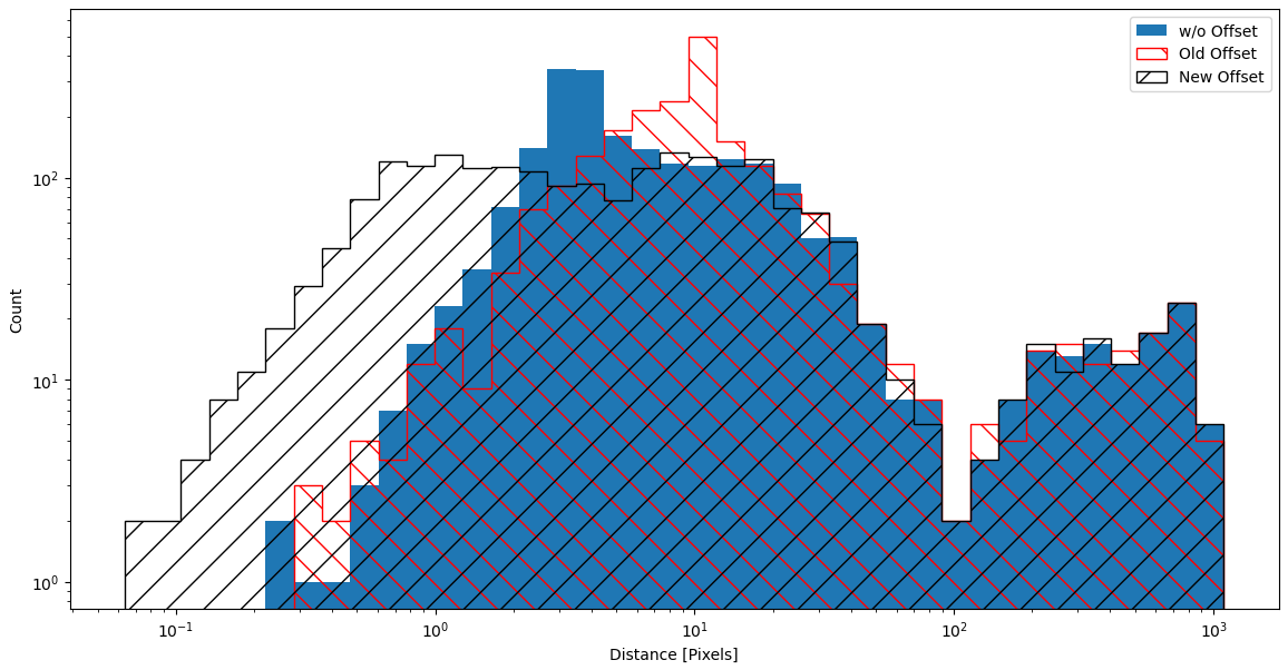 Plot comparing the final offset distribution vs the original offset and the unaltered set.
Future Work
With this final set, we have decided to move forward with only the JWST detections, and will be now be working on photometry. There is still some work being done to figure out how exactly we will get the photometry or align the different filter images from the JWST, so I will likely spend the majority of my time experimenting with some of my pre-existing photometry knowledge.
I will likely also try and figure out how we can center these sources, as otherwise we will be unable to get proper photometry. This has been difficult in the past, with attempts causing some strange behavior, where the clusters are pulled from their proper place towards a distant, brighter point.