Research Update - Week 14
YSOLab
Resolving Mistakes on Filtering
Previously, we had discussed some odd issues we were experiencing with the later epoch Spitzer data, where we were seeing large jumps between adjacent points that were fairly unphysical. It turns out that, for this issue, the problem was a result of my failure to properly filter the dataset. Included with this data was a ‘notes’ column for both bands, which included information indicating both saturation and non-detection. When implementing this data, I had failed to account for this information, and was not filtering out measurements that were saturated or non-detections. Now that this has been implemented, these anomalous measurements are no longer present.
Reexamining Magnitude Offsets
In addition to the refinement of the filtering, I also spent some time examining how the offsets between the untimely and Spitzer data differ between the existing set, and this new set of data. After running the existing code I had originally written for this task from several months ago, I recieved the following graph;
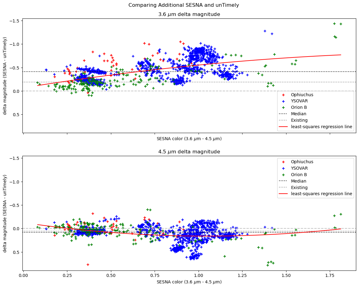 plot showing the delta magnitudes between the newer epoch Spitzer data and the nearby untimely data.
This seems to reinforce our initial assumption, which was that we could model this offset durably by applying a blanket magnitude correction to the untimely data. It also provides some evidence for the behavior we were seeing, where the 3.6 micron band was exhibiting a much larger offset between the untimely and Spitzer data, whereas the 4.5 micron band is much more consistent between the two telescopes, due likely to the more similar band profiles between the 4.5 and 4.6 filters on the two telescopes.
Future Work
For next week, I am going to work on reviewing the unTimely data, and try to implement some filtering based on the different flags that I had previously ignored.
Cosmology Group
Single Kernel Variant
One improvement that I had discussed last week was to consolidate the different bubble scales that are being used inside the modified semi-analytic model into a single operation. By doing this, I had hoped to eliminate the concentric shell structure that was present in the model output from the modified model.
I created the kernel such that it matched the effect at each radius, such that each pixel had a value equal to 1 over the volume of a bubble with a radius equal to that pixel’s distance from zero. By doing this, each point reflects the value it would have obtained had we iterated over an infinite number of bubble scales, then kept the highest value present in each pixel over those scales.
While tuning this variation, I decided to disable recombinations for the time being. This was because the logic by which we were estimating recombination was based on our old methodology for bubble placement, and would therefore not necessarily match with this new variation.
Following some tuning, I achieved the results characterized by the following graphs;
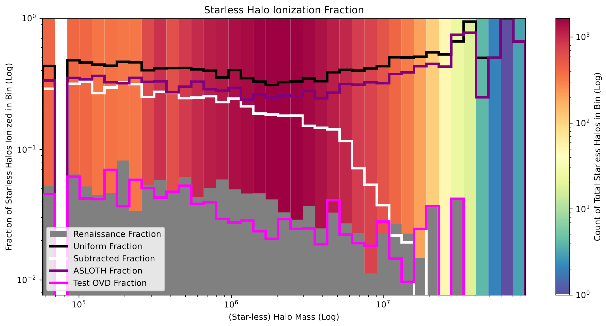 plot showing the fraction of ionized starless halos versus the halo mass.
As before, this variation of the model does an excellent job of mimicing the renaissance values for the starless halo ionization, especially in comparison to the previous model attempts, which all wildly overshoot the expected value.
![]() plot showing the fraction of ionized pixels versus the pixel density.
plot showing the fraction of ionized pixels versus the pixel density.
The pixel ionization distribution is slightly less excellent, with the new model undershooting the ionization of pixels at around average density, while overshooting (to a significantly smaller degree) at higher densities, and overshooting more than the existing models at the less than average densities. Overall, while it doesn’t look great initially, the lessened overshooting at the larger end still indicates that this model does improve over the existing models.
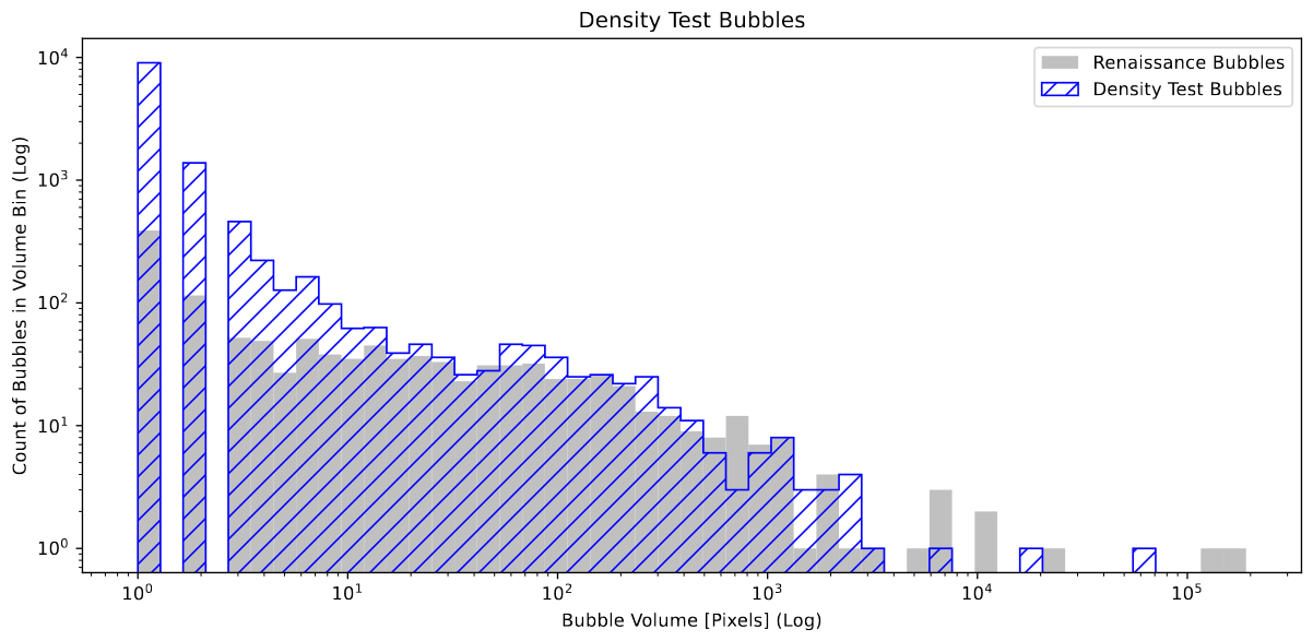 plot showing the count of bubbles within each volume bin
The bubble volume plot, again, shows a very promising but still imperfect result, with the distributions matching very well for bubbles of above 3-4 pixels in volume. However, one possible explanation for the extreme overshooting at the low end is related to an odd bit of geometry that is visually present in the new model. There is a ‘fuzziness’ to the bubbles in this new variation, where there are many small individual ionized pixels that are close-ish to a larger bubble, but are disconnected. This isn’t something that is seen in renaissance, and is likely a result of the new model’s method of ionization placement allowing it to place such pixels.
From a visual inspection, this unified kernel also eliminated the concentric shell structures that had plagued the previous model, as I had planned.
Argument Against Single Ionization Fraction
While tuning the model variation, it struck me that perhaps using the overall Ionization fraction was not the best way of trying to match the renaissance output. The primary impetus for this is a specific region that has proven itself to be a consistent thorn in our sides during this project;
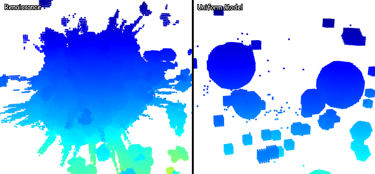 image comparing one specific region in the renaissance output vs the uniform model
This region is primarily because of halos that exist just outside of our selected simulation box, and therefore our models do not have the necessary information to replicate this very large ionized region. Therefore, in order for the overall box ionization of the model to match, we need to turn up the escape fraction higher than it would be in reality to compensate for this lost ionized region, resulting in bubbles that are much larger than they should be.
One way to address this would be to leverage the plots I had explained last week, where we instead sample small matching regions within each box, and measure the ionization fraction of each of these boxes in comparison. By doing this, we can generate the following plot;
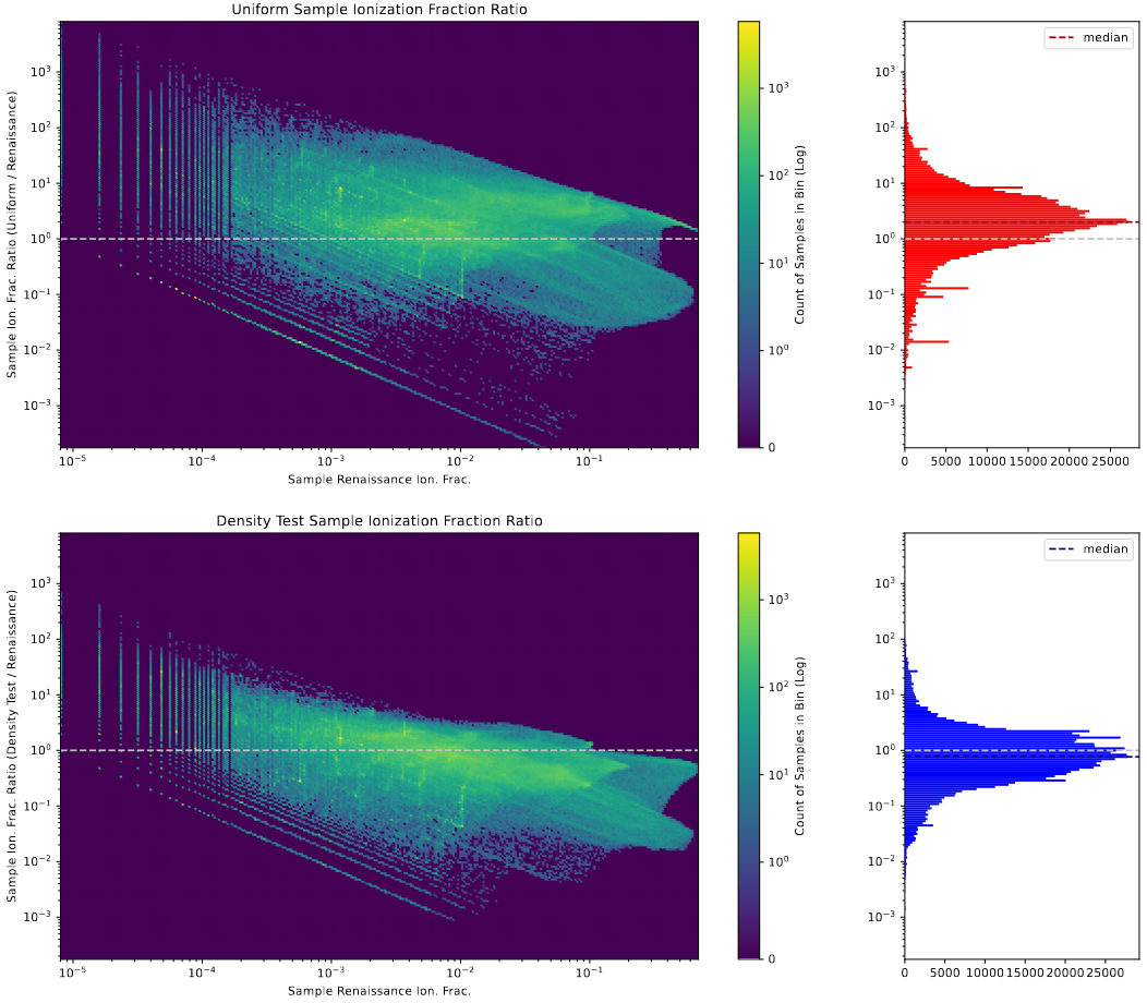 plot showing the distribution of sample ionization fractions.
In this plot, the x axis of the 2D histograms represents the renaissance ionization fraction of the sampled region, and the y axis represents the ratio of the model’s sample ionization fraction to the renaissance’s sample ionization fraction, where a value of 1 indicates agreement.
The sideways histograms on the right represent the values along that axis in the 2D histograms, and contain dotted lines indicating the median value of the very normal appearing distributions.
From this, we can start to see the behavior that I expected; despite matching the renaissance ionization fraction of the overall box, the median ratio is actually much larger than 1, indicating that the existing uniform model is, on average, overshooting the ionization when compared to renaissance. In contrast, the new model variant, despite having an overall box ionization fraction that is half that of the renaissance data, has a median ratio that is much closer to 1, if slightly below, indicating that, on average, the ionization fraction of any randomly sampled region is fairly close to the ionization fraction of that same region in renaissance.
Future Work
For next week, our plan is to step back slightly, and experiment with this new model variation on a set of manufactured test cases, in order to track down what specifically causes the concentric shell structures that we see within the model.
Gun Violence Archive Analysis
Determination on Missing Incidents
We decided, after reviewing the what we have learned about the unscrapable incidents, to remove them from our dataset going forward. This will affect only the 2014 through March 2018 data, as data beyond that point already does not contain the data we couldn’t scrape, whereas the data from that period was copied from a previously existing scrape of that data from early 2018.
The primary motivator of this decision was that, in general, these incidents were either updates to existing incidents, or were incidents that were only tangentially related to gun violence, as evidence by a mean killed that was significantly lower than the average over the entire set.
Following the removal of these incidents, which only represented about ~6% of the incidents of the overall set, and had a very tiny effect on the overall distributions, when viewed on the national-level trend lines;
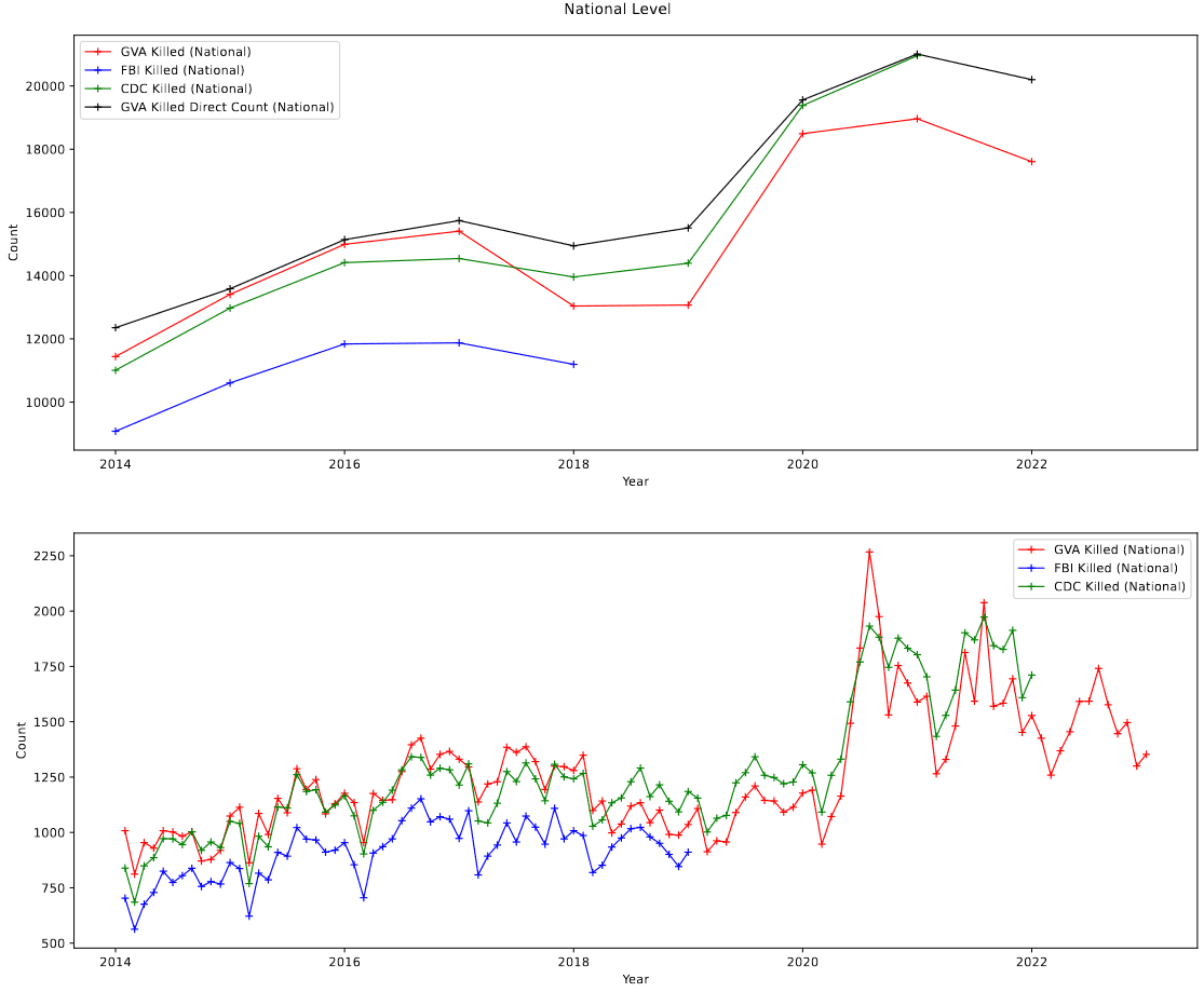 plot showing the national trend of gun violence in the 3 relevant datasets.
In addition, re-running the previous regressions produced slightly different physical numbers (as one would expect), but did not affect the conclusions of these tests in any meaningful way, which is another good indication that these incidents were safe to remove.
Future Work
For next week, my focus will likely be on trying to track down and acquire up-to-date employment and demographic information, which could be obtained from both the Bureau of Economic Analysis, and the US Census website.
Cluster Research Pod
Aligning Different Filters
This week, my focus was on making sure that we could align the different filter images of JWST data that we have acquired, in preparation for our foray into photometry.
To start, I loaded in each of the filter images, then examined them without alignment. From this, I could see a slight misalignment on many of the bands, which was about what was expected.
Using the package astroalign, which I have previously used in my Astrophysical Measurements class, I chose a ‘base’ image that would retain it’s original state and WCS, then aligned each of the other filter images to that image.
The result of this was an essentially perfect alignment between each of the images, to at least the level that could be verified by-eye.
Further Problems with Centering
The centering of our clustering candidates has continued to be a consistent problem. We took a few minutes to test our cluster identifying code on the hubble images, and the resulting candidates were very well centered on the hubble clusters out of the box, so we are currently theorizing that there is some quirk of the JWST images that is resulting in the cluster selections appearing slightly off-center.
For the time being we are going to move forward with experimenting on photometry, however we will eventually need to resolve this before we can obtain proper photometric measurements for our clusters.
Future Work
For next week, the goal is to experiment with some provided photometry code, and begin to work towards identifying the parameters we will use to extract the photometry for each of the clusters within the image.