Research Update - Week 15
What’s Next?
It depends on how productive I am over the break, but it is entirely possible that the updates will slow down significantly, or stop entirely, starting next week. In any event, they will start up again in mid-january when the spring semester begins.
I am also hoping, if I find the time, to write a few additional blog posts over the break. These would detail some of the work I did with Dr. Lilley, as that work has been referenced a few times, but is otherwise invisible.
YSOLab
Filtering Saturation in unTimely
One of the main things I worked on this week was in trying to use the provided flags columns in the unTimely data to identify and filter saturated measurements.
The flags are given as a set of 2 8-bit integers, with each bit within those integers representing a different flag from either the unwise data or the unTimely process. To extract these, I made use of a loop and a format string operation to convert each integer into it’s 8-bit representation, which is then stored as a column of strings within the pandas dataframe. I can then use the pandas .str accessor to create a ‘sat’ column, which is true if either of the saturation flag bits are 1.
Using this process during the pre-loading stage removes about ~3% of the measurements from the set, however that is 3% of every possible measurement in the entire field. In reality, it is likely a much larger percentage of the actually relevant measurements.
Filtering Saturation in NEOWISE
Filtering saturation in NEOWISE turns out to be a significantly simpler exercise than with the unTimely data. This is because the NEOWISE data, as downloaded from IRSA, comes pre-packaged with a column that indicates saturation (as a float between 0 and 1), which can be used directly to filter for sources with no saturation.
Future Work
Immediate Future
For next week, my goal is to refine my unTimely filtering strategy somewhat; Dr. Megeath suggested that, instead of removing saturated points outright, to instead include them, but have them in a different color to distinguish them. The main reasoning was that we want to observe the effects of saturation, and see how common it is among our set of sources.
Looking Ahead
We spent some of our meeting this week discussing our long term plans for the next semester. Our primary goal for next semester is to put together a paper that details the light curves that we have been able to create
Cosmology Group
Testing New Kernel
The main thing that I worked on this week was trying out the previously defined single kernel method for bubble placement against the existing bubble scales method on a set of simplified test cases, in order to ensure that we understand how it operates, and that it is operating correctly.
Defining the Test Cases
When defining our test cases, we settled on the scenario of a single pixel source in the center of the simulation box (128,128,128), with some amount of photons. The other important part of this was the density field, which we decided to place as a sort of ‘filament’.
Specifically, I defined 4 different density fields; the first was a cylinder of overdensity 10 centered along an axis running through the center of the box (such that the halo would be in the center). The next was similar, however it had a density dictated by a 1/r relationship, such that the density at the central axis was 10, and every other point was equal to 10/(distance to axis). The third and fourth density fields were defined similarly, just with 1/r^2 and 1/r^3 relationships instead.
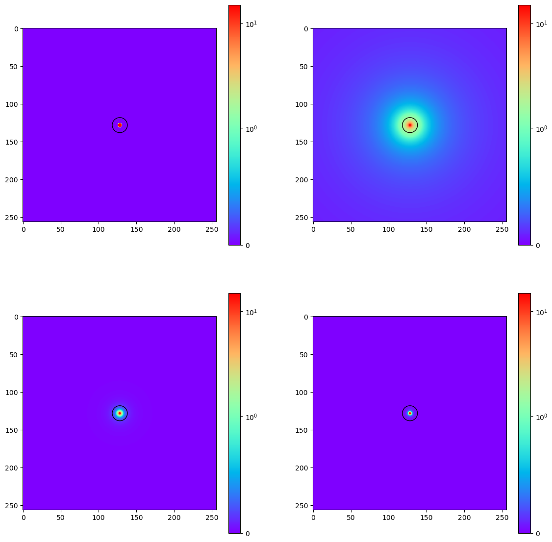 Slices of the overdensity cubes made perpendicular to the direction of the filament
Analytically Calculating
One additional step that I performed was to write some code that analytically performed the operations we were doing in the model, in order to verify that the model was doing exactly what we would expect it to. The only real difference was that, instead of using a convolution to smooth the photons, I calculated the ‘smoothed’ photon grid using either the kernel defining equation, or the different bubble scales in a similar way.
The results were promising, so the only thing left was to run the model with these parameters and see if they came out any differently. This was actually one convenient feature of having the analytical calculation functions; I could use them to quickly find some decent parameters to use when running the model.
Examining Results
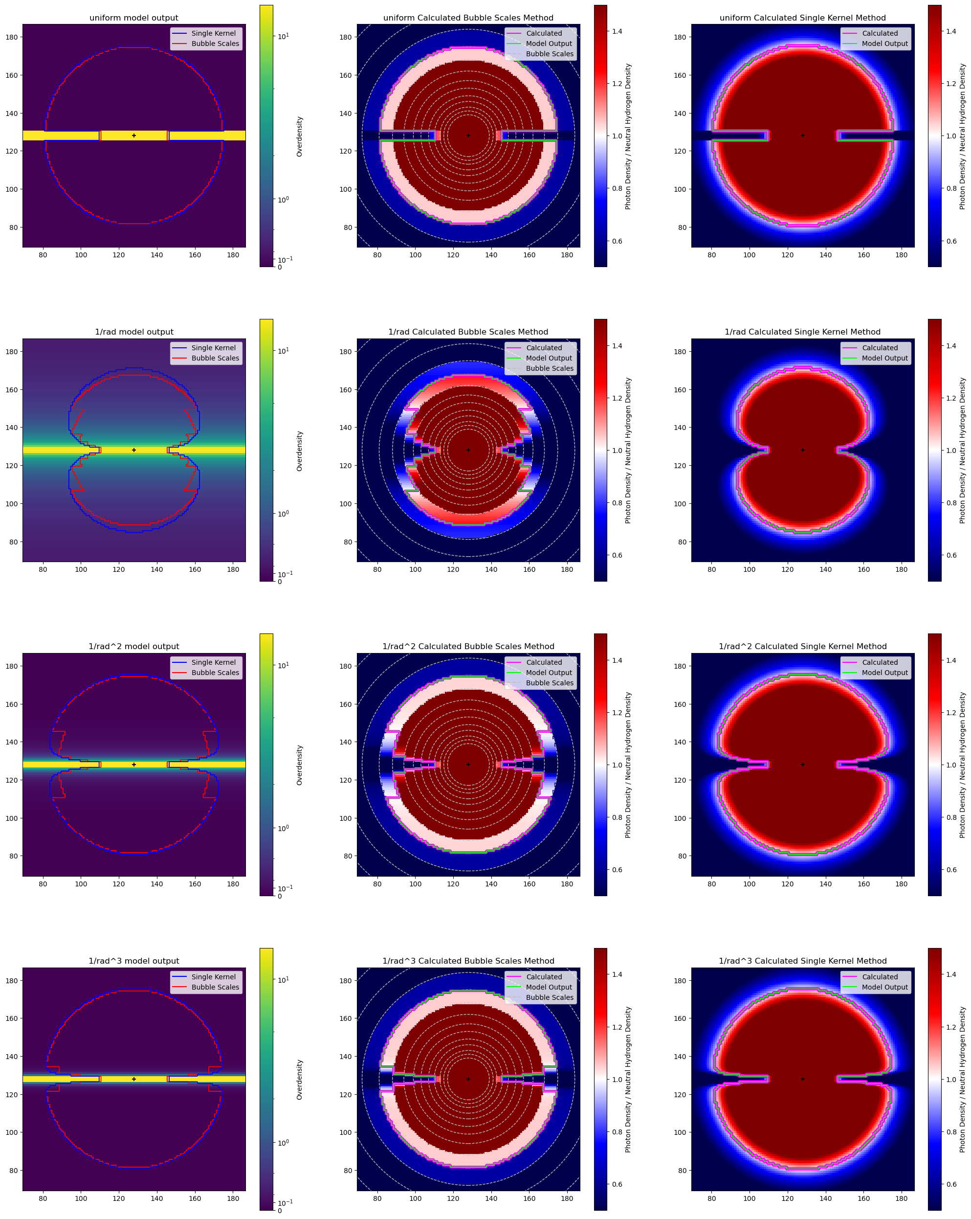
After running the model, I made use of a specific and fairly complicated plot to compare the results. I am going to break it down into sections, as that will make it easier to explain.
These examples are all being done with the test case of density decreasing by 1/r from the central ‘filament’. each of the plots shows a single slice taken parallel to the central filament through the middle of the plot
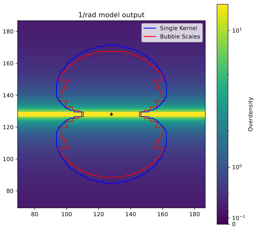 View of the model outputs as contours over top of a slice of the overdensity parallel to the filament.
This plot compares the model output for this case with both the bubble scales and single kernel method, and the background shows the overdensity at each point. The main thing to notice her is the odd artifacting present in the bubble scales method, with the single kernel method much more effectively tracing what would be the actual shape if we had an infinite number of bubble scales.
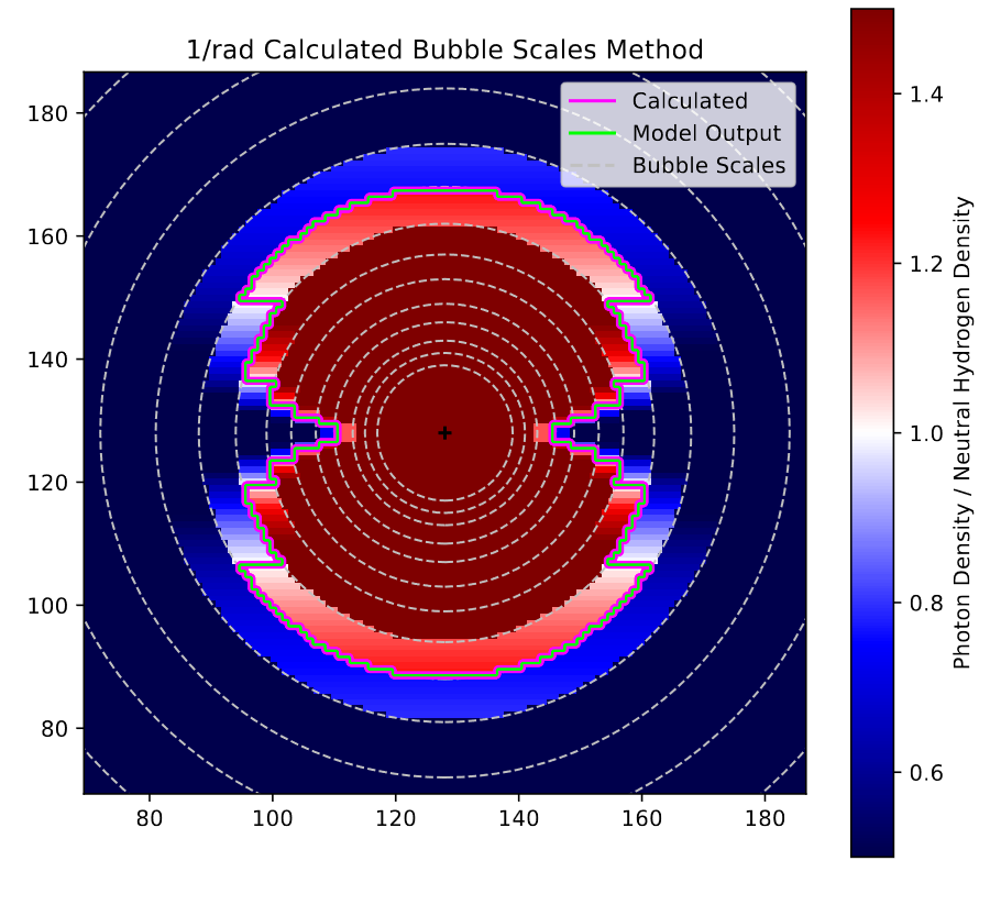 View of the bubble scales model on the 1/r test case.
This plot shows the agreement between the model and analytic outputs for the bubble scales method, with the background showing the ratio between the photon density and the neutral hydrogen density, such that >1 (red) is ionized, 1 (white) is just barely ionized, and <1 (blue) is neutral. There are also dashed circles plotted to show the different bubble scales used. The main thing to notice is the perfect agreement between the model and analytic output, with both lines overlapping perfectly.
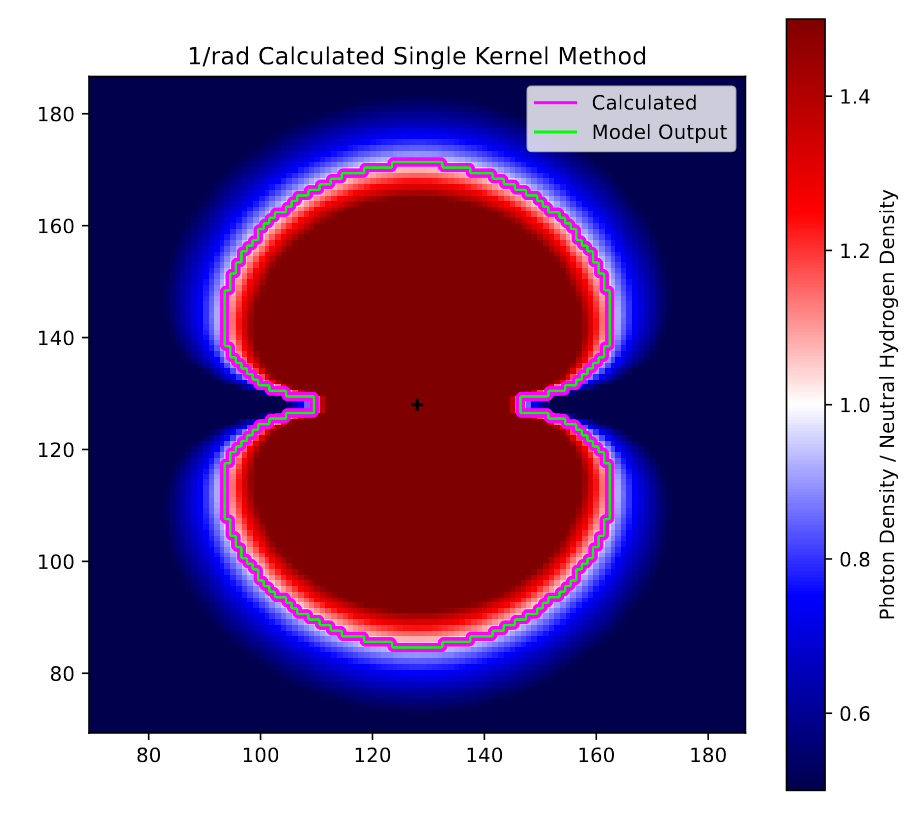 View of the single kernel model on the 1/r test case.
This plot is similar to the previous, and shows the agreement between the model and analytic outputs for the single kernel method. The main things to note from this are the far smoother ratio seen in the background, as well as the perfect agreement between the model and analytic output.
Here is the overall plot, showing these things for all four test cases.
 All of the previous plots for each of the different overdensities.
Conclusions
This process was essential, and helped to confirm a few things. Firstly, it confirmed that the model is performing as we had expected it to in this case. It also showed fairly clearly the improvement that the single kernel has over the bubble scales method.
Future Work
For next week, the plan is to try out a few additional test cases, with a focus on more complex overdensity cubes, and the case of 2 or 3 different sources.
Gun Violence Archive Analysis
Locating BEA and Census Data
I did not get much time to work on this project this week, however the one thing I did accomplish was tracking down some employment, economic, and population data at the county level.
I was able to get statistics such as the employment, median income, etc from the Bureau of Economic Analysis’ website, where it was available at the county level in the CAINC4 dataset.
I was also able to obtain population data from the CDC’s website, where they have a set that can be split by race, age, and other factors.
Future Work
Next week, I hope to spend some time downloading and parsing the previously mentioned sets, with the goal of merging that into the gun violence data.
Cluster Research Pod
First Pass on Aperture Photometry
General Idea
Our goal this week was to try and accomplish some aperture photometry at a preliminary level for our dataset. The general idea is similar to other photometry projects I have done, where we use an inner circular aperture to gather the light of the object itself, and a second annular aperture that gathers the median background light around that source.
Using a provided example, I put together some aperture photometry code, with parameters available for changing the background annulus, as that is the part that we are still testing different values for.
Examining Background Annulus
For the background annulus, we decided to quickly test a set of values, with the inner radius at 10, and the outer radius at values between 11 and 20. We then found the change between each row (how much the applied background changed as it expanded by 1 pixel), before finding the maximum change.
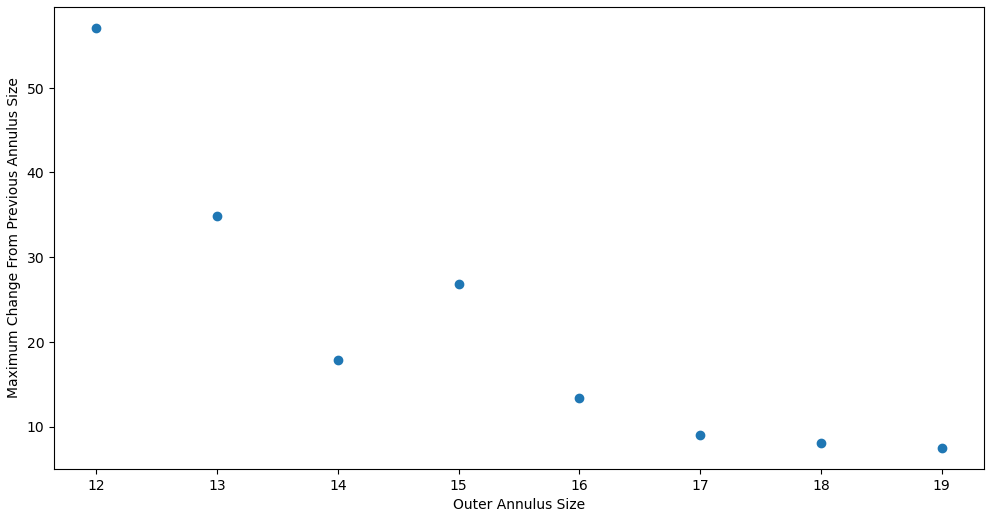 plot showing the maximum change in background from the previous outer radius size tested vs the outer radius size.
The main takeaway here is how the the changes level off at about 13-15 outer radii, which is what motivated us to move forward with a preliminary background annulus of radius 10-13.
Applying Zero-Points
Getting & Cleaning the File
While researching, we found that, for the NIRCAM filters on the JWST, there exist zeropoints, which are given for each of the possible filters, pupils, instruments, etc. The file provided is a strange sort of text file, with added spaces to ensure a consistent column width.
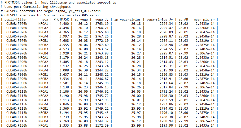 An image showing the raw text table that contains the zero point, which will need to be cleaned to be usable.
While nice to look at, this kind of table is often a real pain to read in. Thankfully, they did include a column delimiter, which means that all I needed to do to fix this file and arrange it as a .csv was to open it as a list of lines, strip out the spaces and edge pipes, replace the remaining characters with commas, then save as a text file.
Following this, it was fairly trivial to load this as a pandas dataframe, however there was one additional wrinkle, in that many of the images had the ‘MULTIPLE’ tag in their header, and as such did not correspond to a NCRB1, NCRB2, NCRB3, etc.. To get around this for the time being, I grouped and aggregated, so that each filter and instrument had a single value composed of the median of each of possible 1,2,3,4, etc.
This is clearly not super scientifically defensible, but we are only doing a preliminary check at the moment, and later on we can dig into this and address this problem.
Examining Outputted Magnitudes
Using the zeropoints from above, as well as the aperture method described, I was able to get very preliminary magnitudes for each of the sources in each of the bands.
Using a histogram, we can check the values we have found, and our general consensus was that the values made sense, and looked fairly correct, which is good.
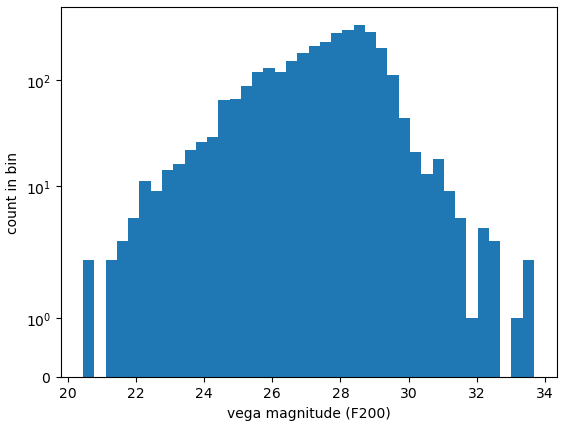 Plot showing a histogram of vega magnitudes for the preliminary photometry setup.
Future Work
For next week, my plan is to extend these magnitudes I found for the different filters into colors for each source, then start plotting color-color diagrams for the different sources. We don’t yet have models for these bands, so these early color-color plots are mostly for diagnostic purposes, rather than as a scientific product to be examined.