Research Update - Week 16
This post covers work that I did both during the last week of the previous semester, as well as over the course of winter break.
YSOLab
Plotting Saturated Measurements
One thing I worked on initially was ‘un-hiding’ the saturated measurements in the unTimely dataset. Previously, I had created a way to mask out saturated measurements, and I was removing them from the set before plotting. While this is technically the correct thing to do (these saturated measurements are not really usable), a suggestion that Dr. Megeath had was to retain these measurements and plot them as greyed out points, instead of the usual color, similar to our current treatment of the unfiltered NEOWISE data.
This ended up being fairly simple; since I had already defined a boolean ‘sat’ column for the unTimely data, I only needed to scoop out the section that was dropping rows, and add some logic to separate the data by saturation and plot. A brief check shows that this seems to be working correctly, and both saturated and unsaturated points can be plotted at the same time.
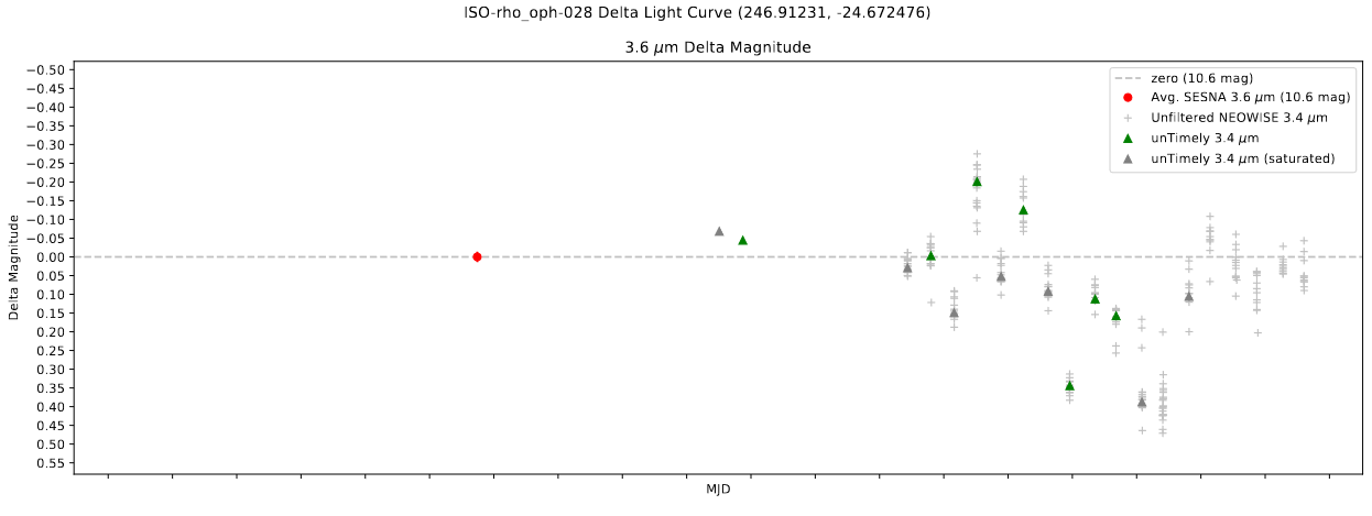 Image showing a light curve with both saturated and unsaturated untimely measurements
Writing Output Log File
One of the other things that we wanted access to was diagnostic information about each of the sources. Specifically, we wanted to know;
Number of NEOWISE points
Number of unTimely points & saturation
Number of Spitzer points
Overlap of Spitzer and unTimely points
This information is not difficult to obtain from the currently output data files, however it is somewhat inconveniently distributed, and would require its own bespoke script to do so. Instead, I wrote a small extra function that gathers this info for each source as part of the larger script, then outputs a .CSV file containing this information.
This was a fairly simple addition, and the results will likely prove useful over the next few weeks.
Future Work
There likely isn’t much I can work on ahead of our next meeting, which might not be for a week or two, depending on scheduling.
Cosmology Research Group
Additional Test Cases
During finals week, I spent some free time working on a few additional, more complicated test-cases to compare the results of the single-kernel and bubble scales methods to. These cases were more focused on diagnosing the performance of the two methods when dealing with two sources, rather than the single point source that was previously used, as well as more complex density setups.
Overall, the results of these cases were very conclusive. I will only focus on one of these cases, but each of the other cases reinforce the results explained here.
The case of interest is one with two sources of equal intensity placed on a plane of overdensity 10 that decreases at a rate of 1/r. While the initial goal of this test was to try and ‘catch’ the new single kernel method doing something stinky at the intersection of two sources, we instead observe the existing bubble-scales method absolutely fumbling, as evidenced in the below picture.
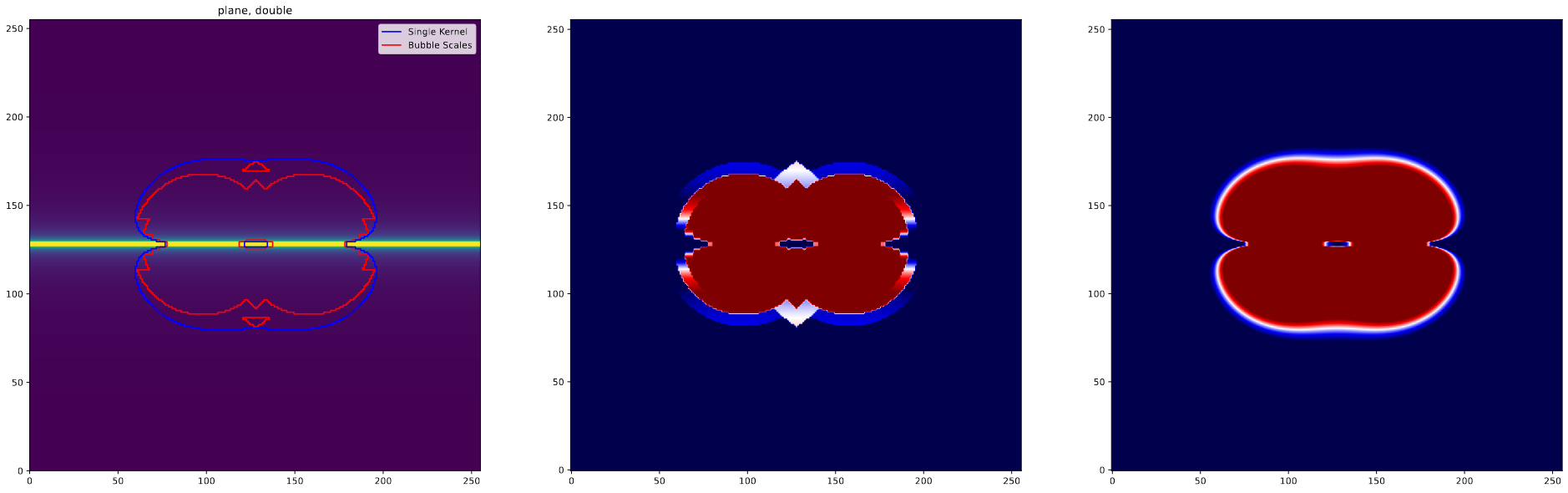 Image showing a slice made perpendicular to the plane through the center of the cube
The clear problem is that little triangle that appears parallel to the plane in the bubble scales method. This appears due to the way that the bubble scales determines the number of photons at each position, where the gaps between the different scales result in regions being assigned fewer photons than they might actually have.
These results were the final evidence that we needed to decide to move forwards with the single-kernel method of bubble placement.
Tuning Escape Fraction
Over the break, I had two main goals. The first was to try and dial in the escape fraction on the newly implemented single-kernel method. When initially testing this method, I had quickly picked a popII escape fraction that worked well enough, however now it was in our best interest to try and tune this escape fraction to obtain a closer match of the median sampled ionization fraction. To refresh, this measure looks at the median value of many smaller samples of the box, rather than the full box, in order to account for situations where information is missing from our model that therefore cannot inform its operation.
Since it is fairly cheap resource-wise to run these models, I simply ran a dozen or so models with different popII escape fractions, then used a linear regression to find the one that was closest to matching the median sampled value.
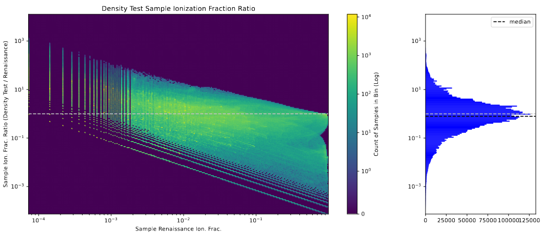 Graph showing the distribution of ionization fractions within many small samples of the larger model box.
This proces yielded a slightly higher escape fraction of 0.0039 as being mostly ideal, and had the beneficial side-effect of improving the model’s performance on the halo-ionization graph, which is one of the primary measures of model success that we are interested in.
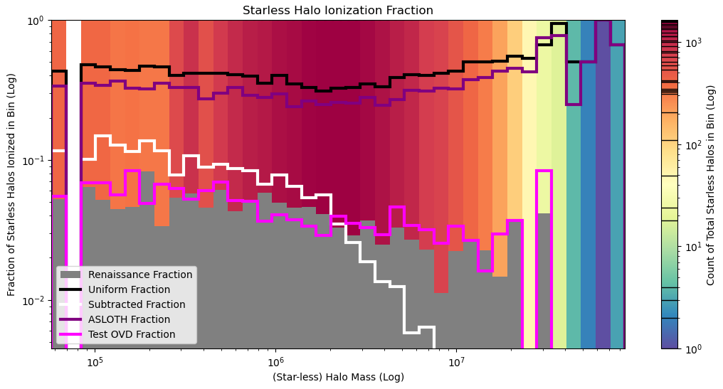 Graph showing the halo ionization with the newly improved and tuned model.
Resolving ‘Fuzziness’
What I Mean
One consistent flaw with this new single-kernel method was present along the edges of the bubbles, which, instead of matching the clear boundaries we see in the renaissance model output, has many fly-away pixels that are ionized along the edges of the bubbles, forming a sort of ‘fuzzy’ border to the bubbles, shown in the below image.
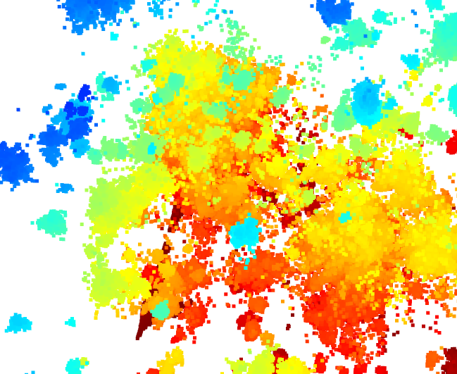 image with an example of what I mean by fuzzy.
This fuzziness is also evidenced by the bubble volumes histogram, where we see a huge spike of very small 1-pixel ‘bubbles’.
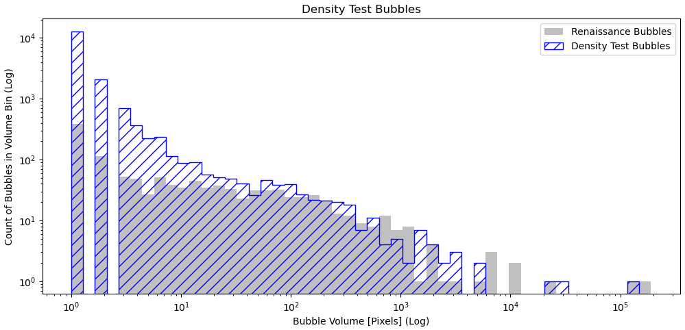 Graph of the volumes of bubbles within the fuzzy model, with the focus being the large overshooting near the small end.
Smoothing Attempt
One of my first focuses was on trying a smooth of some kind, with the hopes that I could preserve the desired detail while also resolving the fuzzy pixels. After some tweaking, I found a set of parameters that mostly worked at resolving the fuzzyness while preserving performance on the halo ionization plot that we are specifically focused on.
Unfortunately, this method had the unfortunate side effect of significantly lowering the ionization fraction of the box, and ruining the performance of the model on the sample ionization fraction test.
Because of this issue, I decided to instead try a different method, in the hopes that I could avoid having to sacrifice the performance on one metric to improve performance on another.
Cutoff Attempt
The next method was motivated by one of the less important plots, specifically pixel density ionization plot, which shows the fraction of pixels within each density bin that are ionized. Looking at this plot, we see significant over-ionization of under-dense pixels in the new model. Further examination reveals that much of this overshoot also coincides with these fuzzy pixels.
A simple density cutoff, where any pixel below a certain density is set to neutral, cleared up the majority of the visible fuzz, and it did not have a significant impact on ionization fraction (at least, not to the level that cannot be rectified by turning up the escape fraction) or any noticable effect on the halo ionization graph.
Future Work
My next goal is to retune the escape fractions, as the new cutoff method has skewed the ionization fraction. In hindsight, I probably should have tuned the escape fraction second, rather than having to redo the process now that I added these changes.