Research Update - Week 18
YSOLab
Examine Saturation in SESNA & unTimely
One task I completed this week was examining the behavior of a selection of normal stars. Specifically, we wanted to compare how the SESNA and unTimely datasets would diverge for sources at high magnitude, indicating some level of saturation.
I was able to reuse some existing code I had written some time ago to acquire and match the sources together, and I was able to produce some graphs to examine this relationship.
The first graph I assembled was one that compared the colors of the selected sources in SESNA vs. the magnitude in one band of the SESNA dataset. This graph was mostly a diagnostic check, meant to highlight any issues present with our selected group of stars. The results were within expectation, with the general shape matching what we expected to see.
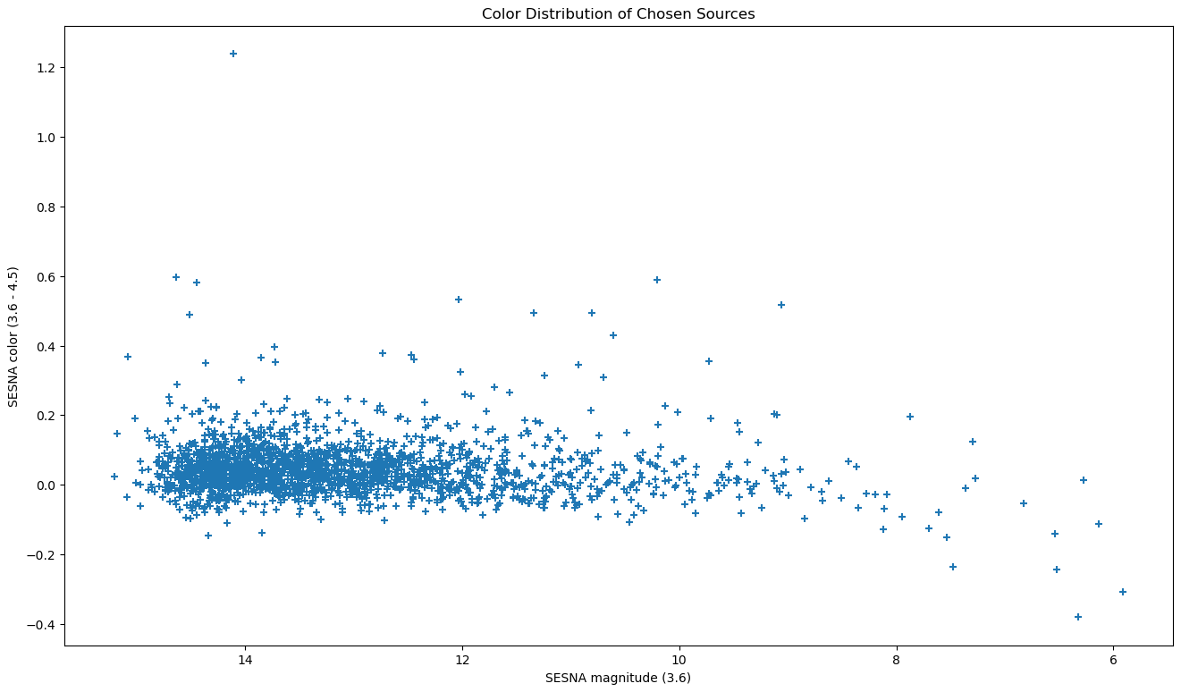 Plot showing the color vs. magnitude of the selected stars.
The next graphs to examine were a set of 2 graphs that compared the difference between the median unTimely magnitude and the SESNA magnitude vs. the magnitude in the SESNA dataset, with each graph representing a different band.
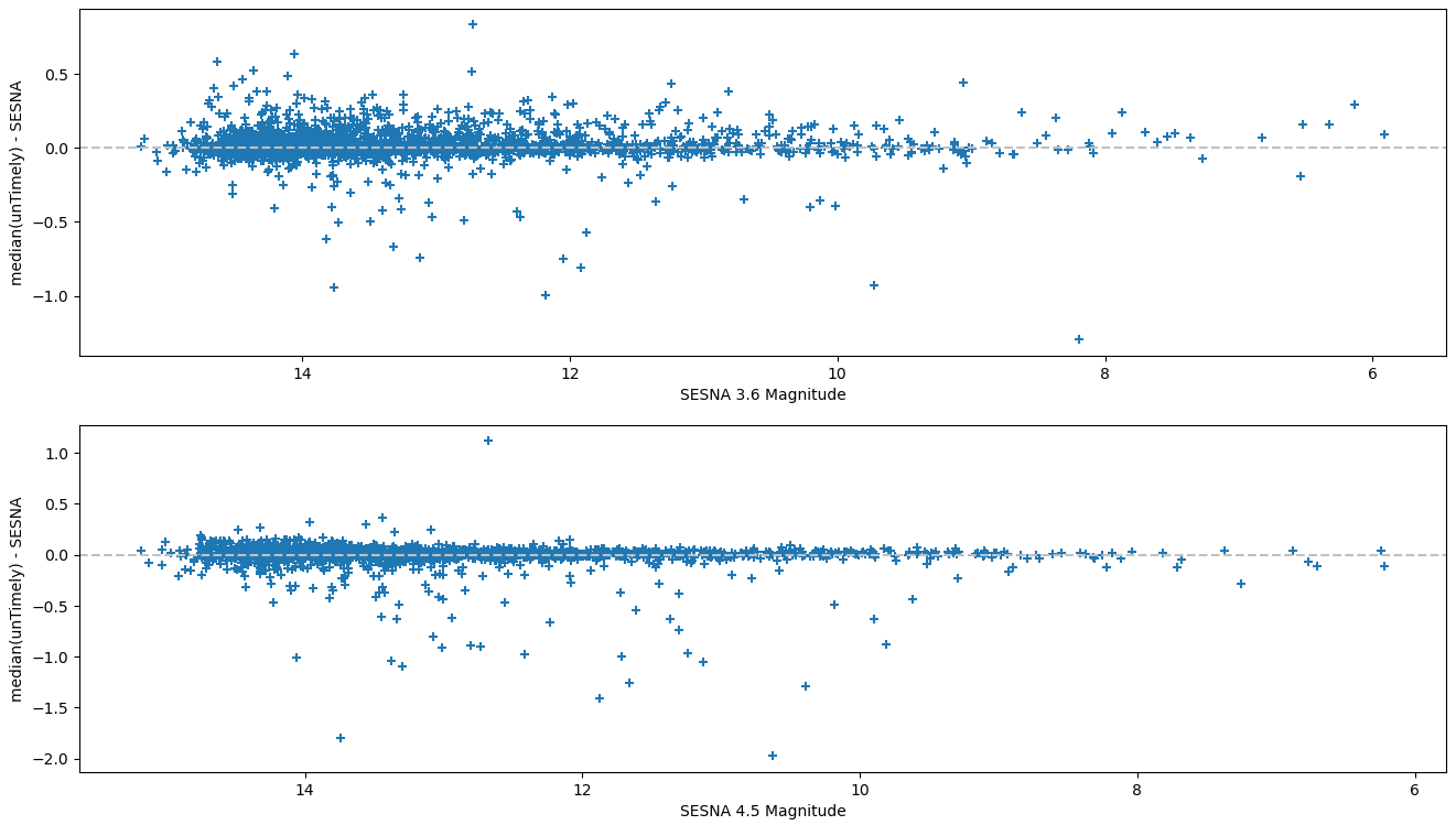 Plot showing the difference between unTimely and SESNA vs the SESNA magnitude.
Overall, this graph didn’t really show a significant amount of deviation, and helped to confirm somewhat our intuition that the existing saturation designations in unTimely are more restrictive than necessary.
Moving forward, we will instead be using the saturation marker that is carried through from the UNWISE data, which is less restrictive than the crowdsource unTimely saturation marker.
Swap to 2MASS-style Names
One of the larger changes I made this week was to switch out the names of each of our sources. Previously, we were using a fairly arbitrary naming system for our ISO sources that would name each source based on the region and the order in which they are listed in the input file.
This was fine initially, however it presented a problem if we ever tried to update our file with more sources, or changed the ordering. In either case, the names of every source would change, which is a serious problem.
We had been kicking around the idea of changing to position based names for some time now, and we finally decided at last week’s meeting to swap to ‘2MASS’ style names, where the digits of the position in sexigesimal are used to form the object name, with the necessary precision to ensure there are no duplicates for closeby objects.
To do this, I was able to use astropy to convert the ra and dec positions into the new names at runtime, and convert our existing names to the new format. I then updated our source tracking online spreadsheet to reflect the new names.
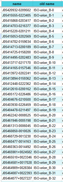 Image comparing the old names of the sources and the newly generated names.
Overall, this was a significantly less painful process than I had expected it to be. Some of this is due to some progressive improvements that have been made over the last year, such as changing from saving the NEOWISE data by the source name to saving by position, which prevented me from having to redownload that data.
Organize Drive
One other bit of housekeeping that I got up to this week was to reorganize and consolidate our shared project google drive folder. Previously there was no central location for the most up-to-date graphs, and it was difficult to tell when a data product was out of date.
To fix this, I went through and gathered the existing graphs, tables, and other products into a quarantined folder (labeled OLD, of course), then created a new folder to contain the most up-to-date graphs from now on.
This folder is further divided by region, then into the different products. It does become somewhat of a pain to update these light curves at the current speed they are changing, but the upside is that other members of the project have convenient access to the products when they need them.
Integrate Additional Spitzer Data
We recently recieved an updated set of datafiles for the Serpens and NGC1333 regions. After using my existing IDL save file extraction code, I pulled the data out and reformatted it into csv files, then added the data to the light curve generator code. This allows us to now plot these points, and therefore create scientifically defensible light curves for an additional 30-40 sources.
Per-Source Offset
One of the more major changes I worked on this week was a change to how we are matching together the WISE and Spitzer telescope data, as these telescope utilized different band sets.
Previously, we have been using a median offset, calculated from concurrent Spitzer and unTimely data for every source in our set, which was applied universally. Instead, we now want to use the offset calculated individually for each source.
In some cases there are multiple concurrent Spitzer and unTimely points for a single source, in which case the median offset is used. This offset is calculated by first regressing a line between the two adjacent (in time) unTimely points on either side of the Spitzer point, then calculating the difference between the Spitzer point’s magnitude and the expected magnitude from that regressed line.
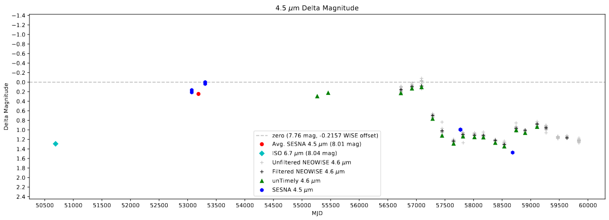 An example of a light curve created using the new per-source offset.
Add Saturated Spitzer Points to Plots
One of the last things I worked on this week was an improvement to how the program handles saturated Spitzer points, taking inspiration from my treatment of saturated unTimely points.
Currently, Spitzer points that are marked as saturated are removed entirely from the dataset, and are not plotted on the light curve. Instead, I am simply marking these saturated point using a boolean column. I then ensure that these points are not used in processes such as the offset determination described above, and are greyed out when plotted on the light curves.
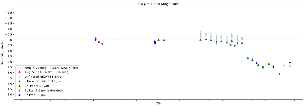 An example of a light curve with the saturated Spitzer points plotted.
Future Work
One of the future things on the horizon is the addition of more ISO data, as Chinmay has a new set of refined photometry. This has the caveat that some of the existing sources will be dropped from the set due to photometric quality constraints, which may cause some confusion if these aren’t clearly labeled.
My current plan is to merge the older set with this new set, dropping any duplicates for the new data, and keeping any missing points, adding a label to indicate that they have been dropped from the set.
Cosmology Research Group
Tuning Each Model
Before assembling the final graphs, I needed to go tune each of the 4 models we are planning on including in the paper. This tuning was done using the median sampled ionization fraction, which helps reduce the influence of cases where bubbles in renaissance are being produced by halos outside of the selected simulation box.
Specifically, instead of taking the total ionization fraction, we randomly select a 50-pixel box within the space, and compare the ionization fraction in renaissance with the ionization fraction in the model within that box. This process is then repeated a large number of times, with the resulting median ratio between the two indicating the agreement between the two.
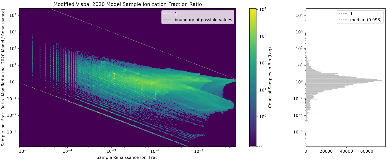 An example of a graph showing the distribution of these sampled ionization fraction ratios.
This process mostly involved running 4-5 versions of each model, then applying the above process to obtain each model’s median ratio. I then linearly regressed this value with the popII escape fraction used, getting a close estimate on what value would produce the desired ratio of 1, indicating median agreement between the two.
Creating Final Graphs
With the tuned models in hand, I could move on to recreating my existing graphs using these final models. These graphs include the ionized halo graph, the bubble volume distribution graph, and a set of slices through the boxes, both of a smaller subsection and of the whole box.
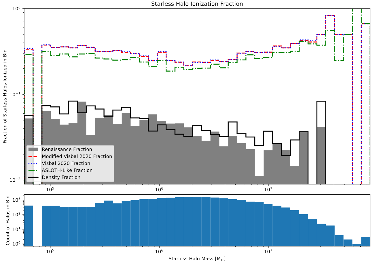 A graph showing the starless halo ionization fractions.
The first graph is the halo ionization plot, which shows the fraction of starless halos that are ionized within each mass bin, between 0 and 1. The main takeaway from this graph is the extreme similarity between the original Visbal 2020 model, and the version that I spent several months modifying. It seems that, at least for this metric, the addition of corrections for bubble sizes, recombination, and the removal of periodic boundary conditions do not improve the performance of the model.
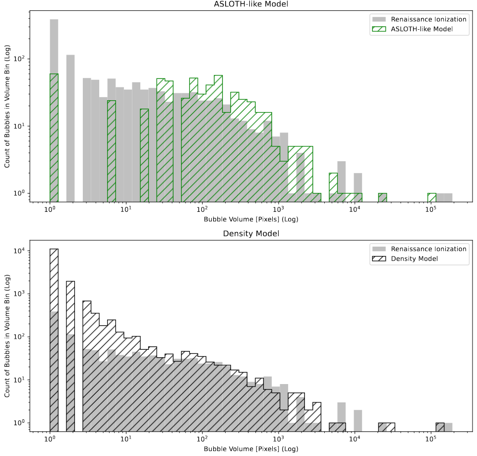 Two graphs showing the bubble volume distributions in an A-SLOTH-like model and the new Density model we have created.
The next graph of interest was the bubble volumes plot. This is produced by first using a clustering algorithm DBSCAN to generate a list of the volumes of disconnected bubbles, which is then plotted using a histogram.
This graph is fairly simple to produce, as I had previously created a reusable class that consolidates the necessary operations, so all that needs to be done is to instantiate the object and add the model data.
The results were as we expected; the existing models are somewhat decent, but have a gap in bubble sizes due to resolution effects only allowing certain sphere sizes to be placed. In contrast, the new method that I put together performs much better for larger bubble sizes, but overproduces bubbles of very small sizes, which is related to the ongoing ‘powdery-ness’ of the model output.
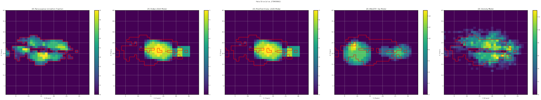 An example of a halo slice, showing a region where the new model performs particularly well.
This next graph is another simple to produce one, as I again have an existing class setup that lets me quickly produce these halo slices from the given data and parameters. The only outstanding issue is that I will need to adjust the size of the graph, as currently the text is comically undersized.
Future Work
For next week, I have a few small adjustments to make to the plots, mostly related to readability and text-size.
Other then that, we are beginning to outline the paper, with my goal being to have a detailed outline of the methods section ready to go over with the group.
As we are getting into the paper writing process now, my updates on this project will likely slow down or stop, as much of the writing process is not well-suited to a writeup in this format.
Data Science Research
Loading BEA CAINC data
I finally took the time this week to to load in and format the per-capita income and employment data from the Beareau of Economic Analysis website. This process ended up being much easier than I had anticipated, and exposed me to a few of pandas’ more advanced features, specifically the ‘melt’ command, which makes converting from the wide/panel formatted input file to the more useful long format.
Loading Race-Bridged Census Estimates
Similarly, this set of data was simpler to load in, and again exposed me to some of pandas’ many strengths, specifically in the pivot command, which was useful for collecting the count of each race into a single column by year and county.
Future Work
For next week, Dr. Lilley sent me some more updated FBI data, with two possible routes to obtain it. The easier method would be to make use of an existing extraction of this data, available online. While easier, this method does come with some concern on data quality, as Dr. Lilley has had issues in the past with the quality of datasets ffrom this archive.
The harder method would be for me to extract the data from the files myself. This would definitely be much harder, as these files are fixed column width hierarchical files, a format that is notorious for being difficult to extract information from. This format is an artifact of the FBI data maintaining a single format since 1921.
My plan is to first get the available FBI data, then try my hand at extracting it myself. This way we still have the data, even if I fail to make any progress on extracting it in the next week.
Cluster Research Pod
Creating Spectral Energy Diagrams
This week’s goal was to choose a few sets of sources, then create a SED’s that combined the existing HST photometry with the preliminary JWST photometry.
Choosing Sources
The first step of this process is to decide on a small set of sources. Our desired set would include 3-4 ‘older sources’, and 3-4 young, H-alpha emitting sources. These criteria were determined using the existing HST photometry, and the chosen sources are shown on color-color diagrams below.
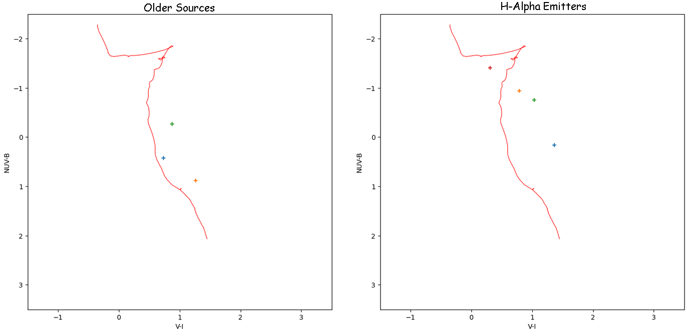 Two color-color diagrams showing the positions of the clusters I chose from the HST set.
Matching with JWST Set
With these sources chosen, I then matched them to their nearest JWST counterpart, as our previous examination revealed that essentially every HST source has a match or set of matches within our JWST candidate catalog.
I am somewhat proud of how I put this together, as I was able to leverage the newly learned ‘melt’ operation in pandas to format the set in a useful way, making plotting a breeze.
Examining Results
The results of this process were, unfortunately, a mess. There existed a severe disconnect between the HST and JWST photometry of these sources. This is disappointing, but not entirely unexpected, given that our photometry is currently very preliminary, and we aren’t even sure if it is working correctly.
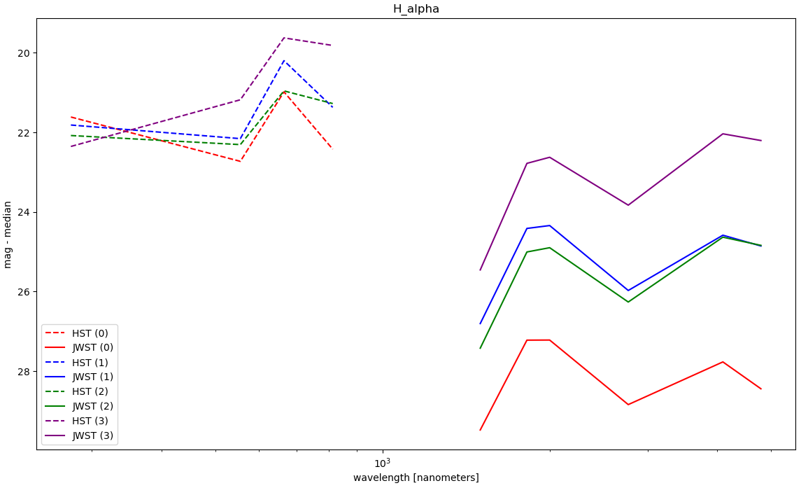 One of the SEDs generated, which shows how the general problem we are experiencing..
Future Work
For next week, Dr. Chandar is planning on setting up a meeting with one of our collaborators on this project, one who has significantly more experience performing photometry on these JWST images, and who would be able to point out any problems or mistakes with our current methods.