Research Update - Week 23
I neglected to put out a research update last week, as my usual writing time was occupied with travel. Luckily, I also had this last week off due to spring break, which seems a decent enough excuse for a smidge of laziness.
All this is to say that the majority of the work covered in this update occurred the week before last, rather than the previous week.
YSOLab
Implementing New ISO Set
This last week, Chinmay was able to finally provide the re-reduced ISO photometry. In order to integrate this data, there was something of a puzzle that I had to solve.
One of the main wrinkles with this new set is that, for a number of reasons that are not fully clear to me, the number and positions of sources are different. Some sources are dropped, and no longer appear in the set. Many are ‘replaced’, with updated photometry but retain their original position. A few are ‘inserted’, appearing for the first time in this new set.
My goal through this was to preserve existing sources that were dropped from the set, replace the old photometry with the equivalent updated photometry, and insert the new sources into the list.
To accomplish this, I used the pandas ‘merge_asof’ function, which allows one to quickly merge two sets based on the distance between entries, with some cutoff. After matching these together, I juggle the different variables around slightly, eventually merging back in the data based on their designation, until I end up with the final set, containing an additional column indicating if the source was dropped, replaced, or inserted.
Future Work
For next week, my goal is to examine this new set, and re-evaluate the light curves and ranges using the improved photometry.
Cosmology Group
Update on Paper Progress
Work on the paper has been progressing. I have a draft of the Methods and Results sections, and we have been working on revising this draft over the last several weeks. In addition, I have fairly final versions of each of the figures in the paper, with one or two still in flux.
Future Work
Work has been stalling slightly, as everyone is somewhat busy. In order to try and keep things moving, I plan on trying to produce a sentence level outline of the remaining Introduction, Renaissance Overview, and Conclusions sections.
Gun Violence Archive Analysis
Examining FBI Data Coverage
One thing that we worked on last week was examining the FBI data coverage. Specifically, we wanted to verify something we noticed, were the number of reporting agencies drops by ~1/3 between 2016 and 2017, where it remains until 2020, which sees another substantial drop for several years, before returning to the first reduced amount by 2023.
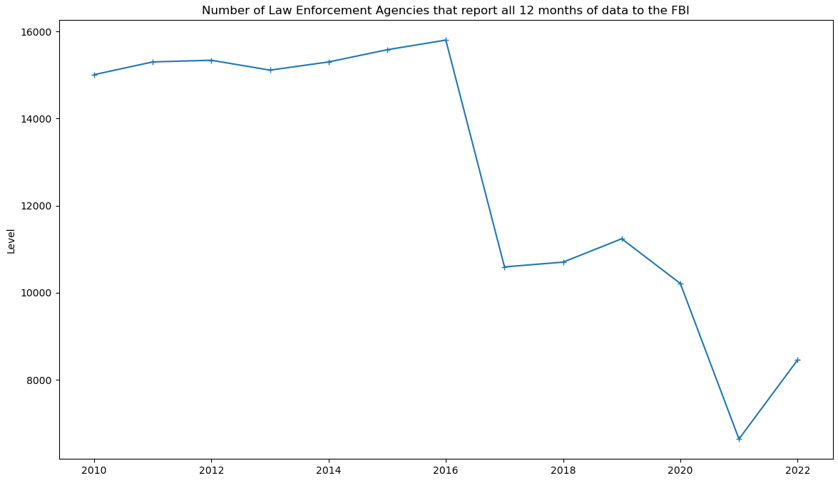 Number of agencies that reported a full 12 months of data to the FBI for each year.
This is a significant problem,as a drop like this presents major issues with data coverage. we tried a few different strategies to try and identify the what agencies were responsible for this drop, resulting in the below graph, which shows the fraction of agencies within each population bin that are reporting data.
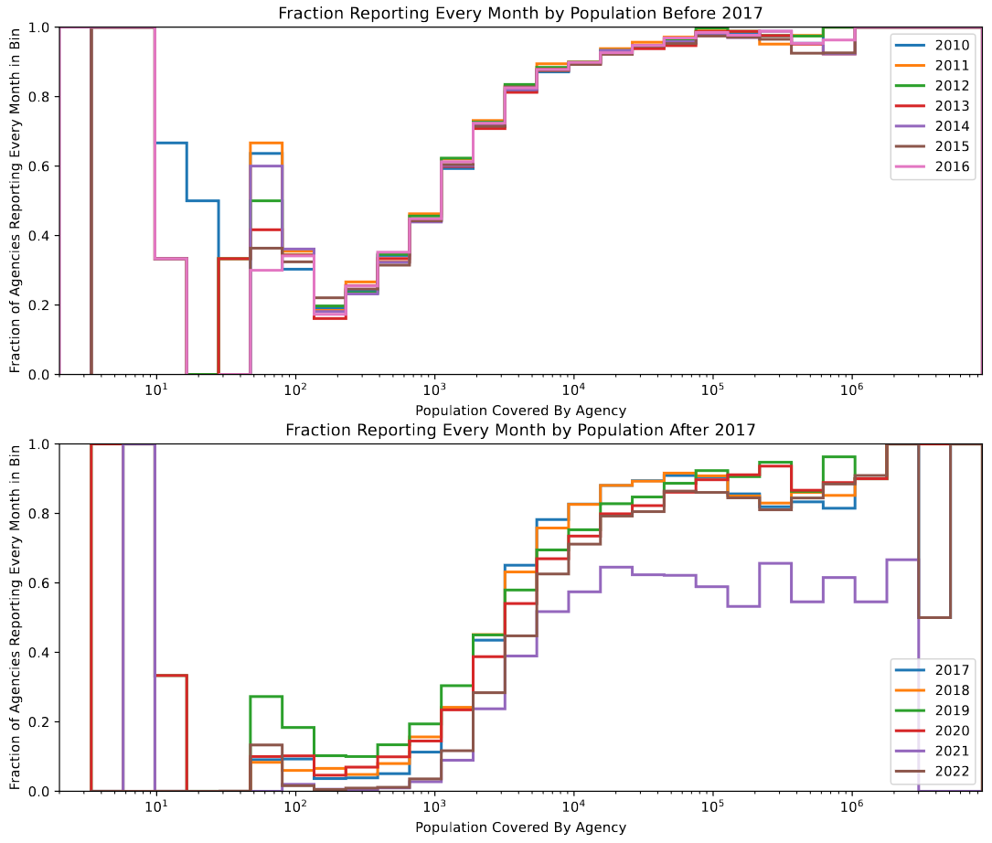 Fraction of agencies that reported a full 12 months of data to the FBI in each population bin.
From this graph, we can glean a few interesting things; we see an overall decrease in reporting fraction across the board, with the primary dip occuring in agencies covering populations between 10 and 1000 people, going from an already low 20% to almost 0% in most cases.
I did some additional research, and it looks like this issue isn’t unique to our reduction, and is a known issue with the FBI data. One theory is that, because 2015-2017 is when the FBI began expediting the transition to a new data format, many smaller agencies decided to abandon the existing RETURN-A format, rather than field the resources necessary to maintain both. This would match well with what we observe from the above graph, where it is primarily smaller agencies that have dropped out of the reporting set.
NOAA Weather Station Data
A side project I worked on over the break was downloading and parsing data from NOAA, which includes precipitation and temperature data, as well as a very incomplete set of other more obscure data (wind speed, snow accumulation, etc.).
This data is available in several different forms, but I chose to make use of the available FTP website (Index of /pub/data/ghcn/daily). From this site, there are a few different data products that are relevant, however I chose to use the individual station data, and to aggregate up from that point, rather than using the available superghcnd dataset. This was mostly done because I didn’t understand the format of the superghcnd files, and as it contains the same data as the individual station files, just in a .CSV format rather that a fixed width column file. I also save ~5 GB of storage by ditching data from outside the US.
Identifying & Downloading Station Data
The first step in this process was to read in the provided ‘ghcnd-stations.txt’ file, which contains information on each of the weather stations included in the database, including an ID, a latitude and longitude, a country, and a few other flags that are less relevant.
I leveraged the pandas string accessor to convert the fixed-width column text file into a usable dataframe, which I then pared to only stations within the US, and saved as a .CSV file.
Next, I loaded that saved .CSV into QGIS, and made use of a county shapefile to associate each station with the county it is contained within, using the latitude and longitude. By doing this, we can obtain more granular information about the temperature, rather than the state-level information that was available in the original file.
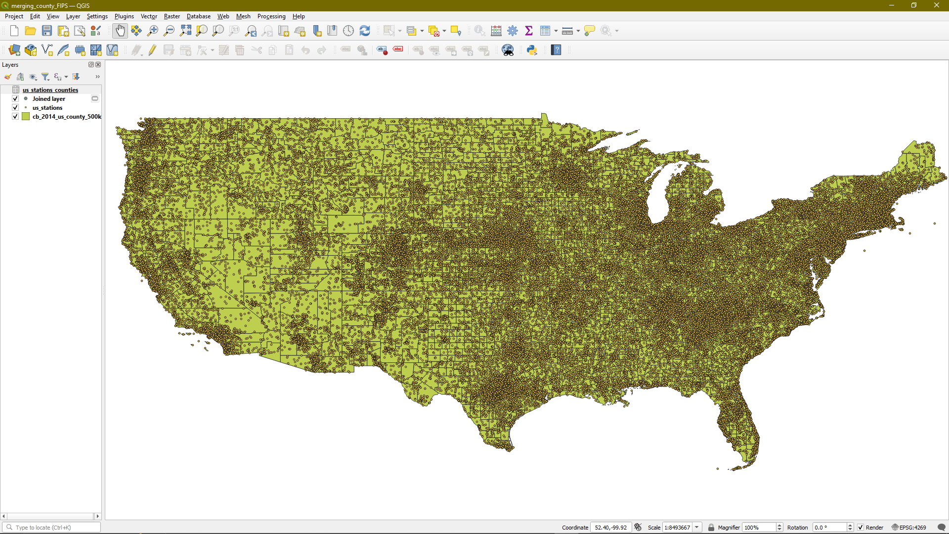 Screenshot of the QGIS file, with each weather station plotted as a dot on a map of US counties.
I then used the wget python package to iterate through each of the stations, and download the associated gzipped .csv file for each station. This took a little over 18 hours, and represented about 6 GB of storage on my computer.
Loading & Aggregating Station Data
Next, I wrote a function that takes in the desired station IDs, opens each of the files, concatenates their data together, obtains a median value for each of the different measurements on each day, then pivots the dataframe so that each row represents the median measurements take of all the stations in that county on a specific day.
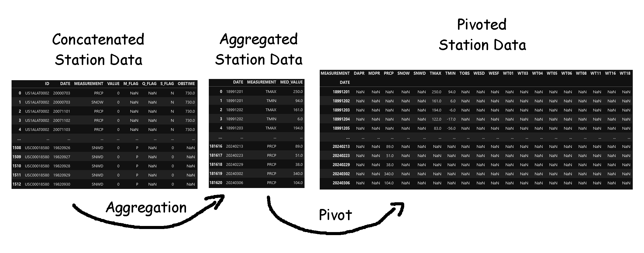 Image showing the general process by which I convert the station data into county-day level measurements.
This process worked well, and I have yet to encounter any major bugs.
Some Preliminary Checks
I have yet to spend time cleaning this data significantly, however I did do a few preliminary checks to ensure that the data made some kind of sense. One of these is the below graph, which shows the (sort of) average temperature in Hamilton County, Ohio (obtained by taking the average of the maximum and minimum temperature). I have yet to associate each of the entries with a specific date, so each entry is just placed sequentially.
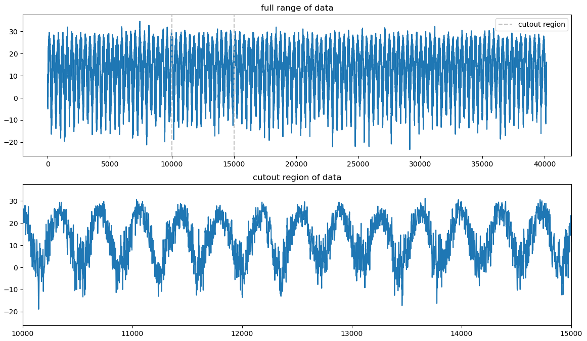 Rough graph of the temperature data in degrees, Celsius, collected for Hamilton County, Ohio.
The main thing to point out is that, for the most part, the general up and down trend seems to match well with what we might expect. One little detail that caught me off guard was the units; for the temperature, the values are given in tenths of a degree celsius, which I was not aware of initially.
Future Work
For next week, I plan to do some additionally cleaning and checking of this temperature & weather data, with the goal of integrating it into our growing collection of datasets, and eventually including it in our regressions and analysis.
Cluster Research Pod
Creating 3-Color Images
The primary thing I worked on this week was creating 3-color images using both the JWST and HST images. In hindsight, it is really strange that I haven’t done this previously, but it really didn’t present as a necessary endeavor until now.
The main point of doing this is to plot the locations of the brightest JWST objects that are not present in HST, so that we can see more clearly what regions of the galaxy they are in.
To create these images, I decided to make use of WCSAxes, as I had yet to apply it to this scenario, and I was convinced that I could use it in this way, instead of having to use the (somewhat clunky) aplpy package. I was correct, and I was able to combine it with imshow to plot the 3-color images with RA and Dec positions, which was nice.
I spent a while tuning the different scales of the images, and eventually found a set that I was happy with. One interesting foible was, with the HST images, I had to first crop and save these files with updated headers, as the HST images are 10000x10000 pixels, but only the very central 3000x3000 pixel area contains the galaxy in question. If I hadn’t cropped them, I would have run into severe memory and slowdown issues trying to hold several of those images in memory, and plot 3 at a time.
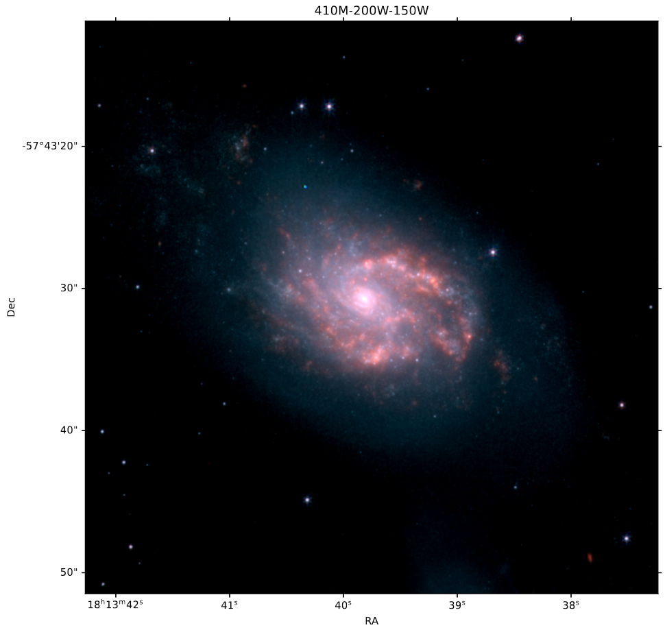 JWST 3-Color image of IC4687.
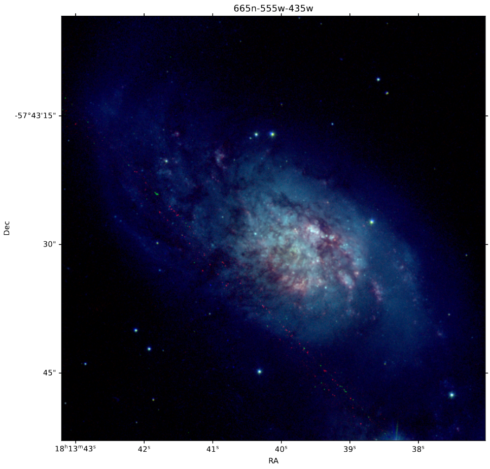 HST 3-Color image of IC4687.
Future Work
Over this next week, I plan on going back through and more finely commenting and explaining the existing photometry code, as there was some confusion as to the exact operations amongst the group.