Research Update - Week 24
YSOLab
Error in Determining Ranges
I tracked down a smaller bug this week, related to how the script calculates the overall magnitude range of a light curve, as well as the zero point (as both operations are very similar).
This bug manifests as the recorded range being slightly larger than the data on the light curve would suggest in some cases, and as the zeropoint of the plot being slightly above the plotted points in these cases.
The issue came about because I was accidentally using the entire set of NEOWISE observations when doing this, rather than the median value that is eventually plotted on the light curve.
After fixing this, this problem no longer appears. As a side-effect, many of the overall magnitude ranges became smaller, which affected our set of ‘noteworthy’ light curves, as we use the magnitude range as a filtering criteria for what we look at by-eye.
Some Early Looks at Overall Set
One thing we spent time working on this week was re-examining many of our sources, now that we have more trustworthy ISO data. This includes some reclassification, as well as a few newly identified ‘good bursts’.
One interesting preliminary detail is that, from just our small set, we find that sources with a larger magnitude range almost always appear to be ‘bursts’, while objects with a smaller magnitude ranger are almost always designated as ‘fluctuators’.
This does make some sense, logically, if you consider that the behavior that defines a burst (a rise to a plateau of brightness) could be present within these ‘fluctuators’, but is drowned out at smaller variations by the fluctuations.
Future Work
For next week, I have a few smaller tweaks to make to some of the dataset filtering and concurrency checks.
I will also be working on creating a color magnitude diagram for this set of sources, which may help shine a light on some of the overall properties of the set.
Cosmology Research
Updated Slice Plot
One thing I worked on this week, in addition to some changes to the paper, was an adjustment to the existing ‘halo slice’ plot, which depicts a projection through a small subsection of the overall simulation space.
This adjustment served to merge in two panels from different plots that were otherwise dropped from the paper, with these two panels showing both the overdensity in the depicted slice, as well as a projection through the entire simulation space, with the subsection outlined.
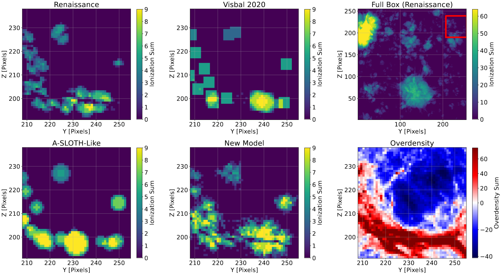 A modified version of the representative slice plot, which includes an additional set of panels depicting both the overdensity projection, as well as the subsections position within the simulation space.
Future Work
For next week, I plan on testing to see if the parameters of the model that we determined work best for this redshift also work at higher redshifts. To do this, Ryan, on of the grad students I have been working with, will be providing the necessary files.
Our concern is that the tuning that I have done is very redshift-specific, and that moving to a higher redshift will result in less accurate results, indicating some sort of redshift-dependent parameters in this new model.
Gun Violence Archive Analysis
Refining NOAA Data
One of my main tasks this week has been doing some refinement to the NOAA data that I worked on obtaining last week.
Attaching Dates
One of the primary things I did was to use the pandas datetime accessor to create a datetime column, and to extract the year, month, and day of each object.
This mostly served as a building block for eventually plotting this data, as I wanted to get a general sense of the data’s coverage.
Plotting Missing
I spent some time plotting the data from a few different counties, and I added some logic to also plot red lines wherever data was missing for a specific day. I was less interested in the overall statistics, and more wanted to get a general idea of whether there was enough coverage to justify trying to merge it into the gun violence data we have.
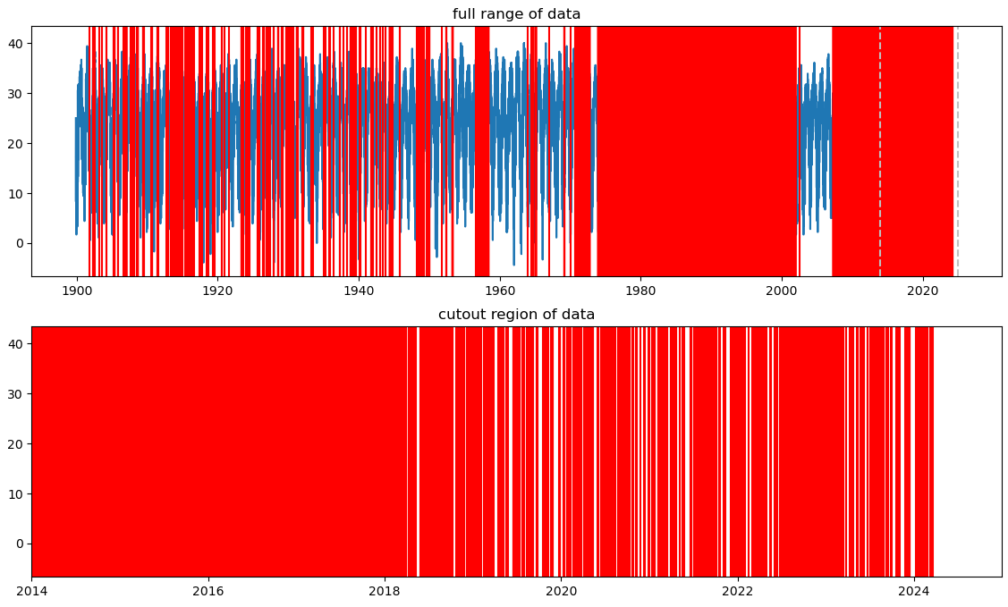 A plot showing the temperature data available for Autauga County, Alabama. The Red lines indicate positions where temperature data is missing.
The plot above is something of a ‘worse-case’ scenario; for most decently populated counties, there is at least one station providing temperature data for every day in our range of interest (2013-2024).
This indicates to us that, for most cases, we should be able to merge the temperature data into our gun violence data. One way we can further ameliorate the edge cases that appear is by getting essentially two temperatures per county; the median TMAX measured by each station within the county, and the median TMAX measured by every station within 50 miles of the geometric center of each county.
Our rationale is that, for the most part, the temperature isn’t going to change significantly within 50 miles of the county, so this provides a rougher, but more reliable fallback measurement to use in counties that do not have relevant temperature data for some days.
To define the ‘geometric center’ of a county, I can use QGIS and the county shapefile I have to quickly obtain the latitude and longitude of the center of these counties, and associate them with the county fips code for later identification.
Future Work
This next week, I am planning on hacking away at the problem of merging the temperature data into the incidents data. The main obstacle is the size of the temperature data; it is unlikely that I will be able to hold it all in memory at once, so I will likely need to do it county by county.