Research Update - Week 25
YSOLab
Changes to ISO Plotting
The main change I made to the program this week was a small change to how some of the ISO points were plotted. The focus of this change was the ISO data for sources that failed on some quality constraint. These sources could be Multiples, within a Nebulous region, or were dropped from the provided ISO set.
In any of these cases, we now grey out the ISO point in these cases, and include the reason within the legend.
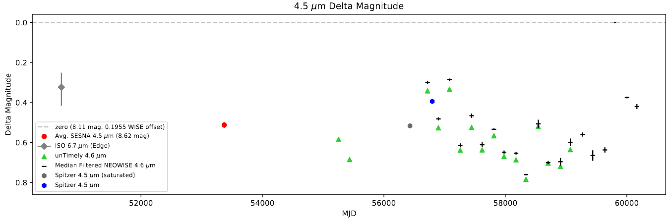 An example light curve with an ISO point of dubious quality.
Future Work
My main task for this week will be to refresh the NEOWISE data used by the script, as there was recently another data release for NEOWISE. This should provide an additional few epochs of NEOWISE data for most sources.
Hopefully we can wrap up this project before the 2025 data release rolls around. :)
Gun Violence Archive Analysis
Merge Temperature and Incident Data
The main task I performed last week was merging the NOAA temperature data into the gun violence incident data, so that each incident has the median measured temperature in that county on that day.
Because of memory constraints, I wasn’t able to simply load all of the weather data into memory, then merge all at once. Instead, I used a more iterative approach.
To start, I iterated through each unique county within the country. For each county, I loaded in both the weather stations within the county, as well as the weather stations that are within 50 miles of the center of that county. I found the centers of each county using QGIS, then calculated the haversine distance for each weather stations.
I then got the median temperature on each day for each set, which I them merged into the incident dataframe. This was done as a two-step process; first, I merged in the new data as a differently named column than the target column. I fill any NaN’s with zeros, and I then add these two columns together. Because each incident can only ever be associated with one county and date, there was never a chance of accidently double summing an incident.
Following this process, I then set any perfect zeros to NaN, to reflect the fact that such an event is essentially impossible, and only occurs when no data was merged in.
Future Work
I had spent some extra time this week doing some early regression using the temperature, but next week I hope to push harder on that. One task I will likely do first is try to address a correlation I have seen between the temperature of a county and the population of a county.
Cluster Research Pod
Creating Cross-Telescope 3-Color Images
One of the things we discussed doing at our last meeting was creating 3-color images that combine filters from both the JWST images and HST images that we have.
Aligning Images
In order to do this, I first had to align the images. I have aligned images using astroalign plent of times before, however this time we made use of a slightly different technique. Rather than allow astroalign to identify matching stars on its own, I manually identified the positions of matching stars within the two image sets and passed those to astroalign. This generated a transformation, which I could then apply to the image.
Plotting
I was able to reuse much of the code I previously used to create some simple 3-color images using both JWST and HST images.
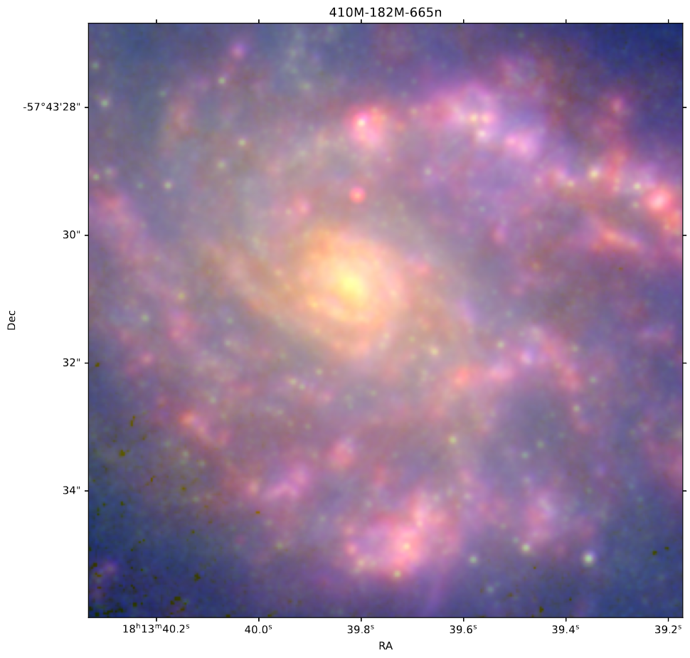 A zoomed in 3color image combining an HST image with two JWST images.
Future Work
For this week, we will be working on creating continuum subtracted images for the three images we have that correspond to Hydrogen lines (665n, 182M, 410M).