Research Update - Week 3
YSOLab
Meeting Results
Our most recent weekly meeting was primarily focused on getting everyone up to speed. We created a github repository to hold the current version of our light curve creation code, and time was spent getting the code running on everyone’s computers.
I also recieved the information from Chinmay that will allow me to plot the ISOCAM points on our light curve, which I will work to implement over the next week.
Spitzer Photometry Correction
One area of progress this week was in implementing a correction for a portion of the Spitzer photometry data. Specifically, the Orion B data produced in 2017 had a small magnitude offset, which was provided to us early this week. I implemented this correction and reproduced the light curves for the objects in question.
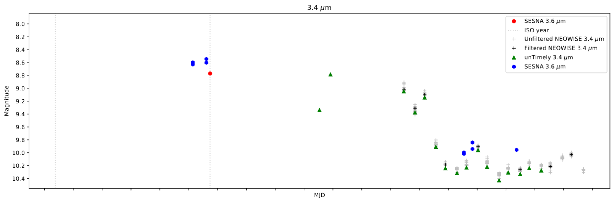 Example light curve for one of the young stellar objects in our set
Spitzer Sub-Array Photometry
I spent some time this week experimenting with the phot_utils python package, with my overall goal of attempting to extract a magnitude from the Spitzer Sub-Array images. I was overall successful in using the package to identify the object in the image, and getting the sum of the image around that location, however without more guidance on direction I will have to wait.
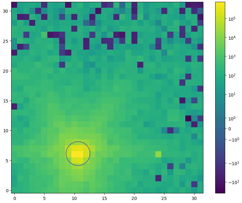 One of the spitzer sub-array images we analyzed through the phot_utils package
Another portion of this was my attempts to find a method for automatically identifying and downloading relevant Spitzer Sub-array images for an object based on its RA and Dec. My search was inconclusive, however I was only looking for resources that would work specifically with the SCS or SIA protocols. My next step would be to expand to the TAP (Table Access Protocol), to see if the image metadata is available from the Spitzer Heritage Archive as a table. With that information, I should be able to use wget or something similar to download the specific images.
Future Work
My future work this week mostly boils down to two main directions.
Firstly, I will be working on implementing Chinmay’s correction for the ISOCAM magnitudes, which will allow us to plot that longer wavelength magnitude on our delta magnitude plots.
I will also be investigating the Table Access Protocol for ways of downloading or identifying the Spitzer Sub-array images for specific objects.
Cosmology Group
Expected Bubble Plotting
This week, our focus was on improving the halo slice plots further. The primary addition was to include another contour that depicts the expected bubble size around each halo, to allow for easy comparison of the model and the mathematical expectation.
The expected bubble size was calculated based on the number of photons each halo would produce, leveraging some existing code from a brief sanity check we performed several months ago. The result of this was an ionization cube, where each halo with stellar mass is surrounded by a sphere based on the number of photons it will produce.
The results of this were as expected, but still useful; the resulting expected contour followed the model output closely, with two specific areas of deviation;
The first main area of disagreement was small, consistent disagreements on the exact bubble size of single halos, with the model consistently undershooting the expected size slightly. This arises from our model code; during the bubble placement, we choose a set of logarithmically spaced bubble radii that bubbles can be placed at. As a result, when a halo produces the photons to create a bubble with a radius between two of the bubble scales, the bubble size is ‘rounded down’ slightly to the lower of the two neighboring bubble scales. This effect is overall fairly negligible, and is one we expected to see.
The other main area of disagreement was also somewhat expected, however it is useful to see it more plainly. In very densely populated areas with many halos, the model will place a bubble that is far in excess of the expected bubbles placed by each halo individually. This tracks with how the two methods differ, where the expected bubble placement only considers each halo in isolation, whereas the model bubble placement considers all of the photons in the surrounding region when placing a bubble. The model also consistently overshoots the renaissance data in these densely populated areas, placing bubbles that are much larger than the corresponding renaissance bubbles. This is one area where we are trying to seek improvement.
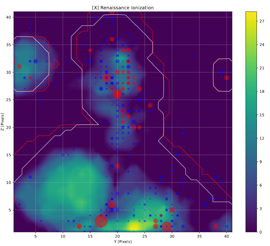 one location where the expected bubble contour, in white, can be compared with the renaissance image and the model contour, in red
Fixes to Density Plot
During my attempt to add colorbars to the halo slice plots, I realized that I had made an error in the plot of the density. My intention was to have the plot center at 0, with the colors growing redder above 0 and bluer below 0. Unfortunately, due to an odd interaction between the colormap and the levels chosen, this was not the actual result.
After some experimentation, I was able to fix this issue, and the density plots are now properly centered, however the result is somewhat more difficult to read, unfortunately.
 one location where the expected bubble contour, in white, can be compared with the renaissance image and the model contour, in red
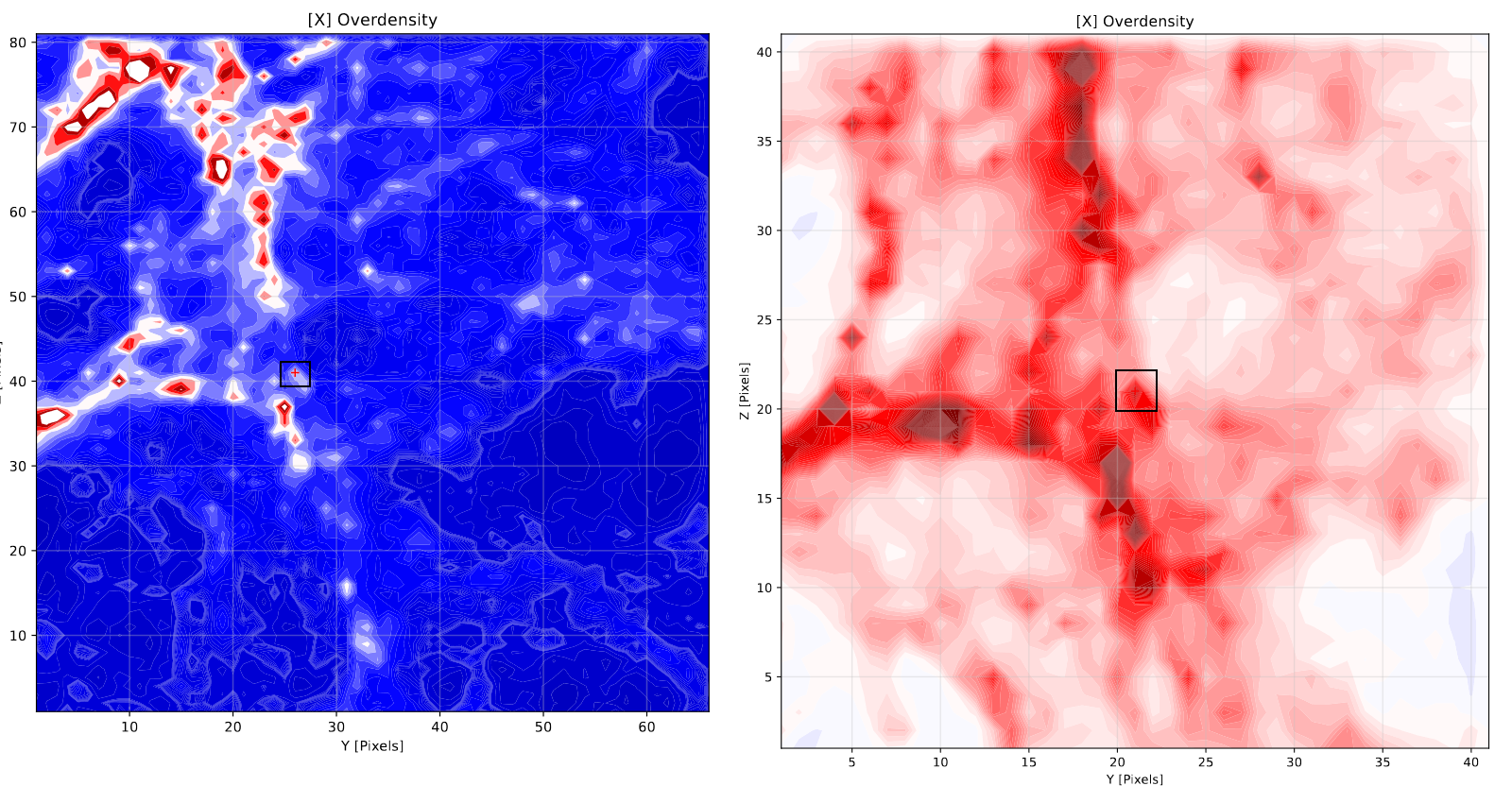
Shrinking Slice Width
One other change I have made is to shrink the overall size of the slices depicted in these plots. This was done in order to better focus on the finer structure depicted in the plots, and help us better pick apart how they are different.
The approach I have taken is slightly more complicated; rather than reducing the width by half across the board, I have instead based the width of the slice on the expected bubble radius of the halo that the slice is centered on, with a minimum width of 40 pixels, which is half of the previous width. I did this to allow for some variation when a halo of particularly significant size is depicted, and avoid producing a plot that is entirely full of values because that halo was inside of a very large bubble.
Future Work
One area of work I will be focusing on in the next week is tracking down some odd emergent geometry we are seeing in the model output. Specifically, we noticed that many of the placed bubbles are not spherical, and instead are either cubes, or partial spheres with shaved edges. This was confusing, as we expected the model to produce perfect spheres.
My plan is to first compare our newest models with some of the very early model outputs I have, to verify whether this issue is a result of changes I have made, or part of some quirk of the model as it existed originally.
 the approximate shape we expect our model to place bubbles in
 the observed bubble shapes from our model output
Gun Violence Archive
I have been working with Dr. Lilley on a data science project for some time, and just had a meeting with him this last week where we covered a number of topics, and set a general direction for our work going forward.
Our project has been primarily leveraging data from the Gun Violence Archive website, which was acquired through a combination of data downloads and a custom python webscraper I wrote over the summer, which gave us access to data not otherwise provided by the website.
Alternative to Google Mobility Data
One area we wanted to improve was our use of mobility data. During the pandemic, many larger tech companies released some of their interal datasets so that researchers could use them to try and predict the spread of COVID-19. One such company was Google, which released a mobility dataset, which tracked the movement of people using google maps queries for different types of places.
We made use of this mobility data in order to better understand the effects of COVID-19 lockdowns on gun violence, however this dataset stopped recieving updates in October of 2022.
In looking for more recently updated alternatives, we came across MobMeter, which uses smartphone trajectory data to estimate both the average distance that people moved on each day, as well as what percentage of people did not leave their homes on each day. This data does not include the distinction of exact places like the Google mobility set does, however it has the benefit of being continuously updated, which allows us to continue our comparison beyond the available range of Google mobility data.
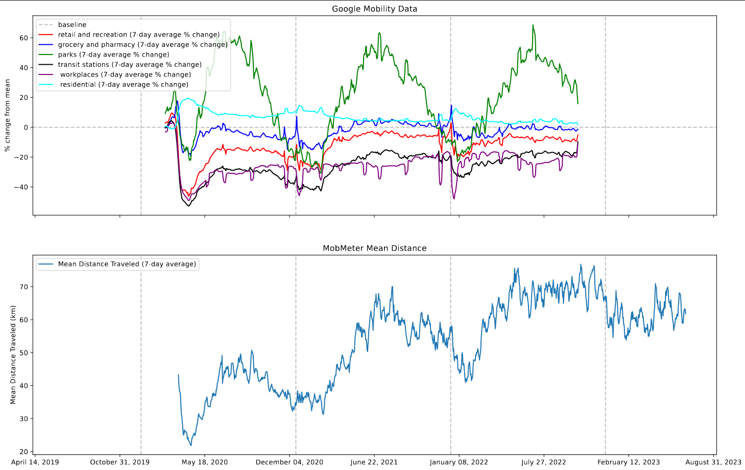 comparing the MobMeter and Google Mobility data over their available ranges.
Examining Atlanta & St. Louis
Partway through the week, Dr. Lilley asked me to take a look at the gun violence data we had for Atlanta and St. Louis, and try to compare that data with the graphs present in a (heavily politicized) crime report by the America First Policy Institute.
To start, I defined the boundaries of Atlanta as the counties of Fulton and Dekalb, and St. Louis as St. Louis City county. Later, I swapped to specifying the place FIPS code for both cities, however the overall count of incidents did not change between these two methods.
I was then able to extract only the incidents that occurred in those counties, and plotted the incidents, injuries, and deaths that occurred.
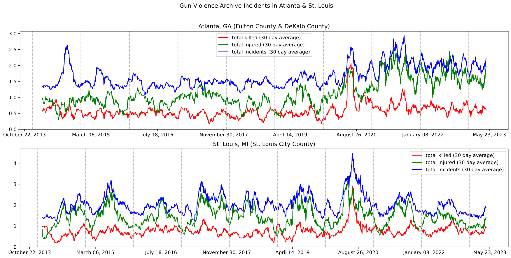 Gun Violence Archive data for both Atlanta and St. Louis, plotted as a 30-day moving average
One interesting feature on this plot is the visibility of the murder of George Floyd, and the ensuing social unrest during the summer of 2020. This appears as a large spike in incidents, injuries and deaths during that time, and is seen in both Atlanta and St. Louis.
Another interesting feature is the difference in the seasonality between Atlanta and St. Louis. From our examinations of the country-wide data, we know that the incidents and injuries both display a seasonal component when examined nationwide, with both decreasing during the winter and increasing during the summer. However, the data for Atlanta and St. Louis both show distinctly less of this periodic behavior, with St. Louis showing somewhat periodic behavior, while Atlanta is very consistent. Our thinking on this is that this reflects how winter is less of a hinderance to movement to people in cities than it might be to people in less urban areas. This increased movement means interactions between people are more common, and gun violence is therefore more likely. The difference seen between Atlanta and St. Louis could also be a reflection of the difference in climate between the two cities; Atlanta is much further south than St. Louis, and would therefore experience much milder winters.
Summing this by year, we can see a plot that resembles the plots given in the AFPI report. One comment on this plot is that it does obscure many of the details of each year, and the resulting plots I created do mirror the general trend that their plot shows, although the exact numbers don’t match, which is what we expected.
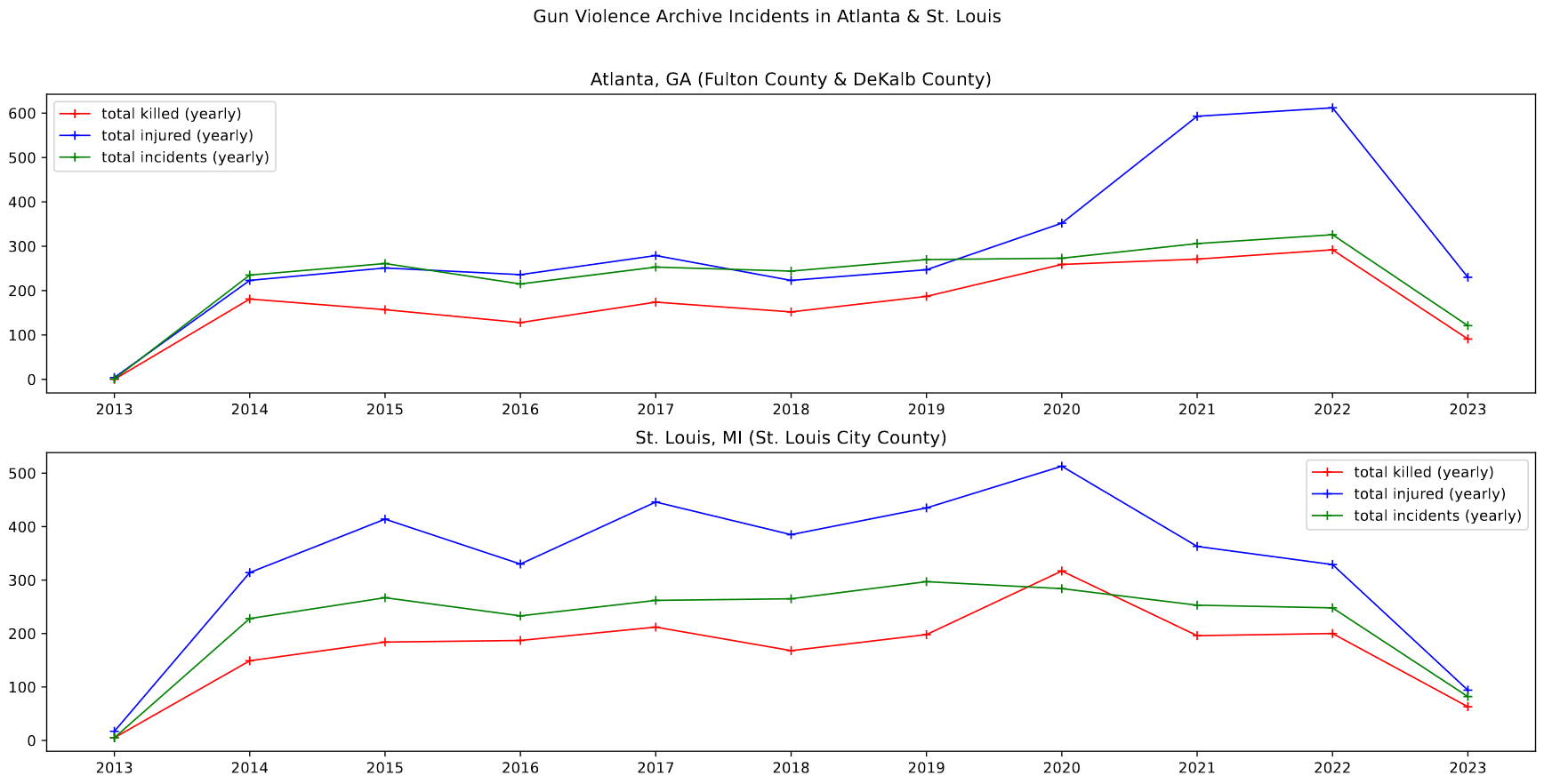 Gun Violence Archive data for Atlanta and St. Louis, plotted as a yearly sum
Future Work
There are a number of directions we could head from this point, however one vector we plan on exploring is to use the FBI homicide data to associate some component of race information with our gun violence set. The FBI Homicide data has a race component for both offender of victim, and has data from 1976 to 2018. Our plan was to use this to find the percentage of homicides commited by each race and upon each race at the county-month level. We can then associate this with the gun violence data, and get some idea of how race is connected to gun violence.
We also plan on investigating the affects of temperature on gun violence. If we are able to find temperature data at the county-day level, we could associate and plot these values together.
Galaxy Cluster Pod
First Meeting
We had our first meeting this friday, where we went over our overall goals and direction, as well as some tasks to complete before next meeting.
General Direction
The goal of the galaxy cluster pod is to examine Hubble (and later, JWST) data for a set of galaxies that are in some ways unusual. We will be focusing initially on NGC4687 and IC3690, two galaxies that will have JWST data in the near future. Our goal is to examine each galaxy in detail, with a focus on the star forming clusters within that galaxy. We hope to age-date these galaxies with the assistance of Dr. Chandar, our faculty advisor.
Future Work
Over the next week, our goals are fairly simple. Firstly, we should read in the provided cluster catalogs, and plot these clusters overtop of a 3-color galaxy image. The purpose of this is two-fold; it serves as an excellent primer on many of the common processes used in this field, and it also allows us to check for instances where there might be missing clusters or misdetected objects, which was a problem we encountered last year.
Once that is complete, the next step is to plot a color-color diagram of the clusters present in each galaxy. We should also try to identify differences in the color-color plot between different v-band ranges. This also serves as another way to identify foreground stars or background galaxies.