Research Update - Week 4
YSOLab
Meeting Results
Our most recent weekly meeting was focused on examining again our filtering criteria for the NEOWISE data. Since we first began using the dataset, there has been an additional data release, which adds an additional two time bins of data to our light curve. Unfortunately, for our current primary target, HOPS388, the additional data was all removed by our existing set of filters.
I tracked the primary filtering to our reduced chi^2 fit parameter, which we had limited to a maximum of 2. We decided to expand this to 2.5, which allowed in many more points across our range, and allowed us to include more of this data in our light curve.
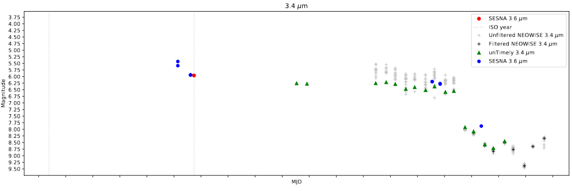 Example light curve for one of the young stellar objects in our set with the increased limit on chir^2
Adding the ISO Points
I recieved the remaining ISOCAM data from Chinmay this week, and I was able to modify my existing light curve program to automatically identify the matching variables in the given set and plot the relevant ISO point on the delta magnitude plot.
Future Work
This next week, my main focus is likely going to be on trying to automatically download the Spitzer Subarray data, which is a task I did not find the time to complete last week. If I can do this, we can automatically perform the photometry and then add additional points to many of the objects we are interested in.
One other focus for the next week is to begin examining our light curves, and categorizing any observed variability, in preparation for finding more durable criteria to sort them upon.
Cosmology Group
Source of Odd Bubble Geometry
Last week I mentioned some strange emergent geometry we had observed in our model outputs, where instead of forming spheres as we had expected, the bubbles would form as cubes, even at scales where the resolution would allow for a sphere shape to form (4-5 pixel radius).
My first step was to verify that this issue was a consistent feature of the model, and not introduced by changes I have made over the last 5 months. I was able to find an example model output I had recieved in May, that was created before I had made any modifications to the model. This older example still featured these cube shaped bubbles, confirming that these features were present, even at this further stage.
Further investigation by both Dr. Visbal, as well as some of the graduate students I have been working with, have confirmed that these cuboid bubbles have existed in even earlier versions of the model.
In order to track down the issue, I broke the model apart into steps I could run locally, and stepped through the code with a simplified test case, where a halo was placed directly in the center of an otherwise empty simulation box and given enough photons to ionize a bubble of a specific radius.
After examining the methods this way, I found the culprit for these changes, while lied in the way the model was deciding where to place bubbles. Rather than only place a single bubble at the very center of the box, the model was selecting a sphere of locations to place bubbles at. The overlapping of a number of bubbles is what was causing the strange geometry; smaller, 2-pixel bubbles (that appear as cubes) where being overlayed in groups of 27 to form cubes far above the expected size.
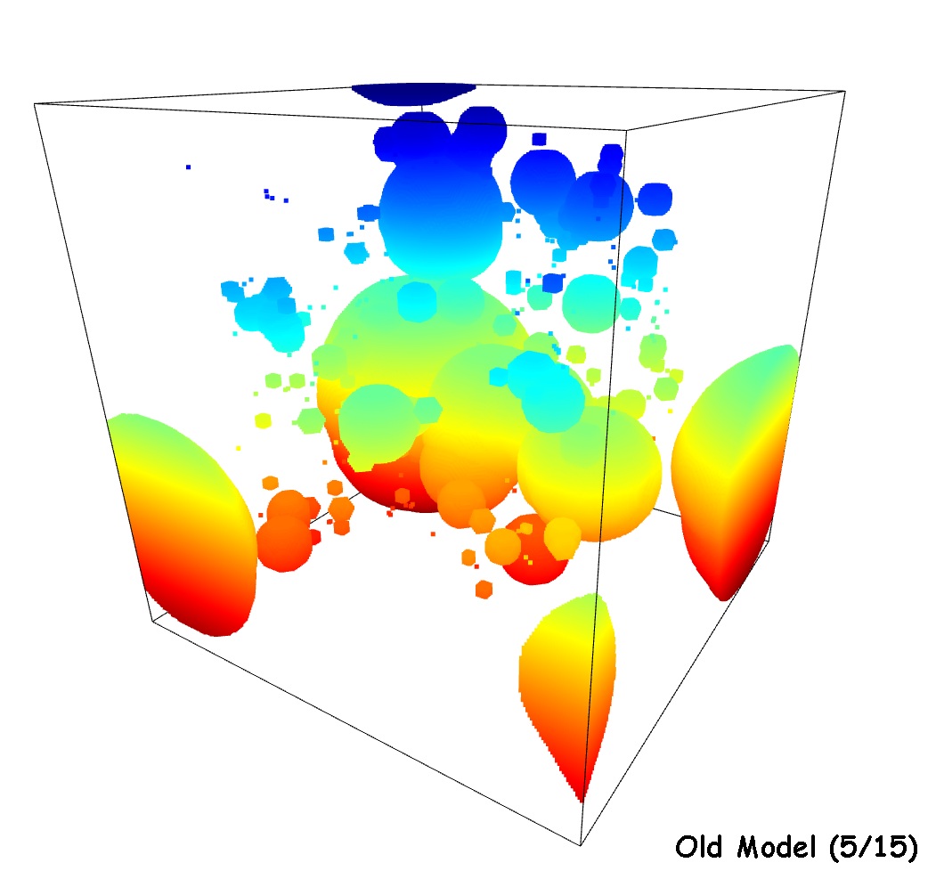 3D view of the earliest model I have access to, which shows the cuboid behavior we are interested in correcting
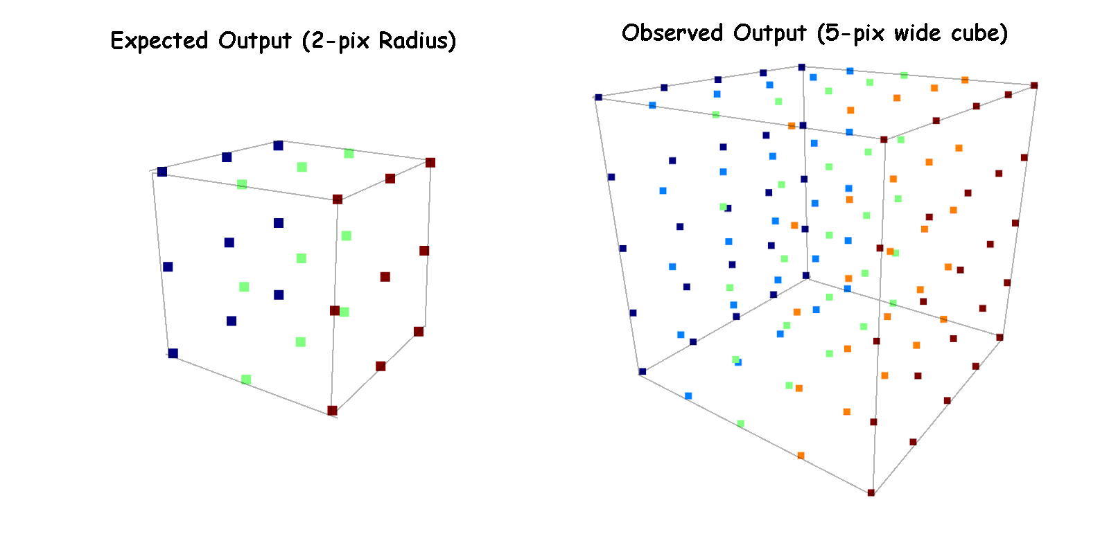 Example showing the expected and observed output for a halo that should produce a 2-pixel radius bubble
We believe this may be an inherent result of the model’s behavior, however we have been considering a few different ways of solving this issue, primarily by reducing the number of photons in each location depending on the planned bubble placement size. These ideas are still in the early stages, however.
Improvements to Slice Plotting
I have made a few minor tweaks to the halo slice plots. This includes adding an additional view that shows the corresponding model output at each location. This is likely the last set of major revisions to the halo slice plots, as they are very close to providing exactly what we want from them.
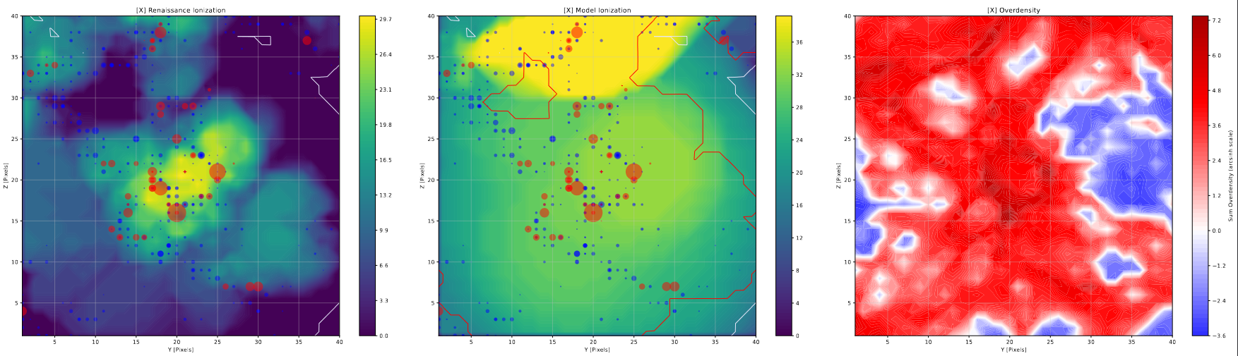 Example of one axis of the halo slice plots
Additional Changes to Density Plot
I have been working on improving the density plots, which while now accurate and performing as expected, are much harder to read on account of the massive scale difference between the lower density range (-1 to 0) and the higher density range (1+).
I have been attempting a few different ways to fix this, primarily by applying a scaling to the contour output. This came with mixed success initially, with my attempt to use a sort of custom symmetrical log scaling causing odd behavior around 0.
While searching for an alternative, I stumbled across a page in the documentation for matplotlib, where it describes using the arcsinh() function to scale a plot, rather than a symlog method. The benefit of using arcsinh() is that it operates continously from +1 to -1, and applies a similar scaling behavior to that of log.
While there is still some tuning and improvement to do with these plots, I believe using the arcsinh() method is likely the best avenue to persue for visualizing this data.
Future Work
My plan for the next week is to try and brainstorm ways of addressing the current deficiencies in the model, with the goal of talking them over with the group during our regular meeting time on Thursday.
Gun Violence Archive
County-Level Climate Data
Following from my work last week, I was able to find county level climate data from NOAA, available for me to download. There were several major wrinkles, however.
The first major hurdle was that the dataset available only offered the data at the monthly level, meaning we only had 12 data points per year for each county. This is acceptable, however we had hoped to find data at the daily level to better match our existing gun violence data for comparison.
The other major hurdle was the format of the given table; the data was provided in a text file, however the text file had been heavily formatted for readability, with the resulting mix of inconsistent spacing meant reading in the file was a chore that took some time to work out.
Following the work done to read the file into python, I next had to decipher the given identifier code for each row into the state code, county code, and year. Then I matched the state code with the state fips code using a separate file and some merging, allow us to associate this set with our other data.
The final major wrinkle was that this data was provided in wide format, with each row have the January to December mean temperature for that state, county, and year. I wrote a small snippet of code to convert this to long format, which finally resulted in a dataset that was usable for comparison.
The results of plotting these temperatures over the gun violence data for St. Louis and Atlanta matched our expectations very well; the seasonal changes were well reflected in the temperature, and the milder winters of Atlanta helped to explain why the incidents in Atlanta were fairly consistent year-round, while the colder winter temperatures in St. Louis corresponded to a dip in gun violence incidents during that time of the year.
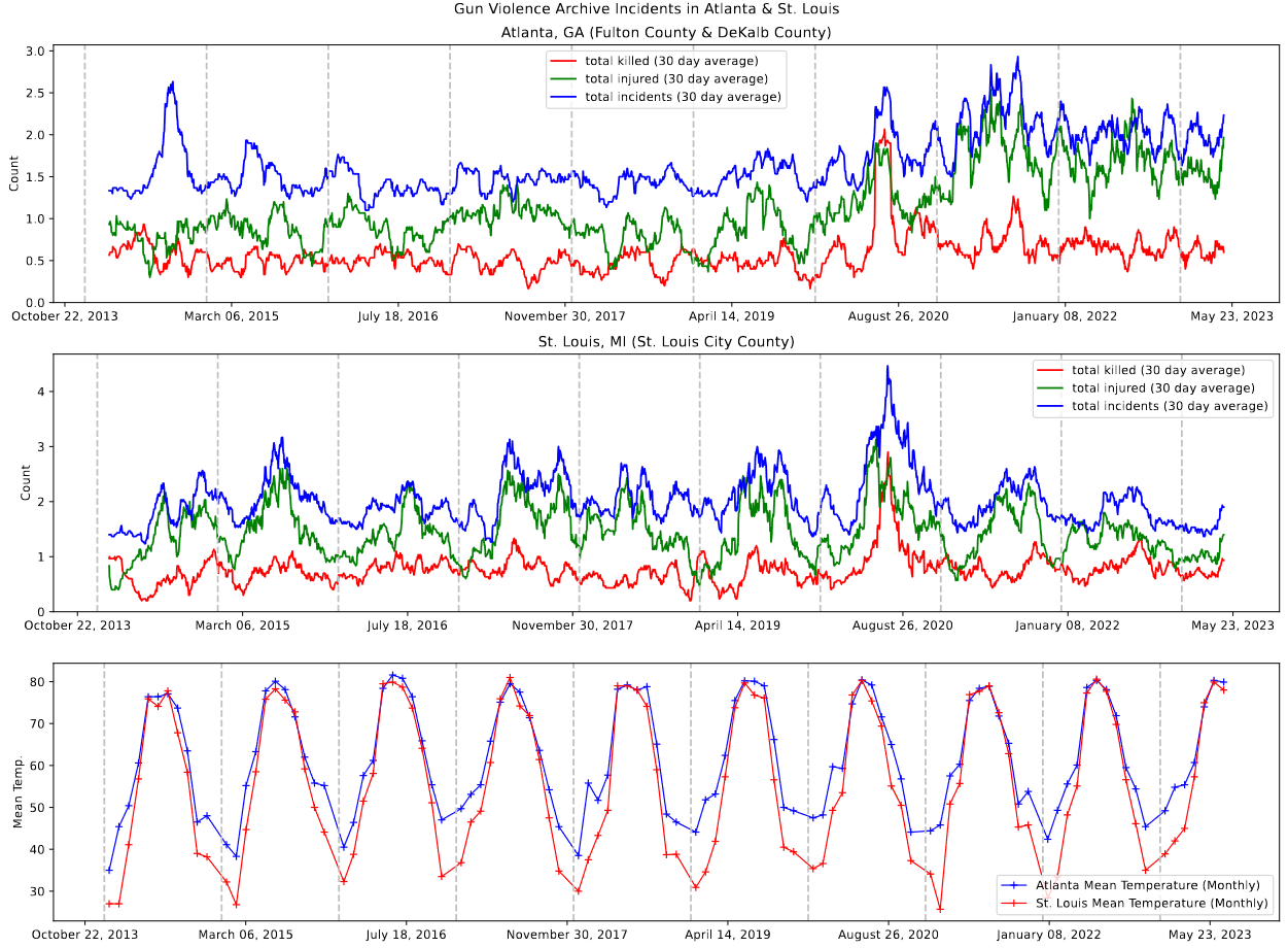 Plot showing the gun violence incidents vs. the monthly average temperature in St. Louis and Atlanta
Future Work
My plan for the next week is to go back into the gun violence archive data and extract the participant relationship information. This information is already stored within the set, however it is given as a dictionary connecting the participant ID with their relationship, which is difficult to parse into anything useful.
My goal is to identify, for each incident, whether there were family members involved, friends involved, or significant others involved in the incident. My next step would be to evaluate the completeness of this data, as it is not uncommon for information on this subject to be poorly gathered or sparse.
Galaxy Cluster Pod
Current Status
We ended up not meeting this week, as there was a significant time conflict between our Friday meeting time and a mentoring pod that the astronomy department runs. We were asked to continue working on our current tasks, and plan to meet next Friday.
Plotting Clusters on Galaxy Image
The only real progress I made this week was on reading in the cluster file and image file. I then plotted the locations of the clusters on top of the galaxy itself, shown below.
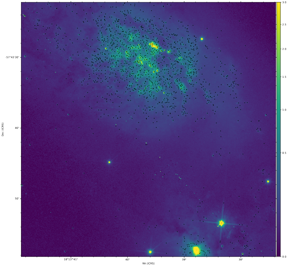 Image plotting the clusters as black dots on top of a v-band picture of the galaxy IC4687
The primary reason for this is to look for any consistent voids in the coverage of the cluster set. Last year, we were stop gapped in our progress when we discovered that our previous set had large chunks of the galaxy’s clusters missing, primarily around the bright regions. From my own inspection, there do not seem to be any obvious voids, however a closer inspection, as well as some additional eyes on the results, wil be useful in making a final judgement.
Future Work
Over the next week, I plan on working more on the other task we were given, which was to plot the color-color diagram of the galaxy’s clusters, and compare it to the given model line.