Research Update - Week 5
YSOLab
Custom Light Curve Limits
This week was somewhat light on progress in YSOLab, but one area of progress was on establishing custom limits on the magnitude range plotted in our light curves.
Currently, we encounter a consistent issue where the unfiltered NEOWISE data will occasionally have a point that is well beyond the reasonable range, sometimes appearing 3-5 magnitudes above the other present data, blasting out the scale of the plots and hiding any variation present in the other datasets.
The obvious solution would be to simply not plot this unfiltered data, however this data can provide some useful context in some scenarios, where the other datasets are less complete.
To address these issues, I implemented a system that collects the appropriate bounds of every dataset present for each object, then finds the necessary bounds to include the relevant data, while ignoring spurious points from the unfiltered NEOWISE data.
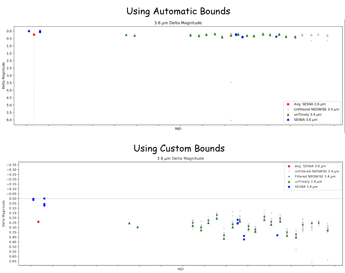 Example light curve showing before and after adding custom bounds
There is still some work to be done on refining these bounds, but the overall effect is as desired, where the light curves are much less susceptible to these spurious points.
Error in Matching ISO Data Between Sets
One issue we identified was that, for many of our sources, we were not recovering the relevant ISO data during the data reduction step, and many of the light curves lacked this crucial piece of data, which should be present for most, if not all of our light curves.
To plot the ISO points, we are relying on an early ISO set, which only includes the ra, dec, magnitude and region, as well as a newer set, which includes some additional parameters that are necessary to calculate the delta magnitude of reach of the ISO points.
To match between these sets, I implemented a simple distance comparison based on the ra and dec. I had assumed this system was working as intended, however others had pointed out to me that the implementation was only finding about 81 matching rows, out of the ~300 rows in both sets.
After some manual digging, I have found that there are some fundamental differences between the two sets, with many sources appearing in one but not the other.
It isn’t impossible that the set of sources has changed, as the newer ISO dataset is nearly 8 months of work removed from when the original set was received.
SIA Interface for Downloading Subarray Spitzer Data
I was able to finally pin down a method that allows us to automatically download the Spitzer Subarray images for a given source, given that sources position.
The final method that I settled on was to use python’s wget package in conjunction with IRSA’s implementation of the SIA protocol, described here, and using the below query;
1
2
3
4
5
6
RA = '86.5547'
Dec = '-0.1013'

rad = '0.001388'

wget.download('https://irsa.ipac.caltech.edu/SIA?COLLECTION=spitzer_sha&POS=circle+'+RA+'+'+Dec+'+'+rad+'&DPTYPE=image&INSTRUMENT=IRAC&RESPONSEFORMAT=CSV', out = 'output.csv')
This query returns a table of image information, where each image can be downloaded individually using the attached database url.
This query gets us most of the way there, however it still returns a number of additional images other than the subarray image sets. To filter this, I first filtered the Instrument to IRAC1 and IRAC2, and limited to specifically the files that end with ‘bcd’.
Following this, we recieve a list of all of the subarray imaging for the source in question, which can be leveraged to insert additional data points for our light curves.
Future Work
The main focus of the next week will be to try to understand and resolve the differences found between the older ISO set and the new ISO set.
I will also be applying some photometry code I recieved from Chinmay to the subarray images, with the goal being to build a script to run through all of the images for each source and produce a set of magnitudes for each from their images.
Cosmology Group
Improvements in Overdensity Slicing
One minor area of focus this week was on further improving the plotting of slices of the overdensity cube. I decide to switch to using an arcsinh() method, rather than the previous pseudo sym-log method. The benefit of this new method is that it acts as a linear scale around zero, but acts logarithmically beyond that portion for both positive and negative values, and maintains continuity between the two.
The results of this switch are somewhat more readable, and there are still more adjustments that can be made to further improve the plotting.
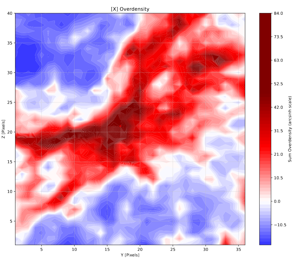 Example of a density slice around one a halo, viewed along the x-axis
Bubble Size Overshooting
One thing I quantified this week was how well our model replicates the expected bubble sizes it is attempting to create. This was done by manufacturing a scenario where the model would be given a box with a single halo of known size, and the resulting volume would be measured to get the results.
Our expectation going in is that, due to some deficiencies in how the model decides on bubble locations, our resulting volume will be 8 times greater than the expected volume for a single isolated bubble.
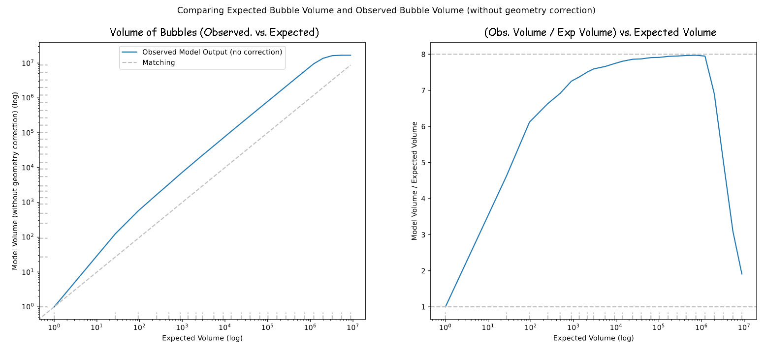 Plot showing the observed volume of bubbles in this test case
This plot did match our expectations, but also showed some interesting behavior; instead of a constant overshoot, the small bubbles much more closely matched our expectations, likely due to the small pixel sizes interfering with the portion of the code that causes the inaccuracy. We also saw a dip in the volume at the largest bubble sizes, which is likely due to the bubbles beginning to fill the entire box as their radii reach 1/2 of the box width.
In the model itself, we expect the bubbles to overshoot by only 4 times, due to the overlapping of adjacent bubbles. Previously, we had been dividing the photon count by 4 in the model to compensate, however this result has inspired us to rethink having a constant threshold.
Brainstorming on Model Improvements
My primary area of work this week has been on trying to brainstorm ways of improving our model, synthesizing from the many different results we have gotten over the past months.
After bringing my ideas to our group, and spending some time working through them, we landed on a set of ideas that were split into 3 categories;
| Pre-Processing Methods | Model Adjustments | Post-Processing Methods |
|---|---|---|
| Subtract Filament Density | Vary Photon Threshold | Subtract Filament Ionization |
| Smooth Density Field | x | Subtract High Density Region |
These methods essentially boil down to two main ideas; leveraging the locations of filaments to counteract a certain deficiency of the model that hamper’s its ability to accurately replicate the geometry of halos within these filaments, and varying the photon threshold that is used to counteract the effects of varying geometry between bubbles.
These ideas take a pretty significant amount of explanation to back up, so I will hold off on doing so for now. A more thorough explanation will likely come next week, or the week after.
Future Work
My plan for the next week is composed of two goals; Firstly, I want to experiment with using a Friends-of-Friends algorithm to identify the locations of filaments, using high density points from our density cube data. This comes as a suggestion from Mihir, a post-doc that has been working with us on this project, who saw a similar approach tried in a paper.
My second goal is to try and implement a photon threshold that varies based on the current bubble radius. This should have the overall effect of increasing the size of smaller bubbles, while not affecting larger bubbles.
Gun Violence Archive Analysis
Fixing Mistakes in City Selection
This week was fairly light on progress in this project, however one area that I worked on was rectifying a mistake I had made.
While selecting incidents that occurred in Atlanta, GA, I had made a mistake, and included more incidents than just the ones of interest. This was a very simple fix, and the overall effect on the shape of the graphs was minimal, with the largest effect being a scaling downwards.
Galaxy Cluster Pod
Color - Color Diagrams
My primary area of work this week has been completing the second portion of our assignment from two weeks ago. This was to create color-color diagrams for both of the galaxies we are interested in, IC4687 and NGC3690.
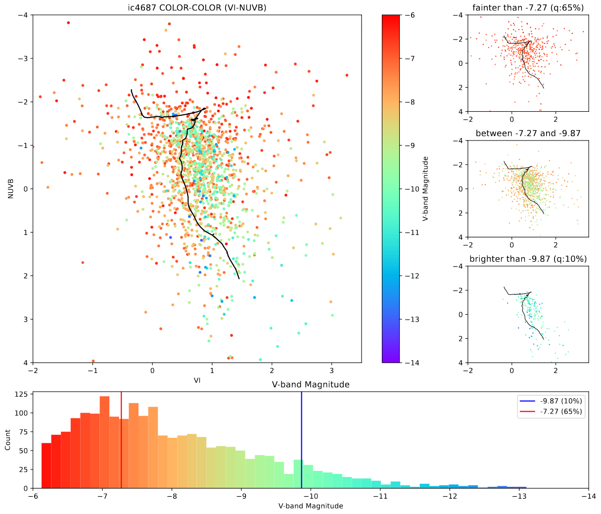 Color-Color Diagram for IC4687
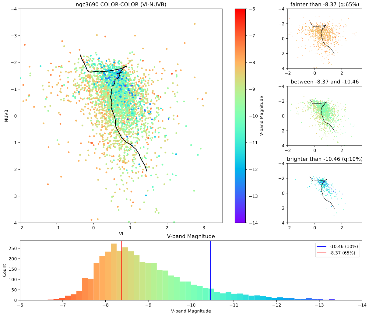 Color-Color Diagram for NGC3690
The main takeaway, looking at these, is that IC4687 appears to have a much older set of clusters, with far fewer very bright clusters present in our cluster set.
Changes to Direction
At our meeting on Friday, our group received some very exciting news; due to a quirk of scheduling, some JWST data that we thought we would be receiving in late 2024 has actually arrived now, and we now have access to JWST images in the infrared of IC4687.
This prompts us to shift focus to exclusively this galaxy, and now point our efforts at comparing the clusters we can see in the pre-existing hubble data with the JWST data, which is much less obscured by dust extinction.
Future Work
Our work for the next week is focused on putting together a training set of clusters from the clusters in our pre-existing set for IC4687. This will be used to help age date the other clusters in IC4687, as well as understand better the changes between the Hubble and JWST data.
We also want to try and find clusters that are mismatched between the JWST and Hubble data; these would be clusters that are faint in Hubble, but appear bright in JWST, or vice-versa. Our expectation is that the JWST data will yield a much larger number of clusters, but we do not have the machinery to create our own cluster set yet.