Research Update - Week 7
YSOLab
Thumbnail Image Generation
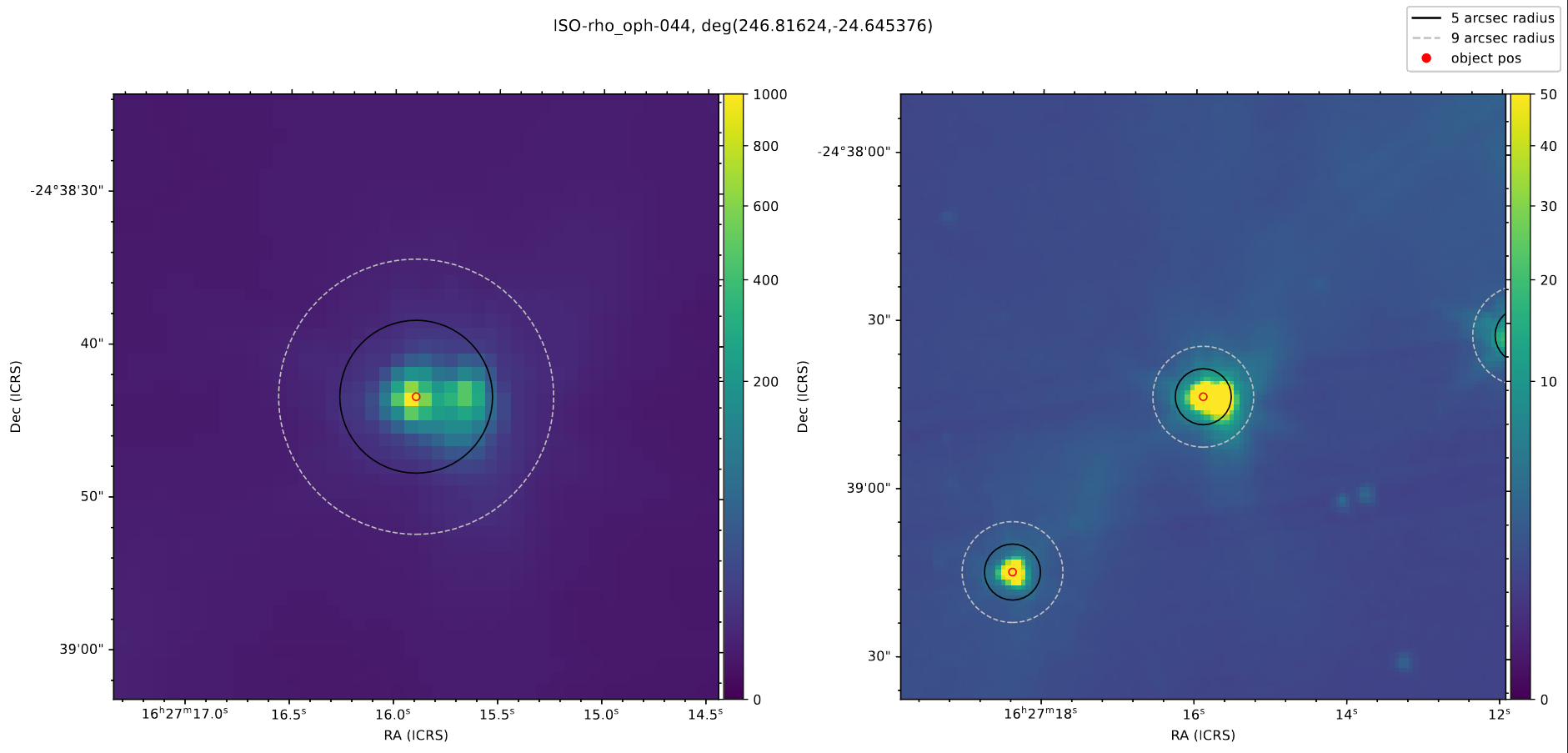
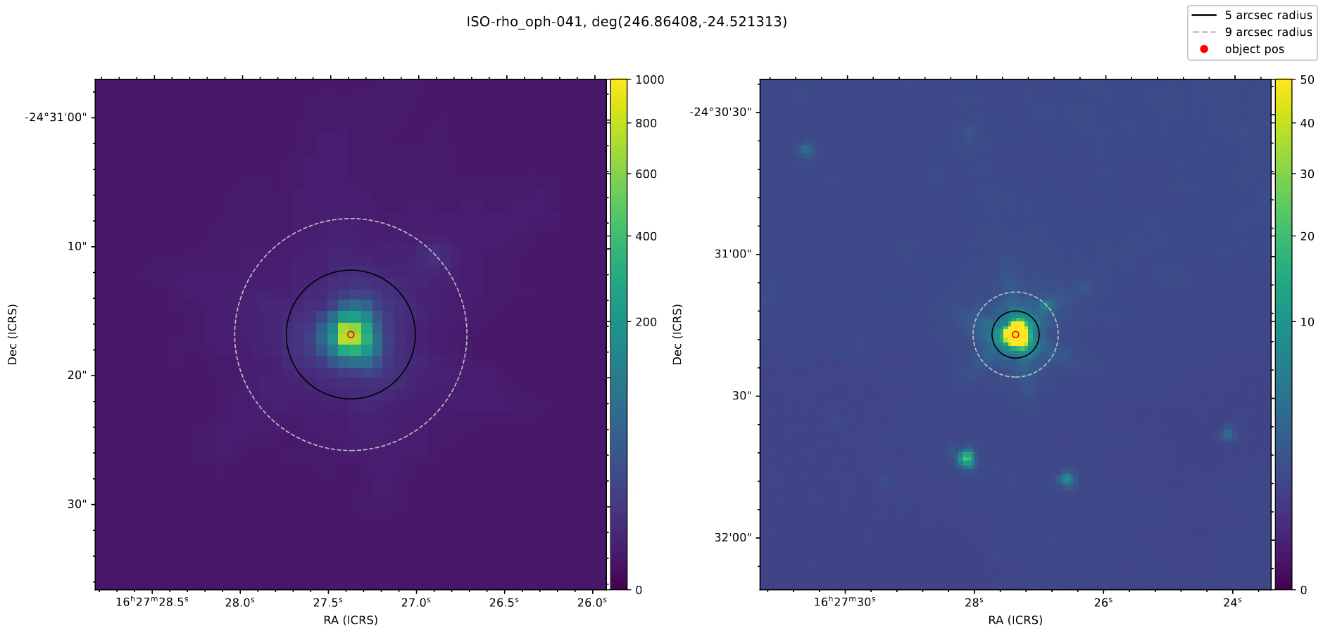
The main thing I worked on this week was verifying our data for the YSOs in the Rho Ophiuchus region. To do this, we needed to verify that there weren’t any oddities in the produced output tables, and check the Spitzer field images to make sure that none of the sources are binaries, or have companions that could contaminate the magnitude data.
Rather than manually track down each source using DS9, I wrote a quick script that used the aplpy package (which is itself a simplified accessor for the WCSAxes package) to plot the Field image FITS file, centered on each source, with two different views.
This made it very convenient to quickly flip through each of my assigned sources looking for any indication of problems. From this, I identified two sources that were clearly binary or overlapping systems, and found one with a very small companion.
 Example of binary protostar seen in these images
 Protostar seen with a faint companion to its upper right (partially obscured by 9-arcsec circle)
Finally Fixing the ISO Points
After what seems like ages, I finally tracked down the last lingering problem that was preventing the ISO points from being correctly plotted on their corresponding light curves for sources in the Rho Ophiuchus region.
The issue was a problem in the trimming process, where the program reduces down the selected points for the ISO data based on distance from the target point, choosing the closest within a 2 arcsecond cutoff. Specifically, I had made a mistake, and was only scaling the RA (to account for the spherical nature of the coordinate system) for the target position, which resulted in the Rho Ophiuchus points being ~20 degrees further from the target position than they should have been.
I fixed this mistake, and individually verified the light curves for each of the sources; the ISO point is being correctly plotted, and the issue is finally fixed.
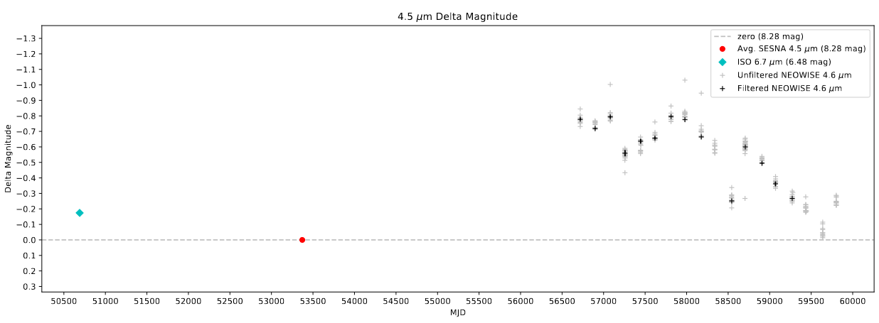 Example of a curve that now properly includes the ISO point
Future Work
For the next week, our plan is to go through and sort each of our assigned objects into groups of nominal, burst, fade, or variable type YSOs. We will do this by looking at the generated light curves for each object.
Cosmology Group
Consolidating Halo Slices
One of the primary things I worked on this week was rewriting and consolidating the code I used to generate the ‘halo slice’ plots into a reusable set of classes.
These plots proved themselves very useful for understanding the effectiveness of the model outputs in comparison to the renaissance, and were just a good way to compare cubes of data in general. However, the code had grown to be somewhat unwieldy as I constructed it, and creating a new set of plots in the same format wouldn’t be impossible, just time consuming and liable to esoteric bugs.
To get around this, I took a day or two to consolidate the code into a set of 3 classes that can be used to quickly and succinctly generate a set of ‘halo slice’ plots from 3D arrays of data. The different colormaps and normalizations can be specified on a per-subplot basis, and functions were included for adding line contours based on other data-cubes, as well as variable-radius circles for displaying points on the graphs.
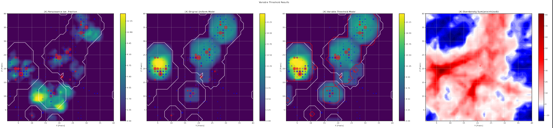 Example of halo slice plot created using the newly consolidated classes
The main draw of this consolidation was its reusability; by spending the time to do this, I can quickly toss together these useful plots in a very short time frame without having to copy-paste code and manually move things around.
 Snippet of code showing the classes being used to prepare a HaloSlicePlot object for later use
This experiment also served as my introduction to classes in python; I am familiar with the basics of object oriented programming (thanks to a particularly in-depth java programming class I took in high school), however this is the first time I have programmed using classes in many years, and the first time ever using python. It is honestly a miracle this turned out so well.
Variable Threshold Slices
Using the previously describe halo slice code, I put together halo slice plots for the results of the variable photon threshold tests.
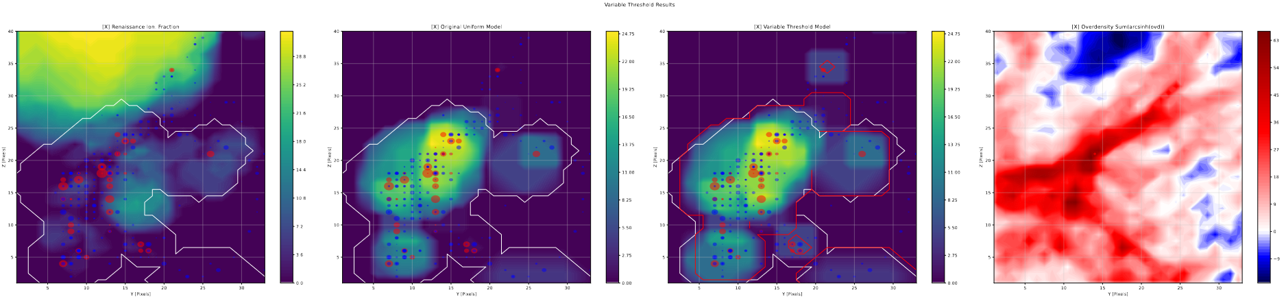 Portion of a Halo Slice plot showing effects; notice the halo in the top middle changes from the second to the third plot
From these plots, the results of this change become more clear; in general, any bubble larger than a few pixels in diameter are unchanged in size or shape, while there are a number of cases where single pixel bubbles jump up a bubble size or two as a result of this change. This matches almost exactly what we would expect from these changes; the variable threshold is only meaningfully different from the previous constant 1/4 value for the smallest bubble scales, where it starts from 1 and it approaches 1/4 exponentially.
Filament Removal Slices
Using the previously described halo slice code again, I put together some halo slice plots for the results of the filament removal tests.
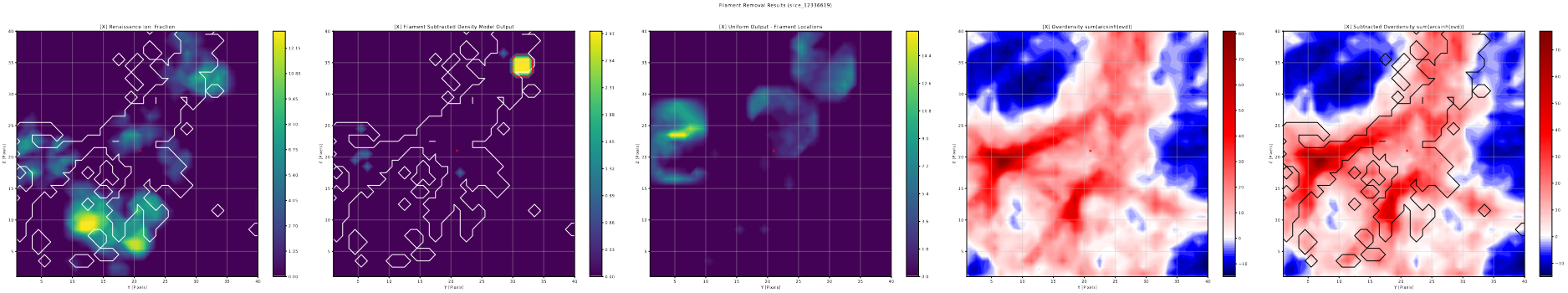 Portion of a Halo Slice plot showing effects of filament removal on density-aware model
These plots are somewhat less useful than the variable threshold slices; the overall impression I got was less than stellar, with very few noticable changes appearing, and the ones that did appear were often very minor, only increasing the size of a few bubbles by a small amount.
This lack of significant changes persists, even after I implemented a method to expand each found filament point into a 3-pixel radius sphere, my thinking being that the selected points only represented the high density core of the filament, and that the surrounding high density region was still suppressing the bubble formation.
Overall, we decided to put this avenue on hold for the moment, and focus our efforts more on the variable threshold methods for improvement.
Future Work
One major area of change I will be working on for next week is attempting to implement the effects of recombination on the ionized regions. Currently, the model makes no attempt to include the effects of hydrogen recombination, which we believe could help to penalize larger bubbles, and suppress their formation somewhat.
How exactly we will implement this is still up in the air; It should be relatively trivial, given we have the approximate gas density at each pixel, to integrate the equations and calculate the number of molecules that recombined in the last timestep for each pixel.
The main challenge will be how to we reflect this in the formation of bubbles; one thought is to try and associate each pixel with the nearest halo, however that has the problem of not considering the overlap of bubbles.
I will keep brainstorming on this over the next week, and see if I cannot at least cobble together an approach to propose.
Data Science Research
Comparing with AFPI Report Data
One goal I worked on this week was to integrate the AFPI report data into the graphs for the relevant cities; This was overall fairly simple, and was essentially just manual data entry for the three cities I was interested in.
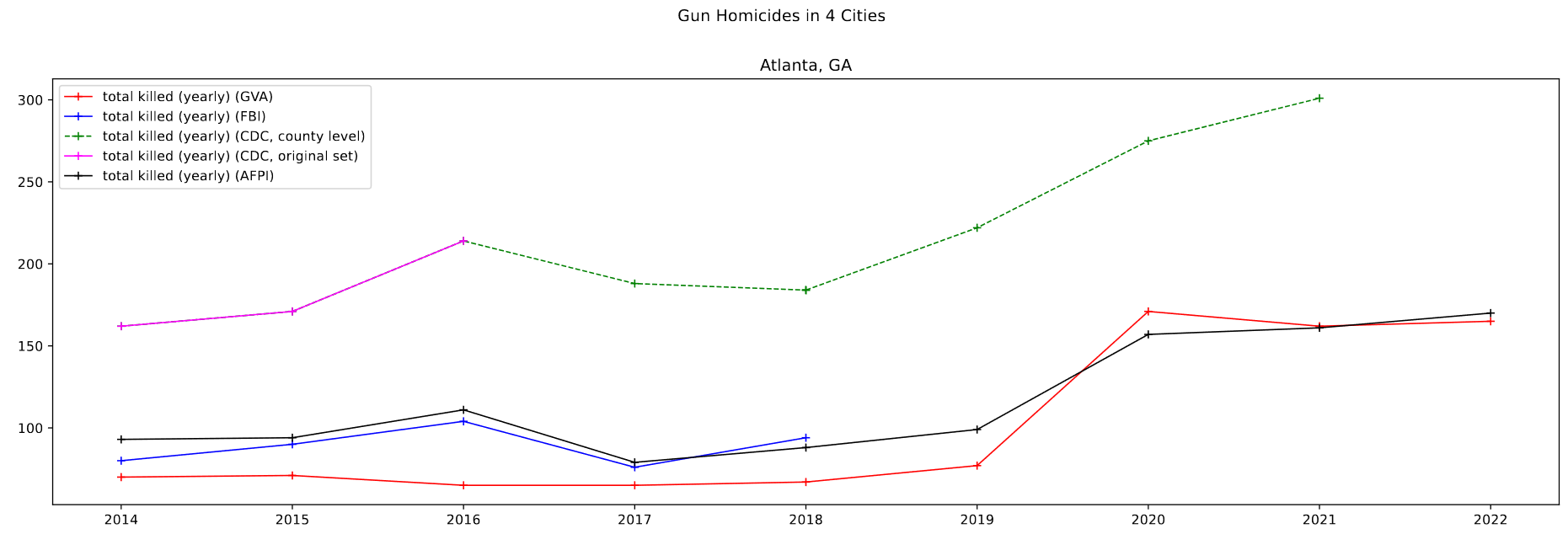 Plot for Atlanta, GA. This is fairly representative of the other cities.
Overall, the data follows the general trend of the other sets, and doesn’t disagree in any significant capacity that would exclude it from use.
Comparing with Pre-existing CDC Data
Another relatively simple task was to compare the Pre-existing gun violence data that Dr. Lilley had with the data I downloaded from the CDC website. I did this by first plotting it against the downloaded CDC data for the few cities we are specifically examining, and the results were fairly conclusive, as can be seen above. In essence, the old CDC data and the newly downloaded CDC data match exactly in their overlapping regions, which indicates that for these larger cities and more populous counties, the data I have downloaded matches exactly.
Checking for Missing Deaths in CDC Data
One area I worked on was checking for the behavior that Dr. Lilley described, where counties with fewer than 10 deaths in the selected time range will not be displayed in the dataset, for privacy reasons.
Plotting a histogram of values present in the newly downloaded set, which could exhibit this behavior, and the older set that Dr. Lilley provided that corrects for this, we see that this behavior is clearly present.
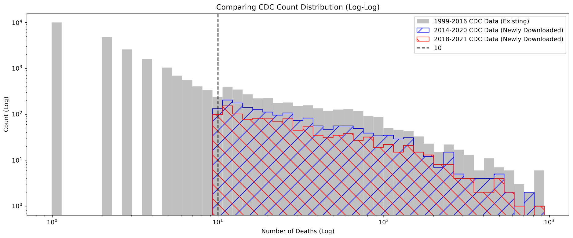 Histogram of deaths in each county in the three CDC sets
Specifically, the newly downloaded sets (2014-2020 and 2018-2021) both do not contain counties with less than 10 deaths, while the older set has many with less than 10.
Future Work
The main thing I will be working on this week is to use the methods Dr. Lilley described to recover the suppressed values for low-count counties. This method is fairly simple, and involves getting the combined death count for a common cause of death, like cancer, and gun violence, then getting the just the death count for that common cause. Then we can simply subtract away the common cause count, and we would be left with the true count of gun violence deaths for each county.
Cluster Research Pod
Examining Sets of FWHM and Threshold
This week I spent some time further refining my set of possible FWHM and Threshold values for starfinding in the JWST images we have.
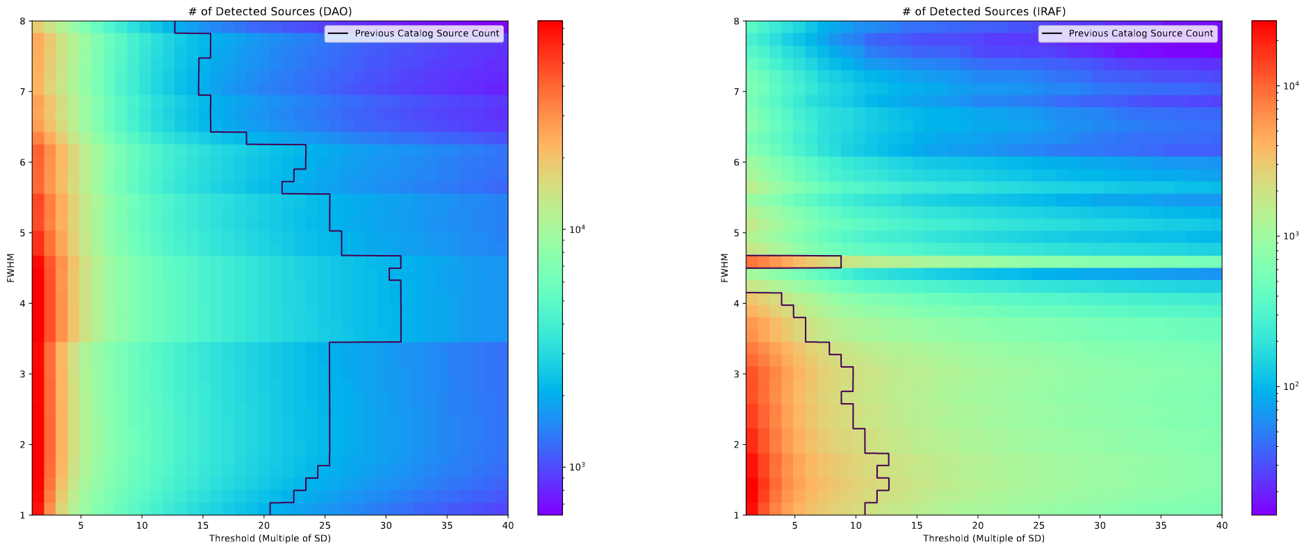 Plots showing the count of clusters found with both DAO and IRAF for a set of FWHM and threshold values
The line on this plot represents the number of clusters in the pre-existing catalog created from HST images. My reasoning is that, because the number of candidates the star finding algorithms give us will be further reduced by different filtering methods, and because we expect there to be more clusters visible in the JWST image, the best set of FWHM and Threshold values will lie somewhere on the left of the line on the plot.
From this, and a bit more context from our grad student advisor, we settled on a decent set of values for FWHM and Threshold that seemed to do a good job of grabbing everything.
General Observations
One other point we worked through was comparing the results of the DAOStarFinder and IRAFStarFinder algorithms. These comparisons were mostly done qualitatively by looking at the chosen cluster locations for each algorithm.
The overall takeaway has us leaning more towards DAOStarFinder. IRAFStarFinder seemed to do a better job at finding clusters outside the ring of the galaxy, but failed to capture many of the internal clusters, only placing a few with a fairly spread, which doesn’t reflect reality well. In contrast, DAOStarFinder seemed to do a much better job at gathering everything within the disk of the galaxy, but failed to find some of the maybe cluster objects outside the disk of the galaxy, although many of those could also be noise.
Future Work
For next week, our main goal is to continue working with the StarFinding Algorithms to try and better nail down their properties. We were also assigned a recently released GOALS paper that used JWST data (link) to read for next weel.
I was also planning on playing around with the standard deviations in our image, as there was some distrust of our current value, which may be being affected substantially by the outer regions of the image.