Research Update - Week 8
YSOLab
Determining Basic Properties
In service of the main thing I worked on this week for YSOLab (Classifying Behavior), I needed to find both the 2004 SESNA magnitudes of each source, as well as the magnitude range of the combined data.
To do this, I put together a small script that would read in the output files we have automatically creating, and pull out the SESNA magnitudes and the magnitude ranges for each source, which is then saved in a csv files.
Classifying Behavior
Our main task this week was for each of us to work through our set of assigned sources and classify them as either Burst, Fade, or Variable, in preparation for a more in-depth examination soon. This information was tracked in a shared google sheets document, which also had information such as the previously collected SESNA magnitude and magnitude ranges.
We generally constrained our observations to ones that exhibited a 1 magnitude overall magnitude range, in order to focus on more clearly variable sources.
Future Work
We did not hold a meeting this week, as there was a research symposium held during our meeting time. For next week, I will likely work to refine my classified sources, and maybe experiment with improving the delta magnitude light curve plots, perhaps with an additional set of tick labels indicating the corresponding date for the displayed mjd value.
Cosmology Group
First Pass at Recombination
My primary work this week was on implementing recombination into the semi-analytic model. I was able to get something that was approximately working, although later I will elaborate on a number of issues that became clear following a more careful look at the methods.
My general approach was to integrate the below equation to recieve the number of ionized molecules that would recombine within a given volume over a certain amount of time, assuming a constant rate of recombination (an assumption that wasn’t entirely correct.)
\[\frac{dN_\gamma}{dt} = \alpha_B \bar{n}^2_HV_p\] \[N_\gamma = \alpha_B \bar{n}^2_HV_pt\]I could then calculate the number of recombinations that occurred in each pixel within the simulation box since the previous timestep using the redshift of each step.
The next step was to use the ionization output from the previous step, which has a 1 in ionized regions and 0 elsewhere, to mask away neutral regions, and recieve a cube that contains the number of recombinations that occurred in each ionized pixel.
My next step was probably the less immediately obvious part; because the recombinations represented an additional amount of photons that needed to be overcome in each pixel in order for it to be considered ionized, I decided to subtract the recombination cube from the photon cube. This resulted in some locations having ‘negative’ photons, but that actually represents a location that takes more photons than average to ionize. I believe this to be defensible because the next step in the model process involves taking the average over a set of spherical sections and comparing to the number density of hydrogen, and then assigning ionized regions based on that comparison; as such, the ‘negative’ photons only serve to reduce the average photons measured in each location, and therefore make it harder to place bubbles.
The end result of this was fairly workable; the output still had ionized regions, but many of the larger bubbles had been suppressed substantially, with many of the bubbles shrinking to around the same size.
One cause of concern however was the ionization fraction over time; I had theorized that this method could cause some ‘harmonic’ motion, where an ionized region would grow, cause more recombinations, and then shrink in the next timestep, causing fewer recombinations, and grow in the subsequent timestep, and so on. This theory turned out correct, as evidenced by the below plot, which shows the fraction of the simulation space that is considered ionized vs the redshift of each timestep. Of specific note is the zig-zagging motion as the model progresses.
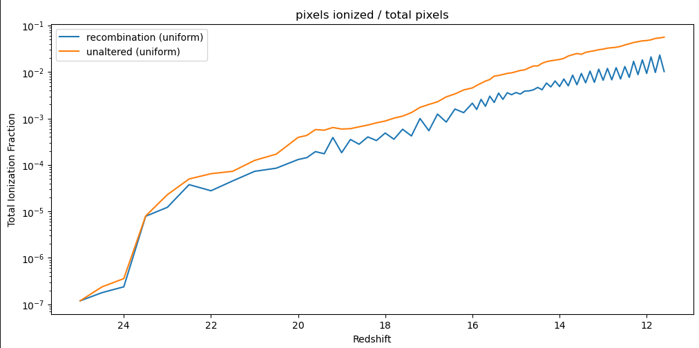 Plot showing the ionization fraction vs redshift for the unaltered model output and the recombination model output
Issues with Recombination Implementation
There are a number of issues with this implementation, which came to light as I discussed the methods with Dr. Visbal, Mihir, and Ryan during our weekly meeting.
The first issue was a mistake on units; while the overall units were fine, I had accidentally mixed the proper $ cm^3$ of the constant $ \alpha $ with the co-moving $cm^3$ of the volume and number density. This should be relatively simple to fix, and should cause the number of recombinations to decrease across the board.
The next mistake is related to how I am comparing the recombinations with the number of photons. Currently, the photon grid we calculate contains the lifetime total of photons in each pixel, while my method only calculated the number of recombinations in the previous timestep, resulting in significantly fewer recombinations than should have been present. This is also somewhat simple to rectify, and would involve tracking the number of recombinations in each pixel between each timestep, and adding in the new recombinations from each timestep before comparing against the photon grid.
Another mistake is related to my assumption that the rate of recombination remains the same over the whole timestep. In reality, as the pixel recombines and becomes more neutral, the rate of recombination would decrease. Resolving this is more involved, and would involve constructing and solving an ODE for the rate over the course of a timestep. I will likely shelf this problem for the time being, as there are other, more significant problems to resolve.
Future Work
For next week, my main focus will be on fixing the numerous mistakes I had made in creating the recombination method, as well as implementing a variant of that method that Dr. Visbal believes will be more accurate. This variant, rather than associating a recombination number with each pixel, would instead associate the recombinations with a specific halo. This comes with the problem of attempting to associate a pixel with a specific halo, especially in cases of overlapping bubbles where the responsibility is shared between multiple halos.
Gun Violence Archive Analysis
Resolving CDC Low Count Suppression
As I discussed last week, I was able to (mostly) rectify the supression of low-count counties within the CDC data. To do this, I used the CDC WONDER API to download two sets of counts; a count of every death that occurred at the county-year level, and a count of every death, excluding deaths from assault by gun, at the county-year level. I can then subtract the second count from the first, which would recover the count of gun violence deaths, even in counties with fewer than 10 gun violence deaths.
After performing this operation, the resulting distribution of values was much more consistent with what we might expect; the values now extend below 10, and the number of counties without counts has dropped significantly.
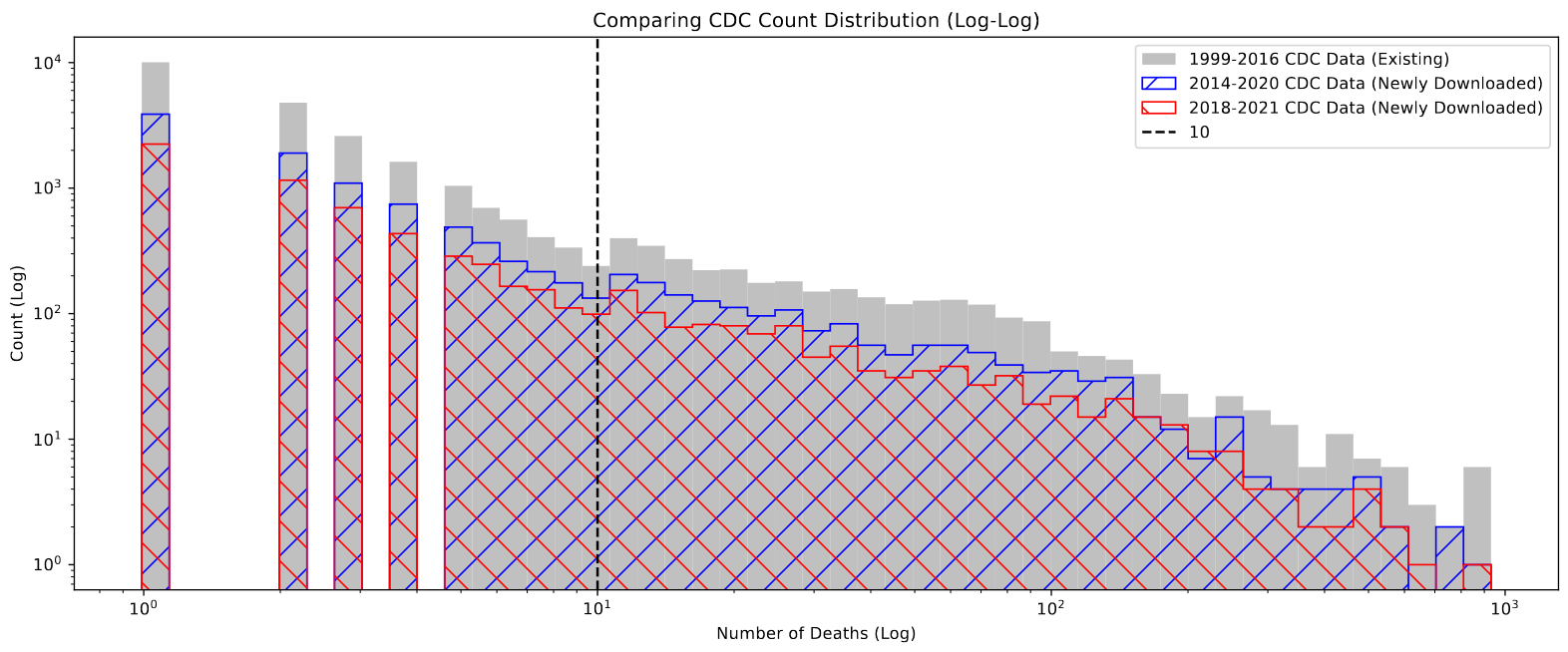 Log-Log plot showing the distribution of death counts in the existing and newly-downloaded datasets with the correction implemented.
One important note is that there still exist ~300 county-year designations with suppressed values. on closer examination, these counties all have very small populations of less than 10000 people, and in general are suppressed for both counts, meaning less than 10 people died of any cause during that year in that county. This means our current method of recovery will not work, and these values are lost to us for the time being.
Future Work
Over the next week, my plan is to try and do more rigorous comparison between the GVA dataset and the corresponding data in the FBI and CDC datasets. We have reason to believe that, because the GVA improved their collection methods sometime between 2016-2017, their data will become more accurate following this, and would be less accurate before those dates.
Cosmology Group
Nearest Neighbor Comparison
One thing I worked on this week was related to an observation we noticed while examining the preliminary results of the DAO and IRAF starfinding algorithms. Specifically, we noticed that the IRAF results seemed much more evenly distributed, while the DAO results were much clumpier, and more closely clustered.
To verify this, I converted the cluster candidate list into an open3D point cloud, and then calculated the nearest neighbor distance for each point within the DAO and IRAF sets, which I then plotted the distribution of.
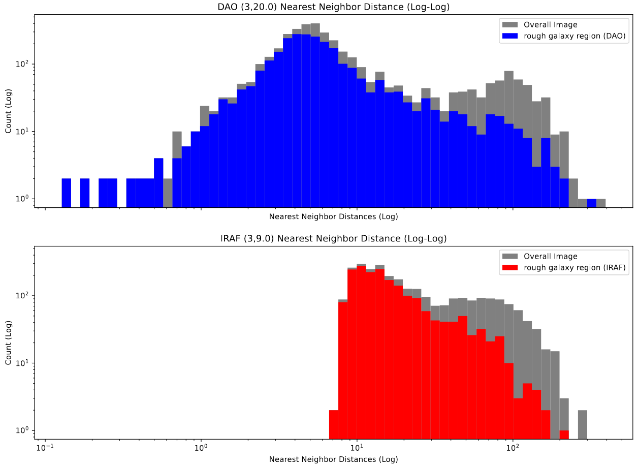 Log-Log Plots comparing the distribution of nearest-neighbor distances in clusters found with DAO and IRAF star-finders.
This plot backs up our observation; the IRAF distribution is much narrower, and altogether cuts off at about 6-7 pixels in distance, whereas the DAO distribution is much wider, and extends all the way down to less than a pixel in distance.
This indicates to us that the DAO starfinder is likely the better algorithm for our purposes, as we expect the clusters in close clumps, whereas the results of the IRAF starfinder are distinctly less physically accurate.
Standard Deviation Distribution
One thing I worked on this week was trying to get a better understanding of the distribution of standard deviations across the image. To do this, I constructed a small script to randomly select a location within the image and retrieve the standard deivation of the pixels within a square of a specified size around that square.
The initial result of this was a set of histograms that didn’t seem to reveal all much, beyond verifying that there was a fairly even distribution of standard deviations, with a slight bias towards smaller standard deviations, which decreases in intensity as the size of the sampled regions decreases.
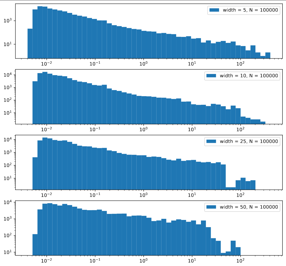 Log-Log plots showing the distribution of standard deviation samples of different widths
Using some interpolation, I was able to also plot an image of these standard deviations. One interesting artifact of this process was that the region around very bright pixels reconstructs into a high standard devation square centered around that point. (the odd ‘fuzziness’ to the plot is an artifact of the interpolation process)
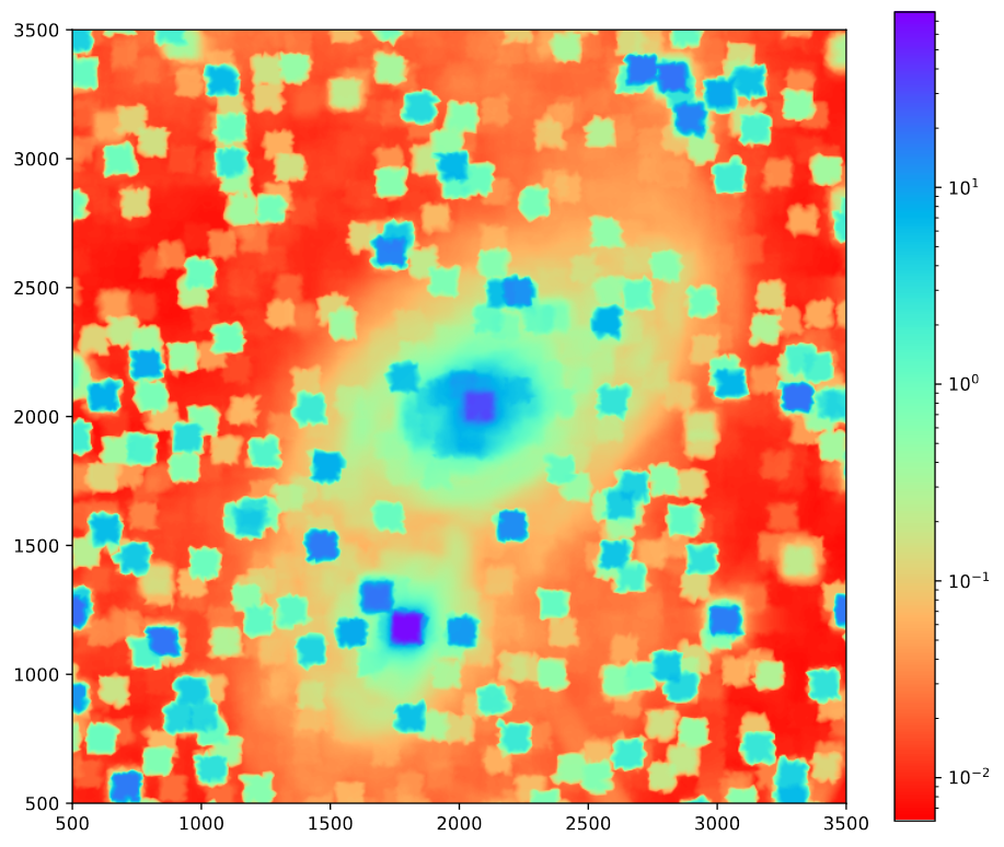 image showing the interpolated standard deviation samples (width=50) vs position.
GOALS Paper Notes
Over the last week, I spent some time working through the assigned paper, marking down notes on different points of discussion. Overall, their methods seem almost exactly similar to ours, except they make use PAHS emission rather than H-alpha to track star-formation and young clusters, as they don’t have the same selection of infrared filters that we do.
One consistent point of comparison is their observed difference between their HST-derived cluster set and their JWST-derived cluster set. Specifically, they found that 20% of the sources in their JWST catalog did not have a complement in the HST set. This relationship became more clear in their color-color diagram, where they have highlighted a region where nearly all of the clusters were only found in the JWST data.
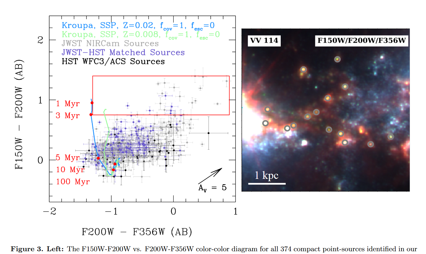 screenshot of figure 3 of the previously mentioned paper
One interesting verification of our results would be to highlight that same region on our final color-color diagrams and see if we observe a similar relationship.
The rest of my notes mostly revolved around whether we would want to include several of the corrections they did, and as such I won’t copy them down here (it would take a while).
Future Work
For next week, I will be working on a system to divide the image into smaller sections, then run the starfinding algorithms using their individual standard deviations, and finally merge the sets back together.